dddrees
Distinguished Member
- Joined
- Aug 27, 2012
- Messages
- 9,323
- Reaction score
- 1,605
STYLE. COMMUNITY. GREAT CLOTHING.
Bored of counting likes on social networks? At Styleforum, you’ll find rousing discussions that go beyond strings of emojis.
Click Here to join Styleforum's thousands of style enthusiasts today!
Styleforum is supported in part by commission earning affiliate links sitewide. Please support us by using them. You may learn more here.
Wow, now these are just simply gorgeous.I am pretty sure JLC does its enamelling in-house at Le Sentier - at least I am sure they do so for peinture sur émail (painted enamel) - which is led by the incomparable Miklos Merczel. Cannot speak for whether their cloisonne work is outsourced.
I think the other big house that led the way for in-house enamelling is VC, but I am not sure if that is a current thing with them.
For the benefit of everyone else here are some examples in lieu of a lengthy explanation as to why I rate the JLC enamelworks very highly. Remember this is all done in vitreous (as in glass) enamel - everything is done with the consideration that the end product has to survive being fired in a jeweler's kiln.
This is not widely known, but only gold cases can have vitreous enamel applied to them. Steel JLCs have epoxy resins applied to them and are then baked at a much lower temperatures. Which is nice in its own way, but not quite at the same level as vitreous enamel in terms of depth, beauty or difficulty. Thankfully not cost either though.
Your friendly neighbourhood JLC boutique or AD is likely to refer to either process as "enameling", and while a little misleading they are not technically wrong - one is vitreous enameling, the other cold enameling.
Sometimes they more accurately refer to the process for steel JLCs as "lacquering". This is cold enamel:
I wish you all the very best with your venture, and will keep an eye on your marque!
That's actually a pretty good (if crazy) idea, but I sadly don't print money...![shog[1].gif](http://files.styleforum.net/images/smilies/shog[1].gif)
Anyway, since I'm on a bit of a didactic roll, here are some examples of engraving on JLCs... I'll leave it up to you guys to decide who does the finer work.![peepwall[1].gif](http://files.styleforum.net/images/smilies/peepwall[1].gif)
JLC Le Sentier:
J.C. Randell:
Have you checked out the new 2013 JLC Master Perpetual Calendar? Would be interested in your thoughts about its "balance".
Anyway, since I'm on a bit of a didactic roll, here are some examples of engraving on JLCs... I'll leave it up to you guys to decide who does the finer work.![peepwall[1].gif](http://files.styleforum.net/images/smilies/peepwall[1].gif)
Have you checked out the new 2013 JLC Master Perpetual Calendar? Would be interested in your thoughts about its "balance".
Ahhh how apropos, just finished reading SJX's little blurb on the piece:
http://www.watchesbysjx.com/2013/03/photo-essay-jlc-master-calendar-sihh.html
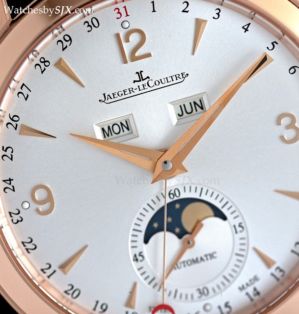
Now a picture for reference:

I think this is a perfect example of what I mean by "balance." I feel like on this watch, to use the same analogy, we have a east-west of "1", and a north-south of "3". By including the arabic numerals, the JLC name, and the day / month subdials, there is a nice balance to the moonphase.
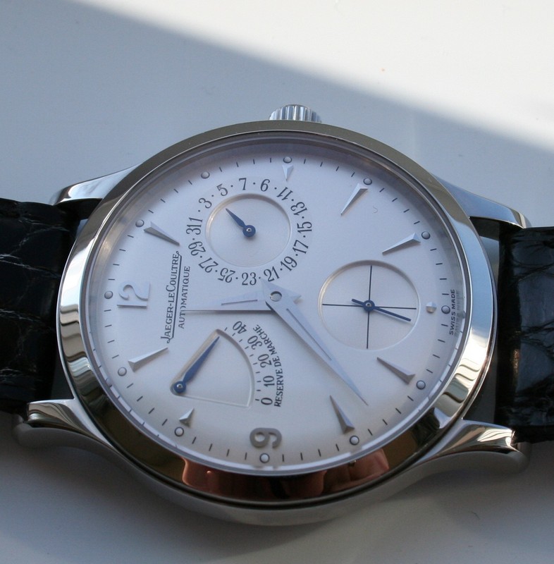
I think that this is one of the most beautiful aspects of the original Master Reserve de Marche. With some pieces, JLC really manages to hit it out of the park.

The inclusion of the arabic 9 and the applied marker on the "northwest" part of the dial somehow provides balance to the asymmetrical dial, and it does so in an undeniably quirky way. Unfortunately, some of that quirkiness is lost in the newer model in my opinion, which is a bit unfortunate.
IMHO each of those pieces is beautiful and their respective dials/fonts work well for each of them. Whenever a company puts a movement from a smaller watch into a larger case they have to do something to compensate and the subdials or date windows etc from looking like they are set too close to the center of the watch. Hence, sometimes hour markers get larger as they do at the 3 & 9 on the 5140 (compared to the smaller markers at 3& 9 on the 3940). I think if they had stuck with smaller font it would have seemed out of proportion to the new larger case and dial, and then it might create a somewhat stark or barren looking dial.But here's the thing: I've stated my clear preference for the 3940 versus the 5140. I feel that the relative proportions of the case size and subdial letterings for the 3940 work better than the 5140 (photo from Mech at PuristSpro):

I think the larger letterings work for the 5040 (which I have too), but because of the unique tonneau shape:

But what really comes across as a bit "off" to me about the 5140 is that squished up "27" in the date/moonphase subdial:

Which, interestingly enough, does NOT show up in the 5136/1J, despite the smaller case size (36/37mm versus the 5140's 39mm) and the larger letters in the other subdials:
I know I may be acting a bit unnecessarily nitpicky about this, and if someone wants to give me a 5140P for free I'm happy to own it.
Just wanted to share my nitpicky thoughts with you folks.
I reread my earlier reply, which I find now to be rather brusque. I apologise as that was not my intent, but typing on a phone is hell.
Anyway, with a gold linen finish dial like that I would stick with dark non-brown colours - black, navy, dark green. I would go large reptile. I don't think there is a way to successfully "casualise" or "sportify" this watch if that is what you are looking for.
Nice!! Oh man. My wife to be would kill me if I ever surprised her with a perpetual calendar.
+100. I need more monies so I don't have to decide between JLC models.Agree with the Stitchmeister above.
Going back to the "five watches, one maker" discussion, I think my greedy face could find five things I desire from most decent makers. Certainly all of the traditional "big three" make or have made enough to make a "collection" in their own right - were I wealthy and extravagant enough - and looking at Frilly's insane PP collection makes me drool.
But in terms of balance and design (and of course it's always going to be in the eye of the beholder), reading through this thread and then countless other pictures, reviews and advertisements, has pointed me firmly at two others: A Lange (again, very much a rich man's habit I'm sure), and Jaeger Le Coultre (rich enough, but perhaps more realistic for more people). I actually find their complicated piece quite similar in philosophy sometimes - either very symmetrical in proportion, or very deliberately asymmetrical, with a subtle balancing compensation.
Everyone has their thing, and every maker probably makes something I think is beautiful. But JLC strikes my ignorant brain as being very special design within the realms of realistic attainment.
 LuxeSwap Auction - Henry Poole Savile Row Bespoke Navy Suit Another rare piece offered at a no reserve, $9.99 starting bid auction by LuxeSwap, an eternal classic solid navy blue suit, for which the original owner spent north of $4,000 creating less than a decade ago.
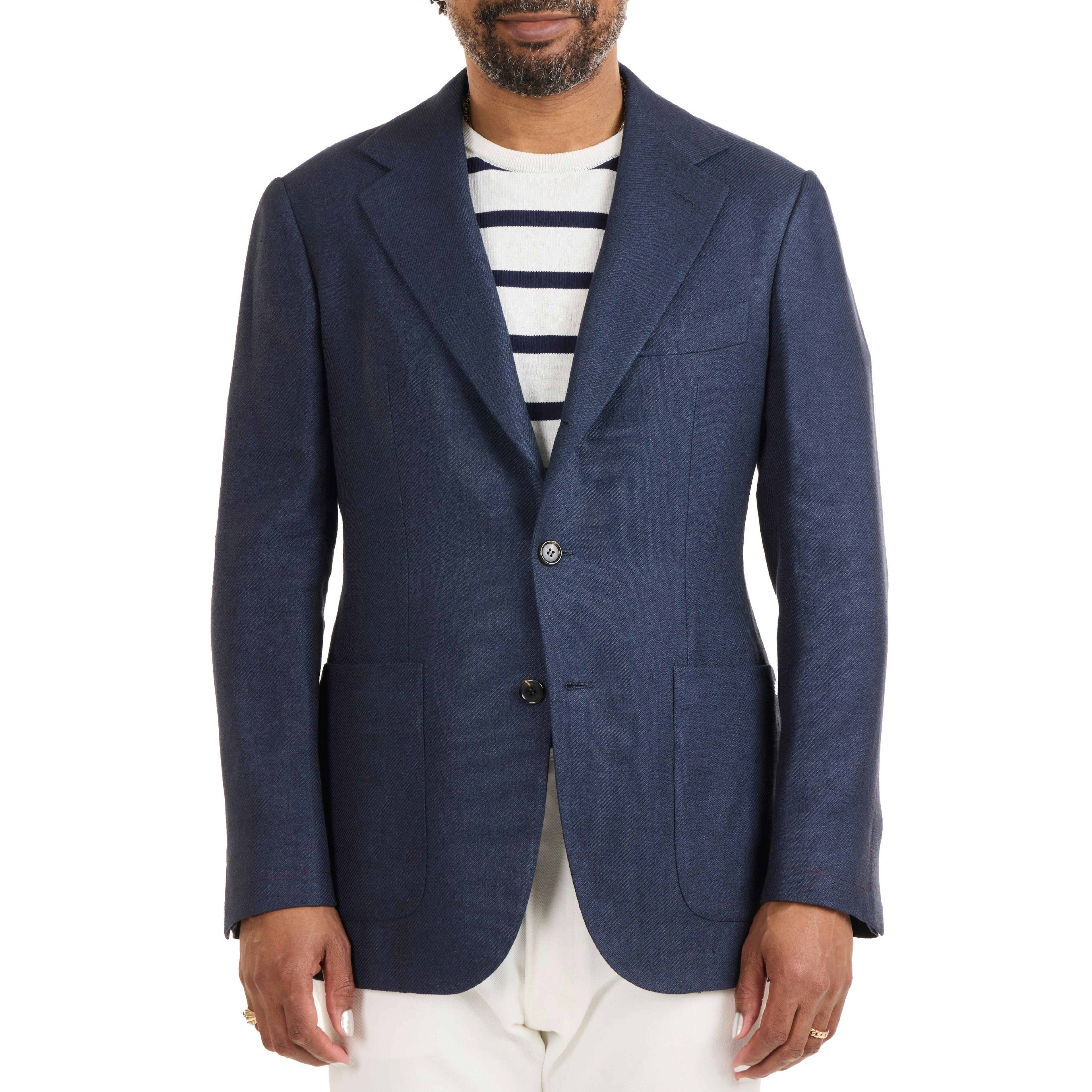
  The Armoury - Linen/Silk/Cotton Twill Model 103 Sport Coat - $3,000 The Armoury’s Hundred Series is a handmade take on our house tailoring models. An evolution of our Model 3 jacket, The Model 103 is almost completely handmade, with all production happening in the center of Italy.