UrbanComposition
Distinguished Member
- Joined
- Aug 6, 2010
- Messages
- 6,583
- Reaction score
- 19,825
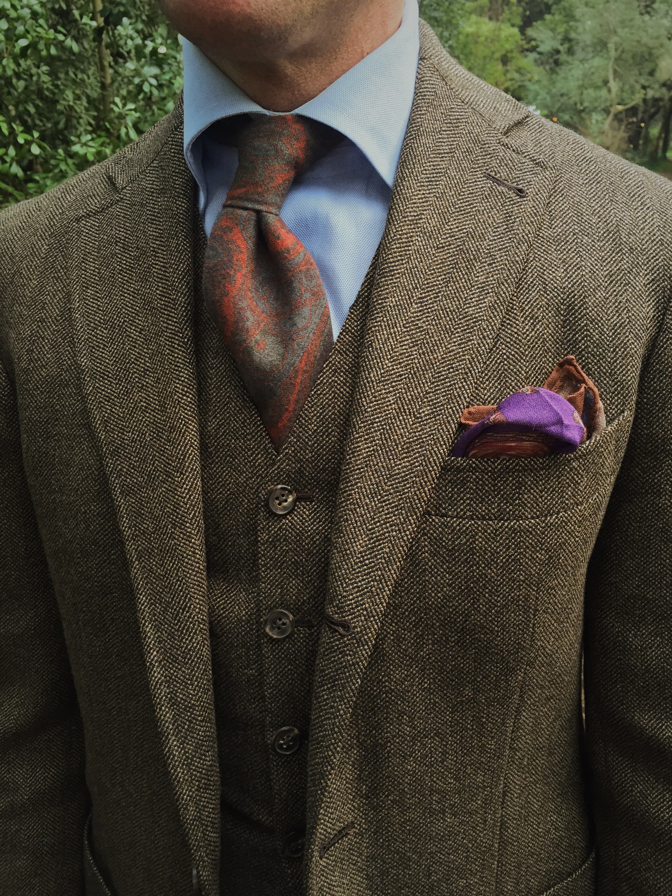
Technically yesterday...
STYLE. COMMUNITY. GREAT CLOTHING.
Bored of counting likes on social networks? At Styleforum, you’ll find rousing discussions that go beyond strings of emojis.
Click Here to join Styleforum's thousands of style enthusiasts today!
Styleforum is supported in part by commission earning affiliate links sitewide. Please support us by using them. You may learn more here.
 LuxeSwap Auction - Henry Poole Savile Row Bespoke Navy Suit Another rare piece offered at a no reserve, $9.99 starting bid auction by LuxeSwap, an eternal classic solid navy blue suit, for which the original owner spent north of $4,000 creating less than a decade ago.
 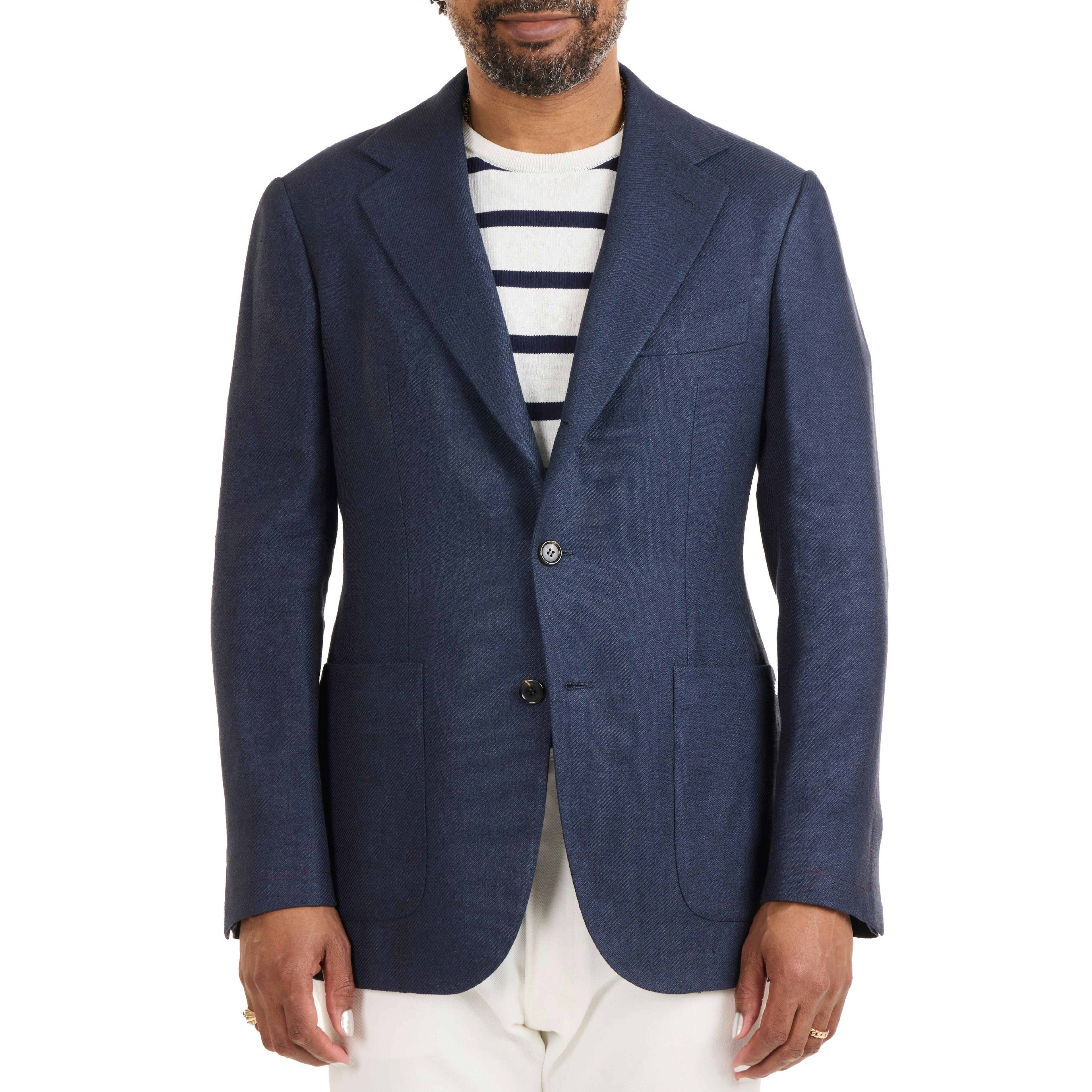 The Armoury - Linen/Silk/Cotton Twill Model 103 Sport Coat - $3,000 The Armoury’s Hundred Series is a handmade take on our house tailoring models. An evolution of our Model 3 jacket, The Model 103 is almost completely handmade, with all production happening in the center of Italy.