UrbanComposition
Distinguished Member
- Joined
- Aug 6, 2010
- Messages
- 6,583
- Reaction score
- 19,825
Technically yesterday...
STYLE. COMMUNITY. GREAT CLOTHING.
Bored of counting likes on social networks? At Styleforum, you’ll find rousing discussions that go beyond strings of emojis.
Click Here to join Styleforum's thousands of style enthusiasts today!
Styleforum is supported in part by commission earning affiliate links sitewide. Please support us by using them. You may learn more here.
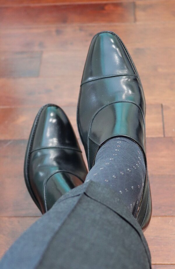
 LuxeSwap Auction - Paul Stuart Edward Green Butterfly Loafers
A piece of forum lore, preferred by the legendary Reginald Jerome de Mans, the Edward Green butterfly loafer on the 184 last is made even more beautiful by years of unique patina.
LuxeSwap Auction - Paul Stuart Edward Green Butterfly Loafers
A piece of forum lore, preferred by the legendary Reginald Jerome de Mans, the Edward Green butterfly loafer on the 184 last is made even more beautiful by years of unique patina.
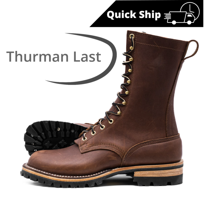 Nicks Handmade Boots - BuilderPro® - ThurmanNW - $589
The BuilderPro® ThurmanNW is designed for those who demand ruggedness without compromising on comfort.
Nicks Handmade Boots - BuilderPro® - ThurmanNW - $589
The BuilderPro® ThurmanNW is designed for those who demand ruggedness without compromising on comfort.