• Hi, I am the owner and main administrator of Styleforum. If you find the forum useful and fun, please help support it by buying through the posted links on the forum. Our main, very popular sales thread, where the latest and best sales are listed, are posted HERE

    Purchases made through some of our links earns a commission for the forum and allows us to do the work of maintaining and improving it. Finally, thanks for being a part of this community. We realize that there are many choices today on the internet, and we have all of you to thank for making Styleforum the foremost destination for discussions of menswear.
  • This site contains affiliate links for which Styleforum may be compensated.
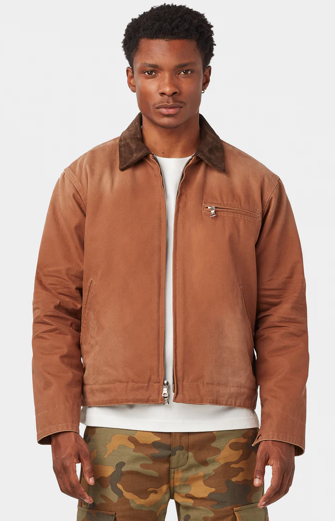
  • UNIFORM LA CHILLICOTHE WORK JACKET Drop, going on right now.

    Uniform LA's Chillicothe Work Jacket is an elevated take on the classic Detroit Work Jacket. Made of ultra-premium 14-ounce Japanese canvas, it has been meticulously washed and hand distressed to replicate vintage workwear that’s been worn for years, and available in three colors.

    This just dropped today. If you missed out on the preorder, there are some sizes left, but they won't be around for long. Check out the remaining stock here

    Good luck!.

  • STYLE. COMMUNITY. GREAT CLOTHING.

    Bored of counting likes on social networks? At Styleforum, you’ll find rousing discussions that go beyond strings of emojis.

    Click Here to join Styleforum's thousands of style enthusiasts today!

    Styleforum is supported in part by commission earning affiliate links sitewide. Please support us by using them. You may learn more here.

Opinion on this hoodie?

masqueofhastur

Senior Member
Joined
Nov 25, 2006
Messages
370
Reaction score
0
Originally Posted by theshonen8899
Alright fine.
The print sucks 'cause it look horribly ugly.
Sorry, but I'm done here.


And why is that, you dislike the font? Do you even know what the font is called? Are you the type of person who dresses like an emo?
 

ghostdeini

Well-Known Member
Joined
Dec 16, 2006
Messages
69
Reaction score
0
... why do you care so much? the font IS indeed ugly, I wouldn't give the sweater a 2nd glance if I saw it on the street... if you like it so much, buy it and call it a day
 

charolastra

Member
Joined
Apr 22, 2006
Messages
11
Reaction score
0
The graphic looks like it was done in about 5 minutes by someone in Photoshop, who is, untrained in Photoshop. If you have to ask, the voice in your head is probably sayin' NO..
 

LA Guy

Opposite Santa
Admin
Moderator
Supporting Member
Joined
Mar 8, 2002
Messages
57,601
Reaction score
36,457
Ime, people heavily into martial arts do not/could not moonlight as graphic artists. I would not buy the hoodie for two reasons. The first is that, as other posters have stated, the print, apart from being unremarkable, is interesting only insofar as the font is completely incompatible with a martial arts company, what with the rounded letters and all. The second is that I would never where anything from any of the schools I've trained at outside of the schools. People who don't know what the print references will just think that it's a rather ugly, but not even distinctively ugly sweatshirt, and people who know will probably think "poser".
 

LA Guy

Opposite Santa
Admin
Moderator
Supporting Member
Joined
Mar 8, 2002
Messages
57,601
Reaction score
36,457
Finally, let's not have any criticisms like "the print sucks. The end." That really isn't very useful at all. And if someone writes something inane like that, let it slide. It's really not worth it, ime.

So, no fighting about Nogi, or I'll be forced to triangle choke one of you while applying a trachea choke onf the other (I like trachea chokes because I am a mean bastard.)
 

masqueofhastur

Senior Member
Joined
Nov 25, 2006
Messages
370
Reaction score
0
Originally Posted by LA Guy
Ime, people heavily into martial arts do not/could not moonlight as graphic artists. I would not buy the hoodie for two reasons. The first is that, as other posters have stated, the print, apart from being unremarkable, is interesting only insofar as the font is completely incompatible with a martial arts company, what with the rounded letters and all.

I don't see how font has anything to do with being tied with martial arts, and I don't want to advertise "hey, I'm a martial artist". Unremarkable isn't something I consider bad, thanks for using a slightly more descriptive word than ugly.

The second is that I would never where anything from any of the schools I've trained at outside of the schools. People who don't know what the print references will just think that it's a rather ugly, but not even distinctively ugly sweatshirt, and people who know will probably think "poser".
It's not from a different school, it's a gear company and my coach only cares that I don't wear shirts from other local gyms. Unlikely for people in the know to think poser, as that's a stigma held for TapouT, KTFO and Xiyence.
 

masqueofhastur

Senior Member
Joined
Nov 25, 2006
Messages
370
Reaction score
0
Originally Posted by ghostdeini
... why do you care so much? the font IS indeed ugly, I wouldn't give the sweater a 2nd glance if I saw it on the street... if you like it so much, buy it and call it a day

I'm interested in useful responses. If people say it's nothing special then that's fine, because if there's nothing special there's not going to be anything distinctive to point out so there's nothing more to say. If someone is going to say it's ugly, they should have an explanation why, because if you find something ugly, there's something about it that you disagree with. So if someone thinks it's ugly because they think gold and white don't go together, they should say that. Or because they dislike cursive fonts they should say that, not that it's ugly or that it looks worse than something a 5 year old would design, because the former is a useless response (and I am clearly not starting the thread looking for useless responses) and the latter is clearly not true, and if the argument for it is an exaggeration for effect, it's an exaggeration of a useless comment. Either way I care about people polluting a thread where I'm asking for information with useless crap.
 

tetro

Member
Joined
Oct 30, 2006
Messages
11
Reaction score
0
I don't like it. I actually think the cursive is ok, but I think the gold print on white looks gaudy. Also it looks like its a pretty bright white which can look bad on a lot of people.
 

drizzt3117

Stylish Dinosaur
Joined
Aug 26, 2004
Messages
13,040
Reaction score
14
Originally Posted by masqueofhastur
I'm interested in useful responses. If people say it's nothing special then that's fine, because if there's nothing special there's not going to be anything distinctive to point out so there's nothing more to say. If someone is going to say it's ugly, they should have an explanation why, because if you find something ugly, there's something about it that you disagree with. So if someone thinks it's ugly because they think gold and white don't go together, they should say that. Or because they dislike cursive fonts they should say that, not that it's ugly or that it looks worse than something a 5 year old would design, because the former is a useless response (and I am clearly not starting the thread looking for useless responses) and the latter is clearly not true, and if the argument for it is an exaggeration for effect, it's an exaggeration of a useless comment. Either way I care about people polluting a thread where I'm asking for information with useless crap.

I don't think a single person has said they like the sweatshirt, if you're keeping score. If you like it, buy it, if not, don't. Simple as that. I don't have any opinion on it either way. The best description anyone has said so far is unremarkable.
 

chronoaug

Boston Hipster (Dropkick Murphy)
Joined
Oct 26, 2006
Messages
13,321
Reaction score
20
The print is allowed to be ugly. Just because it's a cool martial arts school or gear company doesn't make it better. People here love sugar cane jeans, but i don't think many people would(or at least should) defend or buy a hoodie that looked just like that but read "sugar cane" on it. Whoever said it looks like a casual photo shop or any other computer program font is correct. No one here would ever wear it. It's one thing if you were asking for help on how to make it better, but asking for opinions will get you just that; opinions. I don't think trying to change everyone's mind by forcing them to back up their opinions is going to make the jacket more attractive to you or them. I for one think the gold on white is pretty trashy/gaudy. I don't care for the design of the font. I also don't like being walking advertisements by wearing the design openly on my clothes often, especially when it's the centerpiece like with this. Same reason I think the kids running around wearing abercrombie, hollister and ae stuff with the name brand plastered everywhere is dumb, because they're not wearing the shirt/hoodie, just the name brand.
 

no_pseudonym

Senior Member
Joined
Jan 13, 2007
Messages
113
Reaction score
0
I think it would help if you were clearer on what kind of feedback you want.
Firstly, are you considering buying this? For what purpose? What do you think about the hoodie?
I personally wouldn't wear mainly because I don't think white hoodies suit me, and I don't think the logo looks that good (and I have no affiliation with whatever group it represents).

Originally Posted by masqueofhastur
I'm interested in useful responses. If people say it's nothing special then that's fine, because if there's nothing special there's not going to be anything distinctive to point out so there's nothing more to say. If someone is going to say it's ugly, they should have an explanation why, because if you find something ugly, there's something about it that you disagree with. So if someone thinks it's ugly because they think gold and white don't go together, they should say that. Or because they dislike cursive fonts they should say that, not that it's ugly or that it looks worse than something a 5 year old would design, because the former is a useless response (and I am clearly not starting the thread looking for useless responses) and the latter is clearly not true, and if the argument for it is an exaggeration for effect, it's an exaggeration of a useless comment. Either way I care about people polluting a thread where I'm asking for information with useless crap.
 

masqueofhastur

Senior Member
Joined
Nov 25, 2006
Messages
370
Reaction score
0
Originally Posted by chronoaug
I don't think trying to change everyone's mind by forcing them to back up their opinions is going to make the jacket more attractive to you or them.

I'm not forcing anyone to change my opinion, it's just if someone particularly doesn't like it, I'd like to know the reason so I get an idea of where they're coming from. If an emo doesn't like something then that's one point in favour of it for me, because I think emos are some of the worst dressed people around (aside from being fat or anorexic). Just saying it's ugly doesn't tell me why you think it's ugly and what you think would be good.
 

masqueofhastur

Senior Member
Joined
Nov 25, 2006
Messages
370
Reaction score
0
Originally Posted by no_pseudonym
I think it would help if you were clearer on what kind of feedback you want.

Well, any kind of feedback that's at least semi objective. "It's ugly" or "it's great" doesn't give me any idea of how it might make people react who I'm actually going to be around.

Firstly, are you considering buying this? For what purpose? What do you think about the hoodie?
I'm considering buying it if it goes on sale, I like the guy who owns the company. I like hoodies because it rains in Vancouver and they're also handy for wintertime where it's not too cold but still enough where having some head covering would help. My opinion of the hoodie is it's the only one I'd consider wearing of all of them from all the MMA gear companies I'm aware of. I don't really want it to stand out, so unremarkable is pretty much what I'm going for. I've got a grey hoodie from a bike shop in Nanaimo that I got for free from my uncle, nothing special but it looks fine on me, so this would be something a little more relevant.

I personally wouldn't wear mainly because I don't think white hoodies suit me, and I don't think the logo looks that good (and I have no affiliation with whatever group it represents).
I don't think it's a particularly great logo either, I think this one looks better, it's somewhat clever, but they only have it for T-shirts.

GlobeRoyal.jpg
 

sonick

Distinguished Member
Joined
Mar 11, 2003
Messages
5,686
Reaction score
406
Don't like it...

First off, I tend to shy away from clothing that has a visible logo on it.
Secondly, the logo itself is unappealing to me.
Thirdly, the color of the logo, to me, just looks terrible.
Fourth, the hoodie itself looks like any other plain cheap hoodie you'd find at athletes world (2 for $40). Would hardly keep you warm; especially in the weather Vancouver's been having lately.
Fifth, it looks like it would fit pretty poorly.

You should wait till next year and look to score some W+H/Spruce hoodies from CYC's sample sale. That's what I did; $35 for awesomely fitting, thick, warm sweaters.
 

Featured Sponsor

How important is full vs half canvas to you for heavier sport jackets?

  • Definitely full canvas only

    Votes: 97 37.6%
  • Half canvas is fine

    Votes: 93 36.0%
  • Really don't care

    Votes: 30 11.6%
  • Depends on fabric

    Votes: 43 16.7%
  • Depends on price

    Votes: 38 14.7%

Forum statistics

Threads
507,209
Messages
10,594,573
Members
224,384
Latest member
maxskinperfector
Top