NonServiam
Senior Member
- Joined
- Apr 17, 2008
- Messages
- 436
- Reaction score
- 985
I have to agree with the previous gentleman's every point! The watch is amazingly versatile, and the silver dial very handsome. And true enough, silver on silver can be hard to read. Its major fault in my eyes is that it can appear almost bland in its perfectness. It is symmetric, well-balanced and unoffensive to the extreme. But the moon phase adds just the right amount of playfulness as a counterweight.
I have yet to see the black dial in person, but it looks like a choice only down to personal taste. The black looks awesome!
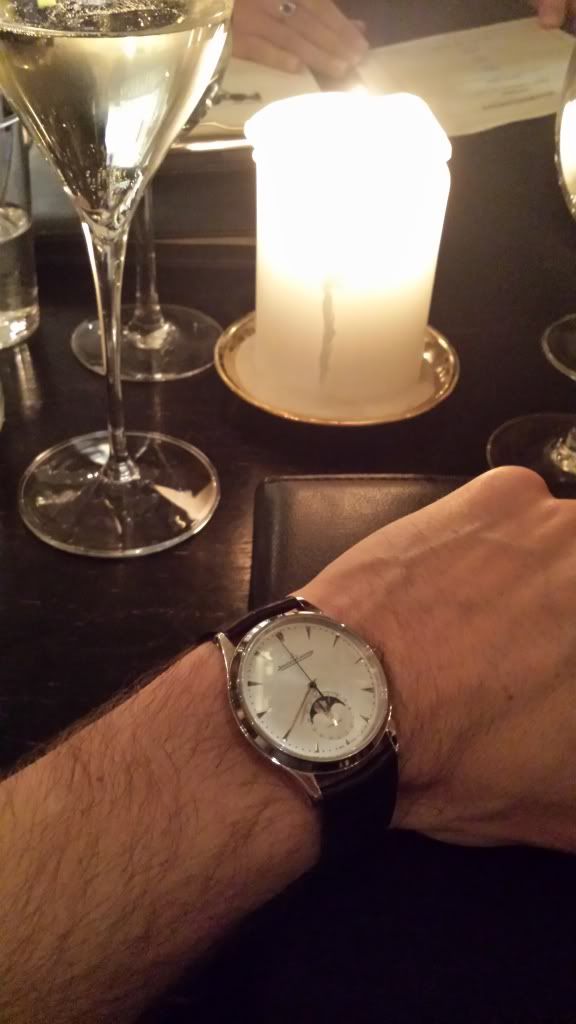
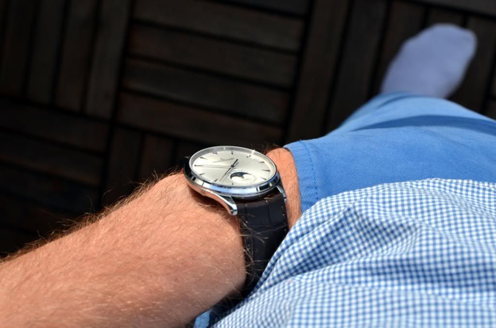
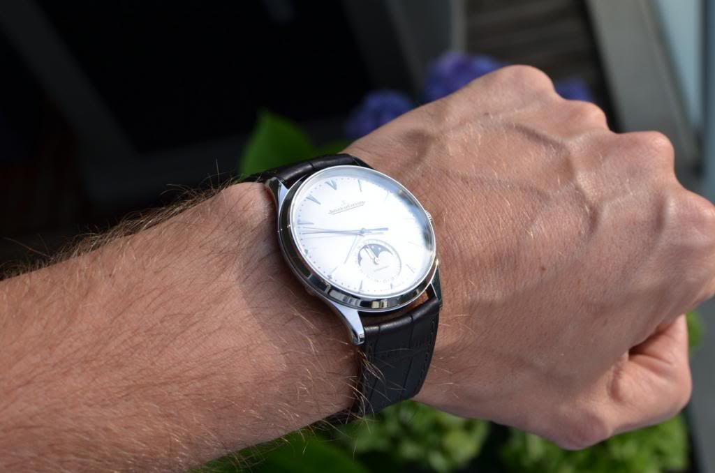
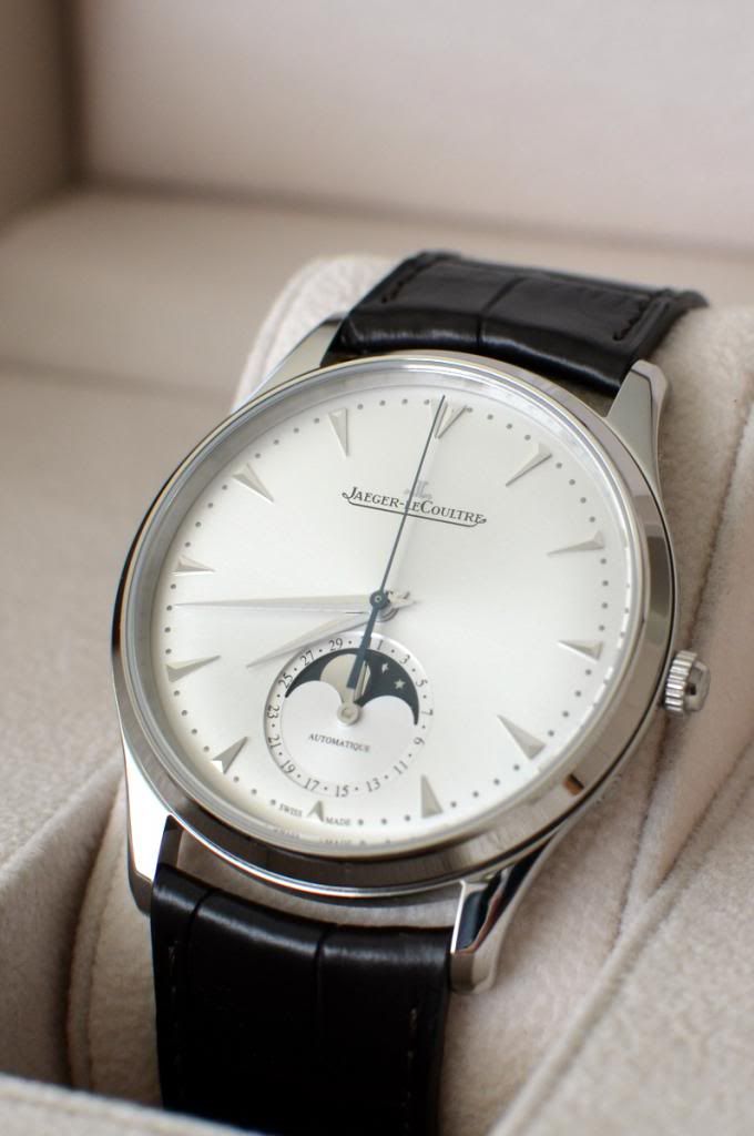
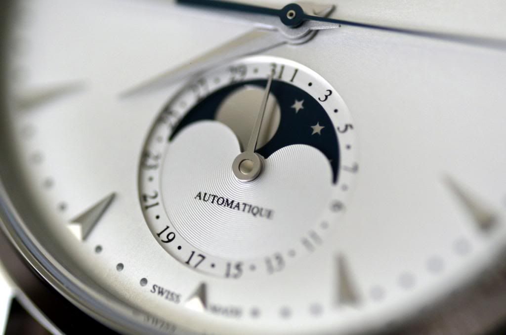
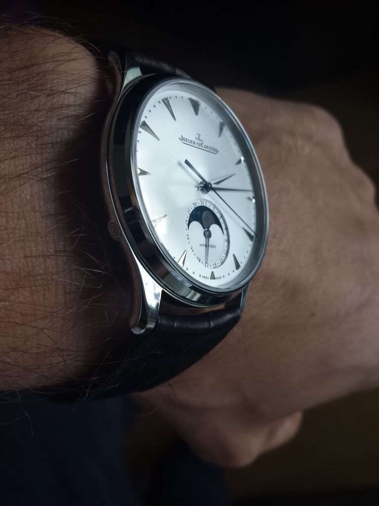
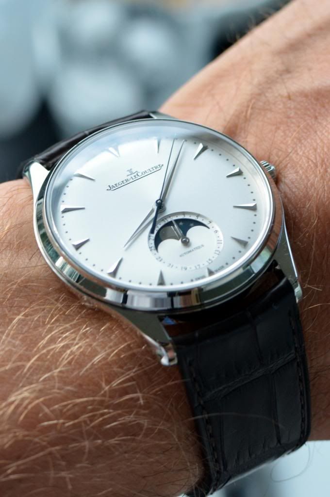
I collected a few pics of my MUT Moon ...

I agree, but I think the MUT Moon bridges the gap: yes, it can be worn as a pure dress watch for formal occasions, but in my opinion it is a true go-anywhere, do-anything watch (short of actual sporting activities). It can be worn in almost every situation and with almost every wardrobe. I have it's bigger (but not "bigger") brother, the Perpetual Ultrathin, and it is almost as flexible. Short of true formal occasions, mine wears equally well with a suit, with jeans, with shorts and a tshirt, etc.
But the MUT Moon is even more flexible and a classic--elegant complications but not complicated. A very clean and elegant design. And while not razor thin like a true ultrathin, it's impressively thin for an automatic.
My one critique of the JLC silver-faced dials is that they don't use contrasting hands/indices on them, so they are harder to read. For that reason I prefer the black dial version (and is the reason I spent the extra coin for the WG perp ultrathin instead of the steel version--the steel's hands got lost on the silver dial, especially the subdial hands). However, that same issue many folks would consider a strong selling point in favor of the silver dial--it is more subtle, which is a nice feature in a dressier watch. Finally, I note that the moon complication will likely have more "pop" on the silver dial--the darker background of the moon disc is more camouflaged on the black face.
Great choice either way.
I have to agree with the previous gentleman's every point! The watch is amazingly versatile, and the silver dial very handsome. And true enough, silver on silver can be hard to read. Its major fault in my eyes is that it can appear almost bland in its perfectness. It is symmetric, well-balanced and unoffensive to the extreme. But the moon phase adds just the right amount of playfulness as a counterweight.
I have yet to see the black dial in person, but it looks like a choice only down to personal taste. The black looks awesome!
I collected a few pics of my MUT Moon ...


Last edited:


