Support the forum
Navigation
-
- Men's Style
- Classic Menswear
- Streetwear and Denim
- Preorders, Group Made-to-order, trunk shows, and o
- Menswear Advice
- Former Affiliate Vendor Threads; a Locked Forum.
- Career and job listings in fashion, mens clothing,
-
- American Trench
- AMIDÉ HADELIN
- Archibald London
- The Armoury
- Arterton
- Besnard
- Canoe Club
- Capra Leather
- Carmina
- Cavour
- Crush Store
- De Bonne Facture
- Drinkwater's Cambridge
- Drop93
- eHABERDASHER
- Enzo Custom
- Epaulet
- Exquisite Trimmings
- Fils Unique
- Gentlemen's Footwear
- Giin
- Grant Stone
- House of Huntington
- IsuiT
- John Elliott
- Jonathan Abel
- Kent Wang
- Kirby Allison
- Larimars Clothing
- Lazy Sun
- LuxeSwap
- Luxire Custom Clothing
- Nicks Boots
- No Man Walks Alone
- Once a Day
- Passus shoes
- Proper Cloth
- SARTORIALE
- SEH Kelly
- Self Edge
- Shop the Finest
- Skoaktiebolaget
- Spier and MacKay
- Standard and Strange
- Bespoke Shoemaker Szuba
- Taylor Stitch
- TLB Mallorca
- UNI/FORM LA
- Vanda Fine Clothing
- Von Amper
- Wrong Weather
- Yeossal
- Zam Barrett
Install the app
More options
-
Hi, I am the owner and main administrator of Styleforum. If you find the forum useful and fun, please help support it by buying through the posted links on the forum. Our main, very popular sales thread, where the latest and best sales are listed, are posted HERE
Purchases made through some of our links earns a commission for the forum and allows us to do the work of maintaining and improving it. Finally, thanks for being a part of this community. We realize that there are many choices today on the internet, and we have all of you to thank for making Styleforum the foremost destination for discussions of menswear. -
This site contains affiliate links for which Styleforum may be compensated.
-
STYLE. COMMUNITY. GREAT CLOTHING.
Bored of counting likes on social networks? At Styleforum, you’ll find rousing discussions that go beyond strings of emojis.
Click Here to join Styleforum's thousands of style enthusiasts today!
Styleforum is supported in part by commission earning affiliate links sitewide. Please support us by using them. You may learn more here.
You are using an out of date browser. It may not display this or other websites correctly.
You should upgrade or use an alternative browser.
You should upgrade or use an alternative browser.
The Watch Appreciation Thread (Reviews and Photos of Men's Timepieces by Rolex, Patek Philippe, Brei
- Status
- Not open for further replies.
- Joined
- Oct 10, 2010
- Messages
- 66,397
- Reaction score
- 33,106
thanks, keith. they are all taken with the macro, i just paned out for the non uber close ups.
i do love it!
actually id say you need two. chocolate brown and a lighter brighter shade.
stichy: great pix, especially the macro-looking ones.
I know how much you like that T-o-G.
You are excused.
thanks, keith. they are all taken with the macro, i just paned out for the non uber close ups.
i do love it!
Note to self: need a brown grenadine
actually id say you need two. chocolate brown and a lighter brighter shade.
dddrees
Distinguished Member
- Joined
- Aug 27, 2012
- Messages
- 9,323
- Reaction score
- 1,605
Dino944
Distinguished Member
- Joined
- Dec 24, 2011
- Messages
- 7,733
- Reaction score
- 8,748
For the uninitiated please, what feature makes this a 'Turn-o-Graph' rather than just a regular datejust?
The bezel with numbers rotates. Years ago the Turn-O-Graph was also known as the Thunderbird, and was affiliated with the US Air Force.
Yes, the bezel rotates.^^ The numbers on the bezel... Not sure if it rotates or not, though.
Last edited:
bkotsko
Distinguished Member
- Joined
- Sep 26, 2013
- Messages
- 2,794
- Reaction score
- 1,992
yes, bidirectional.^^ The numbers on the bezel... Not sure if it rotates or not, though.
http://www.hodinkee.com/blog/2008/9/12/understanding-a-classic-rolex-thunderbird-turn-o-graph.html
I have the sister to stitch with the grey dial.
Last edited:
Fred G. Unn
Distinguished Member
- Joined
- Mar 5, 2011
- Messages
- 2,823
- Reaction score
- 906
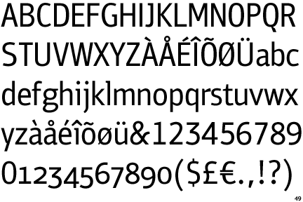
The text sort of looks like a slightly rounded version of PF Bulletin Sans.

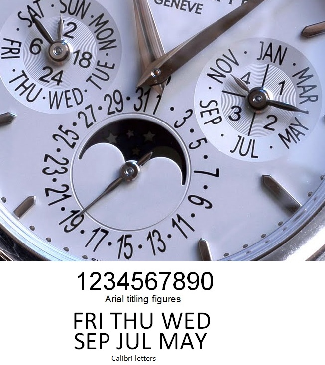
The result just looks cheap and nasty:

hat tip to patekwatch.blogspot.com for the base image
In keeping with the theme of typographical incompetence, Calibri, or some closely-related version of it, was used for the letters. The “R” is unmistakably of the default-Microsoft ilk. The only one that isn't a match is the vertically-stretched “J” with an extra stroke on the top — likely added to make it superficially resemble the good dials.
If anyone can be bothered to identify it differently, I’d be grateful. My guess is that they just used plain ol' Calibri, applied the same clumsy distortions they inflicted on the numbers, and wrapped up by tacking that little tail on the “J”.
The text sort of looks like a slightly rounded version of PF Bulletin Sans.
Last edited:
tifosi
Tire Kicker
- Joined
- Mar 22, 2013
- Messages
- 10,192
- Reaction score
- 2,404
I guess if it didn't it would have been called a "Fixed o Graph" huh?
The bezel with numbers rotates.
Yes, the bezel rotates.
I guess if it didn't it would have been called a "Fixed o Graph" huh?
mimo
Pernicious Enabler
- Joined
- Aug 16, 2012
- Messages
- 7,725
- Reaction score
- 5,256
^^ Rust. The perfect complement to a blue jacket. Which is the most useful jacket. Stitchy your ToG pics are awesome - love that blue "Sun-Ray" dial.thanks, keith. they are all taken with the macro, i just paned out for the non uber close ups.
i do love it!
actually id say you need two. chocolate brown and a lighter brighter shade.
@Keith T @billsmith I would have said Nomos Orion as first thought too, without reading the brief (auto) properly. But I think this is a good shout on the Tag: when I think of Nomos, I'm projecting a bit of my TWAT-reading, over 40, suit-wearing, oddly German-fixated taste on the matter, as we all do in our own way. But this is for a young dude, who may or may not give a **** that Nomos has a distinctive Bauhaus-inspired design ethic and technically in house (though derivative) movements. I suspect...not. But as a young dude, he is more likely to know that Tag Heuer is a "thing", he will probably like the sportier look which, while suit-worthy, is versatile for casual use, and I suspect he might also prefer a bracelet - not an option for Nomos. I say this on the spurious basis that my kids think straps look "old". So, I think you might be onto something.
- Joined
- Oct 10, 2010
- Messages
- 66,397
- Reaction score
- 33,106
thanks, buddy!
thanks, mimo. the sun ray gets me every time.
---
indeed the bezel turns. notice that bkotsko has the triangle by the 12 and mine is by the 9. i used to keep it at the 12 cuz im ocd like that, but ive decided to go nuts and move it to the 9 as its default position.
CRAZY RITE?!
I've always liked the blue and red mix, great looking watch.
thanks, buddy!
Stitchy your ToG pics are awesome - love that blue "Sun-Ray" dial.
thanks, mimo. the sun ray gets me every time.
---
indeed the bezel turns. notice that bkotsko has the triangle by the 12 and mine is by the 9. i used to keep it at the 12 cuz im ocd like that, but ive decided to go nuts and move it to the 9 as its default position.
CRAZY RITE?!
Last edited:
bkotsko
Distinguished Member
- Joined
- Sep 26, 2013
- Messages
- 2,794
- Reaction score
- 1,992
I wouldn't want to run into you in a dark alley...thanks, buddy!
---
indeed the bezel turns. notice that bkotsko has the triangle by the 12 and mine is by the 9. i used to keep it at the 12 cuz im ocd like that, but ive decided to go nuts and move it to the 9 as its default position.
CRAZY RITE?!
Way to crazy for me!
Belligero
Distinguished Member
- Joined
- Aug 30, 2010
- Messages
- 2,423
- Reaction score
- 2,595
Thanks! That looks like a closer match — the "M" in particular. The 5140 dial lacks the indent at the base of the tail on the "R", but that, along with the rounded corners, could simply be due to what appears to be sloppy printing.

The more I look at that dial, the worse it gets. The spacing, alignment and angles are a total mess. It's painfully obvious on the numbers, but the letters are mangled, too; check out "NOV", "MAR" and "WED" especially. You can really see how extreme the vertical distortion is on the date subdial when you compare its "3" the nearby leap year indicator "3". This shouldn't be obscure knowledge to whoever did it; avoiding that is one of the first things you learn in even the most basic material on the subject.
The irony here is that the earlier dial could serve as a textbook example of the craft applied with great sensitivity and skill, whereas the new one shows, for so many reasons, what not to do.
The text sort of looks like a slightly rounded version of PF Bulletin Sans.

Thanks! That looks like a closer match — the "M" in particular. The 5140 dial lacks the indent at the base of the tail on the "R", but that, along with the rounded corners, could simply be due to what appears to be sloppy printing.
The more I look at that dial, the worse it gets. The spacing, alignment and angles are a total mess. It's painfully obvious on the numbers, but the letters are mangled, too; check out "NOV", "MAR" and "WED" especially. You can really see how extreme the vertical distortion is on the date subdial when you compare its "3" the nearby leap year indicator "3". This shouldn't be obscure knowledge to whoever did it; avoiding that is one of the first things you learn in even the most basic material on the subject.
The irony here is that the earlier dial could serve as a textbook example of the craft applied with great sensitivity and skill, whereas the new one shows, for so many reasons, what not to do.
Last edited:
- Joined
- Oct 10, 2010
- Messages
- 66,397
- Reaction score
- 33,106
Anyone else getting the vibe that Belli wants a 5140 really badly?


Classic Menswear Featured products
-
Carmina - Norwegian Derby Shoes Introducing the classy six eyelet split toe derby in a burgundy Shell Cordovan from Horween Chicago. This style features a single oak-bark tanned sole from Rendembach Jr. and full calf lining color brown.
-
 LuxeSwap Auction - Vintage Antique United States Naval Navy Denim Deck Jacket A piece for denim heads, vintage collectors, streetwear enthusiasts and menswear enthusiasts alike, this extremely rare early US Naval issued deck jacket in raw denim is not likely to ever show up at auction again anytime soon. A Haleys Comet of menswear items, offered at auction at a $9.99 starting bid with no reserve.
 -
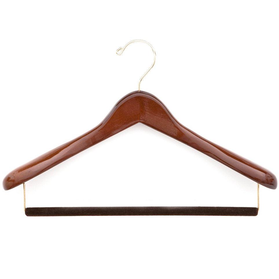
 Kirby Allison - Luxury Suit Hanger - $32 Kirby Allison's Luxury Wooden Suit Hangers protect your suits from stretched collars and droopy shoulders. Our wooden suit hangers provide five-times more support than average hangers and will protect and extend the life of your most important garments.
- Status
- Not open for further replies.
Latest posts
- Replies
- 118,342
- Views
- 4,761,168
- Replies
- 52,106
- Views
- 6,593,417
- Replies
- 0
- Views
- 17
- Sticky
- Replies
- 1,733
- Views
- 244,036
- Replies
- 39,849
- Views
- 5,879,559
Similar threads
- Replies
- 130
- Views
- 126,680
- Replies
- 127
- Views
- 59,821
- Replies
- 1
- Views
- 3,801
Featured Sponsor
Forum Sponsors
- American Trench
- AMIDÉ HADELIN
- Archibald London
- The Armoury
- Arterton
- Besnard
- Canoe Club
- Capra Leather
- Carmina
- Cavour
- Crush Store
- De Bonne Facture
- Drinkwater's Cambridge
- Drop93
- eHABERDASHER
- Enzo Custom
- Epaulet
- Exquisite Trimmings
- Fils Unique
- Gentlemen's Footwear
- Giin
- Grant Stone
- House of Huntington
- IsuiT
- John Elliott
- Jonathan Abel
- Kent Wang
- Kirby Allison
- Larimars Clothing
- Lazy Sun
- LuxeSwap
- Luxire Custom Clothing
- Nicks Boots
- No Man Walks Alone
- Once a Day
- Passus shoes
- Proper Cloth
- SARTORIALE
- SEH Kelly
- Self Edge
- Shop the Finest
- Skoaktiebolaget
- Spier and MacKay
- Standard and Strange
- Bespoke Shoemaker Szuba
- Taylor Stitch
- TLB Mallorca
- UNI/FORM LA
- Vanda Fine Clothing
- Von Amper
- Wrong Weather
- Yeossal
- Zam Barrett
Members online
- ppk
- FightingGator
- Bamaboots
- donkeyhoatie
- jalh97
- a_lost_function
- Beav
- hendrix
- KevM
- tomsocal
- Chunsak
- Ambulance Chaser
- JayDee90
- upr_crust
- abracadabra
- admin
- ramdomthought
- ilikethelights
- Hombre Secreto
- iluvatar
- bicycleradical
- FT412
- Encore
- nbymidwest
- krandles124
- wolfdale
- Camerashy
- classicthrifter
- wdahab
- Tim619
- yungr1
- pcgsayers
- jbarwick
- Brantley11
- TinyEli
- sethrobert
- wilcthree
- ModWar
- SteveL91
- panchley
- PGS
- kurdo
- harveyrabbit
- Dan Dynamic
- Duke Silver
- howardeb
- Mute
- wklq76a
- thehaag
- johnyy123
Total: 2,350 (members: 122, guests: 2,228)