- Joined
- Apr 10, 2011
- Messages
- 27,320
- Reaction score
- 69,987
Nice belly. IMO, this is a good example of how a subtle belly can give lapels a soft, organic feel.
Coat by Logsdail.
(cc'ing @Sander)
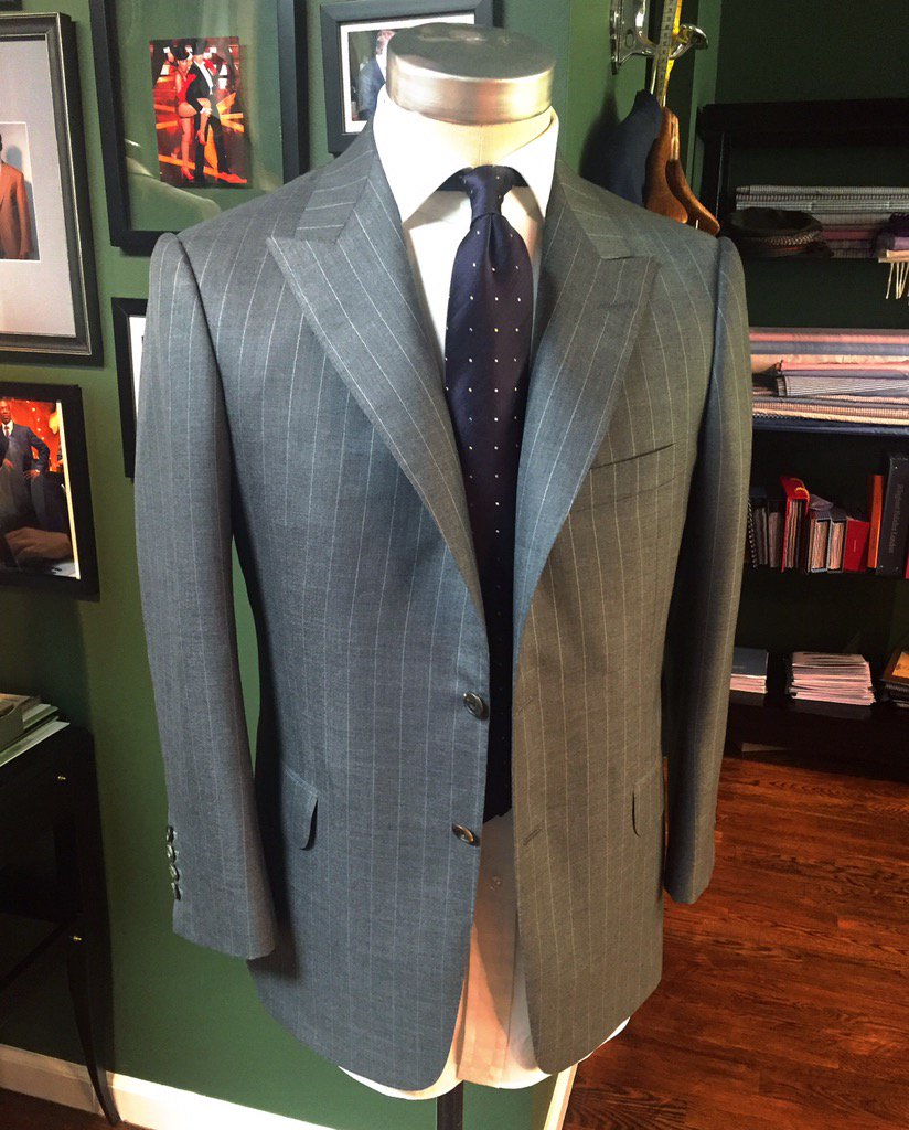
Coat by Logsdail.
(cc'ing @Sander)
Last edited: