officine
Senior Member
- Joined
- Apr 7, 2012
- Messages
- 649
- Reaction score
- 926
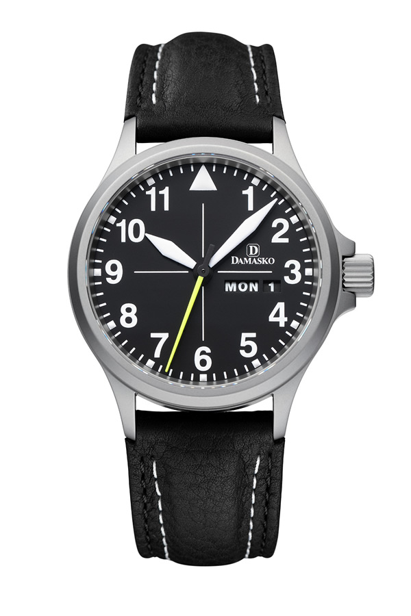
I see.To be specific I don't like cut-off numbers at all, but do not mind, in most cases, fully omitted numbers. That Lange is super.
The Omega is beautiful too, I used to have a similar one, but the cut 5 and 7 "bother" me a bit. The leaf hands are so elegant though I could almost overlook the cut numbers.
Are you against date windows as well?