usctrojans31
Distinguished Member
- Joined
- Dec 12, 2009
- Messages
- 2,239
- Reaction score
- 1,366
Good response. As you know, there are really four tenants of good web design: discoverability, findability, UX and UI. The old Yoox site honestly lacked everything but discoverability. The new one gains in UX and findability. There is no visual storytelling, and it's become even more cluttered.
There are always users, typically hardcore users, who complain about the changes in the redesign of any site. It's pretty much inevitable. And it's typically guys like us, who have used the site often, and for a long time, who are the greatest detractors.
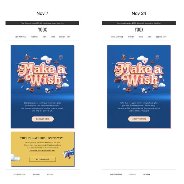
The old Yoox site was usuable, but that it took a lot of to figure out where everything was, and how everything worked, and to figure out work-arounds to the idiosyncracies in the categorization system and search. The pictures also had real issues. On some browsers, they would zoom but you could inexplicably lose the ability to scroll, which made the blown up images useless. It was also cluttered, and the flow to "submit purchase" was not always very fast.
The redesigned site is a lot easier to use in that way.
As for the large amount of negative space and the minimalistic style, that is just the trend today, as opposed to the more information laden pages of the noughties.
I'm not sure that there is that much changed in the backend of the system, though we'd have to ask one of their backend engineers to find out for sure, Most of the changes seem to be in the front end and in the UX.
Good response. As you know, there are really four tenants of good web design: discoverability, findability, UX and UI. The old Yoox site honestly lacked everything but discoverability. The new one gains in UX and findability. There is no visual storytelling, and it's become even more cluttered.