• Hi, I am the owner and main administrator of Styleforum. If you find the forum useful and fun, please help support it by buying through the posted links on the forum. Our main, very popular sales thread, where the latest and best sales are listed, are posted HERE

    Purchases made through some of our links earns a commission for the forum and allows us to do the work of maintaining and improving it. Finally, thanks for being a part of this community. We realize that there are many choices today on the internet, and we have all of you to thank for making Styleforum the foremost destination for discussions of menswear.
  • This site contains affiliate links for which Styleforum may be compensated.
  • STYLE. COMMUNITY. GREAT CLOTHING.

    Bored of counting likes on social networks? At Styleforum, you’ll find rousing discussions that go beyond strings of emojis.

    Click Here to join Styleforum's thousands of style enthusiasts today!

    Styleforum is supported in part by commission earning affiliate links sitewide. Please support us by using them. You may learn more here.

Site Topics - Part II

HORNS

Stylish Dinosaur
Joined
Apr 24, 2008
Messages
18,425
Reaction score
9,085
Originally Posted by GoldenTribe
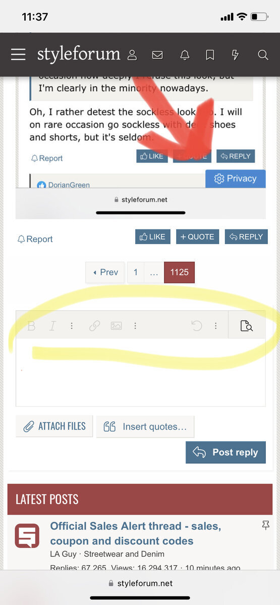
For starters, there's tons of unnecessary padding, especially in the sidebar keeping the advertisers from accidentally brushing against one another's typographical unmentionables.

There's almost 100 pixels of empty space hardcoded into any given horizontal thread cross-section:

XV6LF.jpg


I never thought I'd see the Forvm get Foofed.
 

otc

Stylish Dinosaur
Joined
Aug 15, 2008
Messages
24,560
Reaction score
19,220
I want to throw it out there that the side bar was ok at work (except for what were obvious glitches). Now that I am browsing on my netbook (10" ...works fine with every site I use), it is terrible. Here are a few examples. On my User CP page, it forces it all to fit which means that thread titles are condensed to 3-4 lines which makes them hard to read and needs an ass ton of scrolling on a thread page or a reply page, it enables side scrolling...this is partially a glitch I think because I have a lot of space to the left of my post box...but not enough to fit the side bar. Modern websites should really never force the user to scroll sideways (except for full size images that wouldn't otherwise fit). I've got 1024 pixels across... that should be enough to fit the content that we come here for. edit: as someone who posts a lot from work, I like that there are no massive indicators of what I am looking at (it is a very on and off job so it is totally OK that I am browsing SF...I would just rather not make it obvious from a distance what I am looing at). The SF logo and affiliates won't show up once you scroll down on the old page (and I have used a plugin to hide the large SF logo entirely)...but the sidebar will presumably always be there. edit: what is this, 1997?
Screenshot.png
 

in stitches

Stylish Dinosaur
Spamminator Moderator
Moderator
Supporting Member
Joined
Oct 10, 2010
Messages
66,397
Reaction score
33,106
Originally Posted by LA Guy
Like Jeremy said, the side bar will actually be used for other things as well. The sidebar there right now is a simplified version - mainly because VB can't support everything we are going to have there.

For example, the sidebar, in the new B&S system, will list all of the same seller's items (like an Ebay store, but right there on the page). On the front page, the sidebar, for logged in users, will see their messages.

People in the sandbox system can see this. In stitches, I will send you the test site info, so you can see what there is there. You can log in as yourself once you are there. Please take a look.


bounce2.gif


hope its ok for me to say this, but since you told me to have a look thats exactly what i did.

i am very happy to report that in the new layout the sidebar issue is hardly worth worrying about. its a diferent look thats for sure but not intrusive the way it is now. i dont know quite how to explain it but the way its set up its just not a bother.

there is some dead space on the right side on some pages but it doesnt distort everything the way its doing now. and everything is in screen view no scrolling to the right to see things. looks really cool too. much sleeker and more current looking with very nifty (yes i said nifty) features.

bravo guys, bravo!
 

rnoldh

Stylish Dinosaur
Joined
Jul 24, 2006
Messages
16,976
Reaction score
3,135
Originally Posted by in stitches
bounce2.gif


hope its ok for me to say this, but since you told me to have a look thats exactly what i did.

i am very happy to report that in the new layout the sidebar issue is hardly worth worrying about. its a diferent look thats for sure but not intrusive the way it is now. i dont know quite how to explain it but the way its set up its just not a bother.

there is some dead space on the right side on some pages but it doesnt distort everything the way its doing now. and everything is in screen view no scrolling to the right to see things. looks really cool too. much sleeker and more current looking with very nifty (yes i said nifty) features.

bravo guys, bravo!


I sure hope so.

Originally Posted by otc
I want to throw it out there that the side bar was ok at work (except for what were obvious glitches).

Now that I am browsing on my netbook (10" ...works fine with every site I use), it is terrible. Here are a few examples.

On my User CP page, it forces it all to fit which means that thread titles are condensed to 3-4 lines which makes them hard to read and needs an ass ton of scrolling
on a thread page or a reply page, it enables side scrolling...this is partially a glitch I think because I have a lot of space to the left of my post box...but not enough to fit the side bar. Modern websites should really never force the user to scroll sideways (except for full size images that wouldn't otherwise fit).
I've got 1024 pixels across... that should be enough to fit the content that we come here for.

edit: as someone who posts a lot from work, I like that there are no massive indicators of what I am looking at (it is a very on and off job so it is totally OK that I am browsing SF...I would just rather not make it obvious from a distance what I am looing at). The SF logo and affiliates won't show up once you scroll down on the old page (and I have used a plugin to hide the large SF logo entirely)...but the sidebar will presumably always be there.

edit: what is this, 1997?
Screenshot.png


I am not a computer jock and this page layout ( as above ) is terrible ( at least to me ).
 

CDFS

Distinguished Member
Joined
Nov 12, 2008
Messages
4,762
Reaction score
192
Even though I know parts of the implementation of the sidebar will be changed just some thoughts.

On my Desire HD the banners take about 25% of a very tiny screen which is just enough to make this 34 year old squint.

On my 16:9 laptop screen using firefox the right side of the group of banners isn't visible unless side scrolling. This is no great miss to me. I see Explorer and Chrome condense the page in the content part, which would be worse. Edit: Apparently how it works varies from thread to thread on the laptop.

I know there are bills to be paid so implementing the banner part of the sidebar is probably a foregone conclusion. And it doesn't seem like you've sold your souls just yet. But perhaps the sidebar could be made half the width of the current version. If you'd wanted it to stand out more you could always change the sequence of banners randomly so every page gives a fresh view. The current implementation will probably get me used to narrowing my view and squinting my eyes. And do we really want more narrow minded, squinty eyed people on SF? (no racist)
 

edinatlanta

Stylish Dinosaur
Joined
Nov 17, 2008
Messages
43,045
Reaction score
17,390
I have no doubt that the mods will have an exceptional and perfect site up in no time and that all will be pleased.

Originally Posted by Artisan Fan
Way too much in ads. Looks horrible. Uncomfortable to read threads now.
frown.gif


So this means you'll be posting less?
 

MikeDT

Distinguished Member
Joined
Jun 24, 2010
Messages
4,272
Reaction score
282
Originally Posted by Teger
fok test info pls
I did post a few screenshots from my laptop and phone into the sticky on MC. SF is looking rather messed-up today. Look forward to seeing the finished product tomorrow.
 

Ataturk

Stylish Dinosaur
Joined
Apr 18, 2008
Messages
14,843
Reaction score
2,935
I often browse in a 1920-pixel-wide screen split in half. The sidebar completely ruins it for me.
 

javyn

Stylish Dinosaur
Joined
Mar 15, 2006
Messages
25,526
Reaction score
14,863
I guess I'm late to the party coming here to ***** about the sidebar.
smile.gif


Just kidding, I don't care, this forum has wordwrap so what's the big deal.
 

dfagdfsh

Professional Style Farmer
Joined
Mar 14, 2008
Messages
22,649
Reaction score
7,932
yea on the new layout it's not a big deal. kind of nice on the front page cause it shows you your pm box.
 

in stitches

Stylish Dinosaur
Spamminator Moderator
Moderator
Supporting Member
Joined
Oct 10, 2010
Messages
66,397
Reaction score
33,106
Originally Posted by CDFS
Even though I know parts of the implementation of the sidebar will be changed just some thoughts.

On my Desire HD the banners take about 25% of a very tiny screen which is just enough to make this 34 year old squint.

On my 16:9 laptop screen using firefox the right side of the group of banners isn't visible unless side scrolling. This is no great miss to me. I see Explorer and Chrome condense the page in the content part, which would be worse. Edit: Apparently how it works varies from thread to thread on the laptop.

I know there are bills to be paid so implementing the banner part of the sidebar is probably a foregone conclusion. And it doesn't seem like you've sold your souls just yet. But perhaps the sidebar could be made half the width of the current version. If you'd wanted it to stand out more you could always change the sequence of banners randomly so every page gives a fresh view. The current implementation will probably get me used to narrowing my view and squinting my eyes. And do we really want more narrow minded, squinty eyed people on SF? (no racist)


when you see the new system youll see its nothing like the way it is now. its a clean look not all crazy like it is now. the sidebar doesnt eat up as much space.
 

Featured Sponsor

How important is full vs half canvas to you for heavier sport jackets?

  • Definitely full canvas only

    Votes: 102 36.6%
  • Half canvas is fine

    Votes: 100 35.8%
  • Really don't care

    Votes: 36 12.9%
  • Depends on fabric

    Votes: 46 16.5%
  • Depends on price

    Votes: 41 14.7%

Forum statistics

Threads
508,066
Messages
10,599,295
Members
224,532
Latest member
AnaroWright
Top