• Hi, I am the owner and main administrator of Styleforum. If you find the forum useful and fun, please help support it by buying through the posted links on the forum. Our main, very popular sales thread, where the latest and best sales are listed, are posted HERE

    Purchases made through some of our links earns a commission for the forum and allows us to do the work of maintaining and improving it. Finally, thanks for being a part of this community. We realize that there are many choices today on the internet, and we have all of you to thank for making Styleforum the foremost destination for discussions of menswear.
  • This site contains affiliate links for which Styleforum may be compensated.
  • STYLE. COMMUNITY. GREAT CLOTHING.

    Bored of counting likes on social networks? At Styleforum, you’ll find rousing discussions that go beyond strings of emojis.

    Click Here to join Styleforum's thousands of style enthusiasts today!

    Styleforum is supported in part by commission earning affiliate links sitewide. Please support us by using them. You may learn more here.

best/worst corporate logos

Reggs

Distinguished Member
Joined
Mar 11, 2006
Messages
6,219
Reaction score
698
There was a makeup logo I saw months ago that I loved.

Imagine a skull and cross bones, with the bones being displayed below the skull, only instead of a skull there was a lipstick kiss impression, and for the bones, syringes.

The last time I was at the mall I went to the same counter with my phone to take a picture, but it was no longer there. Would anyone know the brand name of this makeup?
 

lefty

Stylish Dinosaur
Joined
Oct 27, 2006
Messages
10,776
Reaction score
4,597
Haven't read the entire thread so this may be covered but about ten years ago a group of graphic designers sat down to determine the world's most recognizable logo. Their consensus?

Bibendum, the Michelin Man.

lefty
 

Brian SD

Moderator
Joined
Feb 5, 2004
Messages
9,492
Reaction score
128
Originally Posted by lefty
Haven't read the entire thread so this may be covered but about ten years ago a group of graphic designers sat down to determine the world's most recognizable logo. Their consensus?

Bibendum, the Michelin Man.

lefty


Interesting. I might have picked AT&T (the old one).
 

Tokyo Slim

In Time Out
Timed Out
Joined
Apr 28, 2004
Messages
18,360
Reaction score
16
I thought that the worlds most recognizable logo was either the Coca-Cola dynamic ribbon text, or the Disney "Mickey Mouse Head" depending on your definition of brand and product...

coca-cola-logo-bubbles-4004396.jpg

happiestearslogo_pin.jpg


The michelin man might be very recognizable, but I doubt that it means a whole lot to people in third world countries who don't have cars or watch television.
 

designprofessor

Distinguished Member
Joined
Apr 14, 2006
Messages
2,412
Reaction score
8
Well in my opinion here is an example of "older is better".
My dad used to bring this stuff home, and I've always liked the St Pauli Girl label /logo. At a store recently, I stopped to examine the new logo and I just think it fell flat. I'm sure there was plenty of marketing pressure to stay current -but, I still like the older version. I'm all for a big busted fraulein serving beer, this seems to be time tested symbolism -but in its current form, I miss the old St. Pauli girl. German beer labels in general have some of the best graphic design and illustration.
 

Tokyo Slim

In Time Out
Timed Out
Joined
Apr 28, 2004
Messages
18,360
Reaction score
16
D-TRA03-15.jpg
 

sonick

Distinguished Member
Joined
Mar 11, 2003
Messages
5,686
Reaction score
406
Chalk this one up as one of the worst:

brand2webcopy.jpg


The newly launched logo for my University... Way to jump on the Web2.0 bandwagon; its got the drop shadow, all that's missing is the reflection and gradient. The first year interactive arts/design students could've done this.

"I first used pen and paper and then the computer," says
Rimmer, who graciously donated his talents and the lion's share of his time on the project. "I began with a typeface developed 50 years ago called Optima, but I completely changed it in every possible way except that the original flavour is still there. The proportions, the width of the letters to their height are different; things like the placement of the cross stroke in the F are different; even the shape of the F "” the top and the bottom "” is different."
 

Aaron

Distinguished Member
Joined
Oct 31, 2004
Messages
1,131
Reaction score
2
Originally Posted by sonick
Chalk this one up as one of the worst:

brand2webcopy.jpg


The newly launched logo for my University... Way to jump on the Web2.0 bandwagon; its got the drop shadow, all that's missing is the reflection and gradient. The first year interactive arts/design students could've done this.

lol...sorry sonick, my sister goes there too. That's the first time I've seen that logo. Great, now I have another way to make fun of her.
 

LabelKing

Stylish Dinosaur
Joined
May 24, 2002
Messages
25,421
Reaction score
268
Originally Posted by sonick
Chalk this one up as one of the worst:

brand2webcopy.jpg


The newly launched logo for my University... Way to jump on the Web2.0 bandwagon; its got the drop shadow, all that's missing is the reflection and gradient. The first year interactive arts/design students could've done this.

He makes it sound very difficult.
 

sonick

Distinguished Member
Joined
Mar 11, 2003
Messages
5,686
Reaction score
406
Originally Posted by LabelKing
He makes it sound very difficult.
What REALLY happened when he was designing the typeface:
n506427193_19821_9923.jpg
 

muelleran

Senior Member
Joined
Apr 24, 2006
Messages
237
Reaction score
0
Originally Posted by designprofessor
German beer labels in general have some of the best graphic design and illustration.

I like this better, imho.

boelkstoff.jpg


180px-Bolkstoff.jpg


The St. Pauli Girl Label shows a women in an alpine or Bavarian dress, yet St. Pauli is in Hamburg.
Only the Bavarians actually wear this sometimes. Only they can pull this off, these morons. Just look at their politicians:

HBGQAbPaWnc_Pxgen_r_210xA.jpg

Tradition? This kind of dress was invented in the late 19 century anyway.

I guess the beer might be from Germany but the brand?
 

Earthmover

Senior Member
Joined
Feb 10, 2005
Messages
554
Reaction score
0
I agree and to add to the pain, the new faces they are putting forward are not at all appealing either.

Originally Posted by sonick
Chalk this one up as one of the worst:

brand2webcopy.jpg
 

Lucky Strike

Distinguished Member
Joined
Mar 13, 2006
Messages
3,408
Reaction score
31
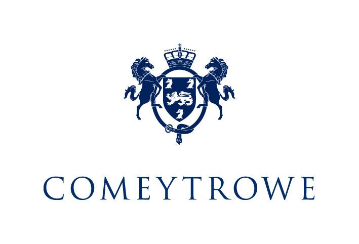
I like the graphics, but if you nitpick about the heraldry, the royal crown may be a bit much, unless there's some sort of royal connection, of course.
 

Featured Sponsor

How important is full vs half canvas to you for heavier sport jackets?

  • Definitely full canvas only

    Votes: 93 37.5%
  • Half canvas is fine

    Votes: 90 36.3%
  • Really don't care

    Votes: 27 10.9%
  • Depends on fabric

    Votes: 42 16.9%
  • Depends on price

    Votes: 38 15.3%

Forum statistics

Threads
507,008
Messages
10,593,520
Members
224,355
Latest member
ESF
Top