TAFJIR
Senior Member
- Joined
- Jul 30, 2014
- Messages
- 160
- Reaction score
- 92
STYLE. COMMUNITY. GREAT CLOTHING.
Bored of counting likes on social networks? At Styleforum, you’ll find rousing discussions that go beyond strings of emojis.
Click Here to join Styleforum's thousands of style enthusiasts today!
Styleforum is supported in part by commission earning affiliate links sitewide. Please support us by using them. You may learn more here.
Top half is daytime, with noon, when the sun is theoretically directly overhead, at the top of the dial. Conceptually, it kinda makes sense, even if it's not the conventional arrangement. It might've worked better if they'd done a light to dark gradient in the 24 hr portion of the dial.This is such an odd watch. 42 mm too big IMO. But I think the 24 should be on top? Like it’s showing 1:08 pm with main hand and 4:08 a.m. with other hand. Why did they put the 12 on top? My brain is offended.
View attachment 1927585
Any cool new Heuers? (Asking for a friend…)
The internet peanut gallery has been pretty savage on the IWC Ingy. Not on its merits, but its price: "Nice watch, but should have been priced at $8K." Point taken, but if IWC sees the watch as a competitor to the Laureato, Octo Finissimo, and Alpine Eagle, it can't price the watch too low.
Certain watches deserve a larger size. If you’re going to jam that many numerals on a dial, then the extra size makes sense, even if the watch itself doesn’t.This is such an odd watch. 42 mm too big IMO. But I think the 24 should be on top? Like it’s showing 1:08 pm with main hand and 4:08 a.m. with other hand. Why did they put the 12 on top? My brain is offended.
View attachment 1927585
W.T.F?
View attachment 1927533
I think yellow and black is nature’s way of saying “stay away…I’m poisonous…”?
(I love/own Omega, but I do t make the rules!)How an Omega owner sees their watch:
View attachment 1927701
How everyone else sees the same watch:
View attachment 1927703
Certain watches deserve a larger size. If you’re going to jam that many numerals on a dial, then the extra size makes sense, even if the watch itself doesn’t.
Raisin for current air king?
That is the reason everybody loves that watch, myself included. Otherwise it's just a fat OP.Possible. That seconds hand is an eyesore. Beside that not the worst looking Rolex.
 LuxeSwap Auction - Vintage Antique United States Naval Navy Denim Deck Jacket A piece for denim heads, vintage collectors, streetwear enthusiasts and menswear enthusiasts alike, this extremely rare early US Naval issued deck jacket in raw denim is not likely to ever show up at auction again anytime soon. A Haleys Comet of menswear items, offered at auction at a $9.99 starting bid with no reserve.
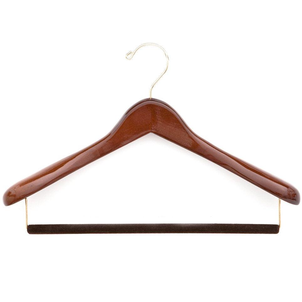
  Kirby Allison - Luxury Suit Hanger - $32 Kirby Allison's Luxury Wooden Suit Hangers protect your suits from stretched collars and droopy shoulders. Our wooden suit hangers provide five-times more support than average hangers and will protect and extend the life of your most important garments.