- Joined
- Oct 11, 2009
- Messages
- 43,896
- Reaction score
- 73,340
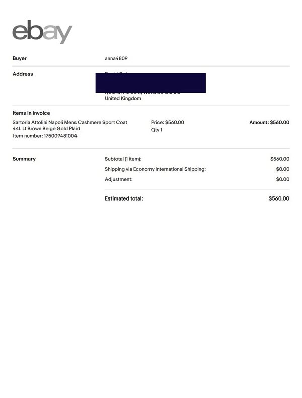
Those things are like 8-10 lbs. Are you sure?sure 'twas. that ****** was heavy.... got cold out there...