- Joined
- Sep 27, 2007
- Messages
- 6,441
- Reaction score
- 324
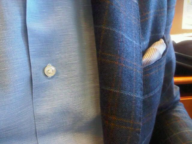
Dormeuil Scottie DerbyOriginally Posted by gdl203
This is the only Dormeuil book I like - some great fabrics in there.
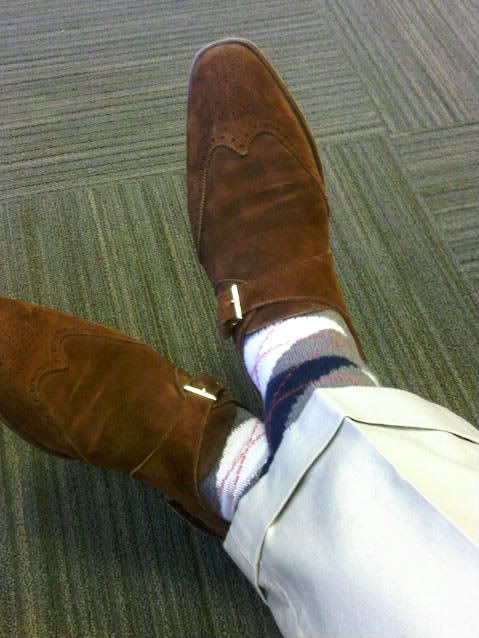
I'm guessing that coat is from NSM?
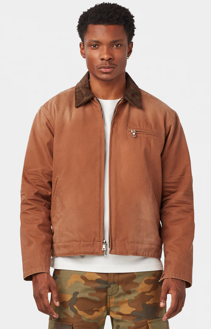
UNIFORM LA CHILLICOTHE WORK JACKET Drop, going on right now.
Uniform LA's Chillicothe Work Jacket is an elevated take on the classic Detroit Work Jacket. Made of ultra-premium 14-ounce Japanese canvas, it has been meticulously washed and hand distressed to replicate vintage workwear that’s been worn for years, and available in three colors.
This just dropped today. If you missed out on the preorder, there are some sizes left, but they won't be around for long. Check out the remaining stock here
Good luck!.
STYLE. COMMUNITY. GREAT CLOTHING.
Bored of counting likes on social networks? At Styleforum, you’ll find rousing discussions that go beyond strings of emojis.
Click Here to join Styleforum's thousands of style enthusiasts today!
Styleforum is supported in part by commission earning affiliate links sitewide. Please support us by using them. You may learn more here.
 LuxeSwap Auction - Vintage Antique United States Naval Navy Denim Deck Jacket A piece for denim heads, vintage collectors, streetwear enthusiasts and menswear enthusiasts alike, this extremely rare early US Naval issued deck jacket in raw denim is not likely to ever show up at auction again anytime soon. A Haleys Comet of menswear items, offered at auction at a $9.99 starting bid with no reserve.
  Kirby Allison - Luxury Suit Hanger - $32 Kirby Allison's Luxury Wooden Suit Hangers protect your suits from stretched collars and droopy shoulders. Our wooden suit hangers provide five-times more support than average hangers and will protect and extend the life of your most important garments.