• Hi, I am the owner and main administrator of Styleforum. If you find the forum useful and fun, please help support it by buying through the posted links on the forum. Our main, very popular sales thread, where the latest and best sales are listed, are posted HERE

    Purchases made through some of our links earns a commission for the forum and allows us to do the work of maintaining and improving it. Finally, thanks for being a part of this community. We realize that there are many choices today on the internet, and we have all of you to thank for making Styleforum the foremost destination for discussions of menswear.
  • This site contains affiliate links for which Styleforum may be compensated.
  • STYLE. COMMUNITY. GREAT CLOTHING.

    Bored of counting likes on social networks? At Styleforum, you’ll find rousing discussions that go beyond strings of emojis.

    Click Here to join Styleforum's thousands of style enthusiasts today!

    Styleforum is supported in part by commission earning affiliate links sitewide. Please support us by using them. You may learn more here.

We are back!

j

(stands for Jerk)
Admin
Spamminator Moderator
Joined
Feb 17, 2002
Messages
14,663
Reaction score
105
Originally Posted by E. Tage Larsen
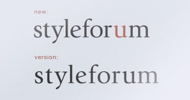
the red u is unnecessary and a bit gauche but the rest of it is quiet and fine. In general you could open up the spacing on the logo a bit and it would flow better but the type is lively. Is there a reason that there are different blues? "Welcom, x" box on the upper right being a lighter value than the border, etc.

In all, nice to see the old boy back up and running in such fine form.

edit: it's useless to kern in photoshop at 72ppi but here's an example

styleforum2.jpg

Thanks for the input on the font - I put the one we are using together in literally about 45 seconds including spacing, so there will definitely be refinements if not a serious revamp. We'll see.
 

mussel

Senior Member
Joined
Sep 29, 2004
Messages
882
Reaction score
2
Originally Posted by j
Considering we have no way of knowing who was real and who was pretending to be certain members in the chat, we really can't do much to anyone.

You mean there's once-in-a-life-time-live-or-die-no-consequence-all-out flame war? And I missed that? Anyone saved the chat log? It's going to be priceless.
 

Nick M

Distinguished Member
Joined
Sep 10, 2002
Messages
1,482
Reaction score
1
Originally Posted by mussel
You mean there's once-in-a-life-time-live-or-die-no-consequence-all-out flame war? And I missed that? Anyone saved the chat log? It's going to be priceless.

Originally Posted by von Rothbart
So who are going to get banned for participating in the flame fest in the chatroom?
devil.gif


Originally Posted by LA Guy
Asylum for all!

Originally Posted by von Rothbart
Disappointed. I thought blood's going to flow.

Originally Posted by j
Considering we have no way of knowing who was real and who was pretending to be certain members in the chat, we really can't do much to anyone.

Clearly those of us not using the chat are missing out on something special.

Clearly I am enjoying the wonders of multi-quote!
 

Teacher

Stylish Dinosaur
Joined
Apr 2, 2005
Messages
12,135
Reaction score
407
I really like it! In fact, robin's egg blue as the border/background would be even classier, though I don't expect such a change. The new logo is fine, if a bit unexciting (sorry BrianSD)...but I do like the red U.
 

nioh

Senior Member
Joined
Nov 3, 2006
Messages
698
Reaction score
2
Good job guys! The site is now way easier on the eyes
smile.gif
Regarding the u I do think it's a very nice touch to make it less a generic text logo. It stands out way more, like any respectable business would try to achieve - which is all good!
icon_gu_b_slayer[1].gif
 

Holdfast

Stylish Dinosaur
Joined
Mar 10, 2006
Messages
10,559
Reaction score
6,354
Pretty fast server move.

I like the new background and logo. Personally, I'd prefer a bit less empty space either side of the actual content, but I suspect I'll adjust!

(does using a widescreen monitor have an effect on this or does the formatting automatically compensate for this?)

Regardless, congratulations on such a swift and apparently pain-free move!
 

etl

Senior Member
Joined
Mar 23, 2006
Messages
243
Reaction score
4
a bright red button will also make your gray suit stand out from across the room, but it doesn't make it a better suit.
 

gdl203

Purveyor of the Secret Sauce
Affiliate Vendor
Dubiously Honored
Supporting Member
Joined
Jun 9, 2005
Messages
45,631
Reaction score
54,492
Originally Posted by E. Tage Larsen
a bright red button will also make your gray suit stand out from across the room, but it doesn't make it a better suit.

No but a bold tie or pocket square could make it a less boring outfit
icon_gu_b_slayer[1].gif
 

johnapril

Distinguished Member
Joined
Sep 28, 2004
Messages
5,600
Reaction score
11
If it's a debate over format vs content, I'll take content.
 

william

Distinguished Member
Joined
Aug 12, 2006
Messages
1,548
Reaction score
4
One thing....my email notifiers (for thread subscriptions) aren't working correctly. They keep trying to take me to the old site.

Will this be fixed soon? Or has this been explained already?
 

Dakota rube

Stylish Dinosaur
Joined
Jan 14, 2005
Messages
13,306
Reaction score
237
I feel sort of... left out. I didn't even know SF was gone.

I like the new look guys. And the red U makes me think you all are thinking of me.
blush.gif
Kinda Sally Field-ish.
 

Featured Sponsor

How important is full vs half canvas to you for heavier sport jackets?

  • Definitely full canvas only

    Votes: 92 37.6%
  • Half canvas is fine

    Votes: 90 36.7%
  • Really don't care

    Votes: 26 10.6%
  • Depends on fabric

    Votes: 41 16.7%
  • Depends on price

    Votes: 38 15.5%

Forum statistics

Threads
506,937
Messages
10,592,972
Members
224,338
Latest member
Antek
Top