• Hi, I am the owner and main administrator of Styleforum. If you find the forum useful and fun, please help support it by buying through the posted links on the forum. Our main, very popular sales thread, where the latest and best sales are listed, are posted HERE

    Purchases made through some of our links earns a commission for the forum and allows us to do the work of maintaining and improving it. Finally, thanks for being a part of this community. We realize that there are many choices today on the internet, and we have all of you to thank for making Styleforum the foremost destination for discussions of menswear.
  • This site contains affiliate links for which Styleforum may be compensated.
  • STYLE. COMMUNITY. GREAT CLOTHING.

    Bored of counting likes on social networks? At Styleforum, you’ll find rousing discussions that go beyond strings of emojis.

    Click Here to join Styleforum's thousands of style enthusiasts today!

    Styleforum is supported in part by commission earning affiliate links sitewide. Please support us by using them. You may learn more here.

How to balance colors

revenant

Member
Joined
May 24, 2008
Messages
7
Reaction score
1
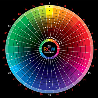
This is my first thread. Hi everyone. Although I am a newbie in terms of style, I am familar with colors. I hope the following may be of use: To discuss how to balance colors is difficult. Because the names we use to define colors is vague and inaccurate. Without going into technical details, there are some general guidelines that can make color selection easy. You will look interesting and unified, regardless of what color you are wearing, if the following happens: 1. Closely related colors dominate over your entire figure. For example: most colors are blues. 2. Keep most colors close in term of lightness and intensity. For example: Light brown shoes with warm gray suit and cream colored shirt. Keep colors close in intensity! This means that if you have a gray suit, you would look very harmonious if your shirt is not in glowing neon. It is also the reason patterned ties/shirts look harmonious if no one or only one color is more intense than all others. 3. Limit contrast to EITHER color or lightness. This means that if you choose a shirt that is significantly lighter in color to your suit, keep the shirt the same color family as your suit. For example, a man wearing dark blue worsted look sharp and harmonious with a light blue shirt. Pair the same suit with a light orange shirt and you have disaster. Another example, if you wish to create contrast in color, as in a brown( which is dark orange) shoe to a blue suit, you would do well to keep the shoe and the suit in similar lightness. So a dark navy would be wonderful with a darker pair of brown shoes, a lighter navy would work better with a lighter brown shoe. A sand colored shoe on the other hand would not work with dark navy. 4. Repetition in color across the entire figure. The reason a brown shoe looks smarter than a black shoe is that the human skin tone is in the same color family as brown. Thus, a brown shoe would echo the color of the man's face and appear harmonious. However if your skin color is exceptionally pale or extremely yellow(due to disease) this example does not apply. 5. When thinking of colors ask yourself whether it is warm or cool. For example, there are some yellows that appear greenish and others that lean towards orange. Think of a lemon compared to a yellow leaf in fall. An orangish yellow would work harmoniously with browns and the greenish yellow would do better with blues. Most of the guidelines above are adapted from Richard G. Ellinger's book Color structure and Design. I have tried to remove all terminology and write in layman's terms. There are others far more qualified than I am to write or discuss the theory of color or clothing, thus if I am wrong, please correct me. I am only a poorly dressed man, trying to repay my debts to the forum for having so recently introduced me to style.
 

ironmarshal

Active Member
Joined
May 28, 2008
Messages
27
Reaction score
0
Regarding the example you cite about brown shoes looking harmonius: I have pale skin, with pink tones. Which shoe color matches best with such a complexion - brown or black? Keeping in mind that I tend to wear lots of navy blue, and grey. Thanks in advance for any help with this matter.
 

goodlife

Senior Member
Joined
May 15, 2008
Messages
202
Reaction score
1
My girlfriend studied color theory, and we have arguements about this all the time. Following these guidelines may create a unified and balanced composition, but does not always lead to an interesting look. The chapter on color in Dressing the man is very helpful in illustrating this point.
 

revenant

Member
Joined
May 24, 2008
Messages
7
Reaction score
1
I took out my copy of flusser's book of wonderful pictures and I don't see any contradiction. If you can point of which particular picture for discussion, I'd be happy to throw in my two cents. But don't quote me against your girlfriend, I'm sure she will win.
smile.gif
It is interesting that you pointed out the difference between unified and interesting. So here are some more examples: 1. Monochromatic color selection is unified but not very interesting. Imagine someone wearing suit, shoes, hat, shirt and tie of the same color. A step from that would be the undertaker, certainly unified, dignified even, but not interesting. 2. Contrast create interest. Notice that guideline 3 says limit contrast and not remove contrast. Contrast done in either lightness or hue (but not both) will be elegant and interesting. Contrast everywhere and chaos ensues. A Black tail coat with white shirt is most graceful. Notice that the contrast here is only in terms of light and dark and not in hue. 3. Discords. As in music, discords in the right place create tension and generate interest. Almost balanced but not quite. Like a woman almost naked, it is most eye catching. Although this is most interesting, it is also dangerous. For too much unbalance brings disaster. To create a discord, the easiest method would be to match a color with its nearcomplement. For example a red brown's perfect complement would be a blue green, its nearcomplement a pure blue. Thus a brown shoe that is a tad on the red side would be a most interesting combination to a navy suit. I did not talk about discords because: it is too easy to mess up, it is not suitable for every circumstance, and it is a matter of taste. While a more monochromatic scheme is tolerable to everyone, a discord might not. For those that do wish to try this, my advice is to keep the surface area small. The shoe takes up significantly less space in the visual field than the suit, thus a discord here would not be so glaring. To men with pale complexion: Brown shoes are okay with you too, just not as effective. Perhaps this is the reason why a tan looks so beautiful. The classic advice for the pale complexion is navy suit with cool greys, I'd second that advice. To echo your skin color is beautiful, and I find that a red dress on a pale skinned lady is heart stopping.
 

ironmarshal

Active Member
Joined
May 28, 2008
Messages
27
Reaction score
0
Thanks for your feedback. Very interesting post, and being somewhat new to better dressing, the color aspect is the most confusing to me. However, I must say that if I put on a red dress my wife is going to seriously question what I'm really doing on this forum!!

Thanks again.
 

16520Man

Senior Member
Joined
Mar 16, 2006
Messages
372
Reaction score
8
Originally Posted by revenant
3. Discords. As in music, discords in the right place create tension and generate interest. Almost balanced but not quite. Like a woman almost naked, it is most eye catching. Although this is most interesting, it is also dangerous. For too much unbalance brings ruin.

FTFY.

Excellent first post. Welcome.
 

bmulford

Distinguished Member
Joined
Apr 1, 2007
Messages
2,994
Reaction score
29
As a sometimes painter, I've studied color theory for quite a while. In applying it to dress one must simplify the rules.

In my experience, I've found (aside from composition, hue, etc) color balance is critical to making vingettes appealing to the eye.

In short, there must be a predominate tone/temperature with a direct contrast in at least one significant aspect.

For examples; Olive (warm) Jacket with Pink/Grey/White (warm/cool/cool) check shirt, Navy (cool) with warm stripes, or a pocketsquare to fill that role. That represents the 'upper' vignette as overall warm tone with cool aspects. I treat the pants/shoes/belt as a separate section but try to keep it in harmony with the top. Typically, I'll match the pants to the overall temperature, albeit with a different chroma or hue.

Additionally, wearing monotone outfits can be pleasing in an atmospheric way, but only on occasion in my opinion. Otherwise one ends up looking like their wearing a uniform or clown suit.
 

goodlife

Senior Member
Joined
May 15, 2008
Messages
202
Reaction score
1
The original post corresponds most closly with the look Flusser prescribes for low contrast complexions. In my opinion it produces a fairly forgettable look for the more darkly complected gentlemen. While a dark blue suit and a light orange shirt seems unusual, a dark blue suit with a pale pink shirt (a combination fitting similar criteria) almost always looks good.

As for the complexity of discords, I think anyone who has spent much time reading this forum would be fairly capable of averting a disasterous combination.
 

whnay.

Distinguished Member
Dubiously Honored
Joined
Jan 7, 2005
Messages
9,403
Reaction score
301
Real_Color_Wheel_475.jpg
 

oscarthewild

Distinguished Member
Joined
May 6, 2004
Messages
2,396
Reaction score
58
Hmm,

I once saw an article (probably 1984 or 85), when Mr. Armani had close to 100 different shades on a gents outfit. Might have been Time or Newsweek. It violated all the rules and still looked great.

-
 

Featured Sponsor

How important is full vs half canvas to you for heavier sport jackets?

  • Definitely full canvas only

    Votes: 92 37.2%
  • Half canvas is fine

    Votes: 90 36.4%
  • Really don't care

    Votes: 27 10.9%
  • Depends on fabric

    Votes: 42 17.0%
  • Depends on price

    Votes: 38 15.4%

Forum statistics

Threads
506,996
Messages
10,593,226
Members
224,352
Latest member
glycogenbp
Top