Thrift Vader
Forum Mechanic
- Joined
- Sep 27, 2014
- Messages
- 13,314
- Reaction score
- 12,050
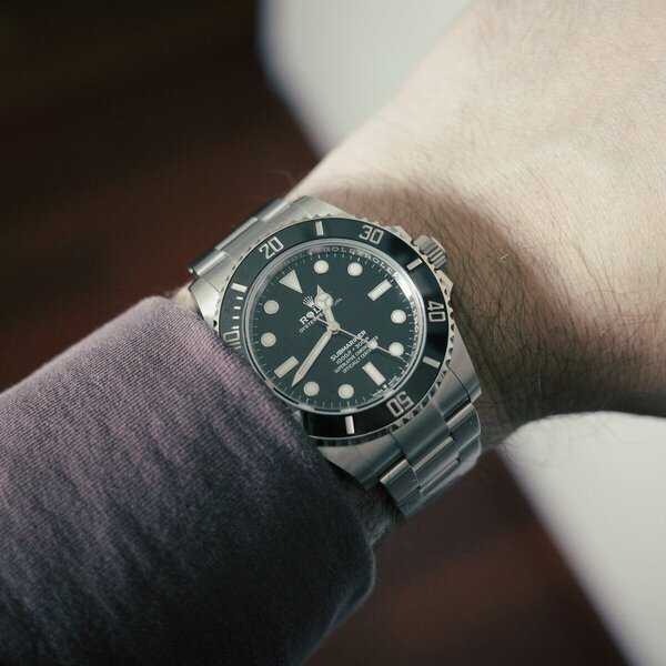
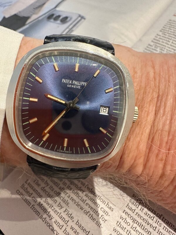
It's like if noisy Jazz was a dial.Here's a watch with all kinds of design "flaws." I think it's one of the most beautiful Pateks ever.

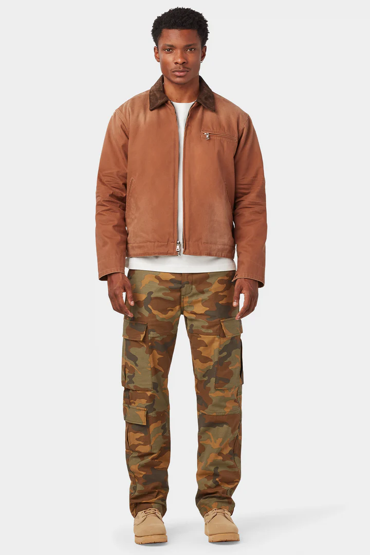
UNIFORM LA Japanese BDU Camo Cargo Pants Drop, going on right now.
Uniform LA's Japanese BDU Camo Cargo Pants are now live. These cargos are based off vintage US Army BDU (Battle Dress Uniform) cargos. They're made of a premium 13.5-ounce Japanese twill that has been sulfur dyed for a vintage look. Every detail has been carried over from the inspiration and elevated. Available in two colorways, tundra and woodland. Please find them here
Good luck!.
STYLE. COMMUNITY. GREAT CLOTHING.
Bored of counting likes on social networks? At Styleforum, you’ll find rousing discussions that go beyond strings of emojis.
Click Here to join Styleforum's thousands of style enthusiasts today!
Styleforum is supported in part by commission earning affiliate links sitewide. Please support us by using them. You may learn more here.
 Vanda Fine Clothing - Sports Collection Pocket Square - Golf $61 Vanda collaborated with textile designer Angeline Oei to produce a collection of six sporty pocket squares. The Sports collection has an art deco influence in the use of geometry and shape, while the use of softer brush strokes increases the wearability of these pocket squares.
  Fornasetti Milano Limited Edition 15/97 Gold Inlay Burlwood Wood Valet Box As our friends at LuxeSwap primarily deal with textile garments, this exceedingly rare Fornasetti trinket box has to be special for them to work outside their normal wheelhouse - and it is. There are only 96 other examples of this limited edition box on the planet. Who knows when another one might ever surface for sale?
  TLB Mallorca - Comfort Suede Loafers - $269 Designed for maximum comfort with lightweight rubber sole and supple leathers this model offers comfort all day long, as a perfect choice for the daily commute or casual outing. For this model, we have choosen suede leather in vivid colors, our sommelier last and a full rubber sole. It is also finished in blake construction.