- Joined
- Apr 25, 2007
- Messages
- 3,463
- Reaction score
- 45
Hello chaps, welcome to another edition of angry asian man's exhaustive pedantry. If you were left out, worry not for you are still a special snowflake in your mother / daughter / cellmate's eyes <3. We begin as we have since time immemorial, a signal of our manliness:
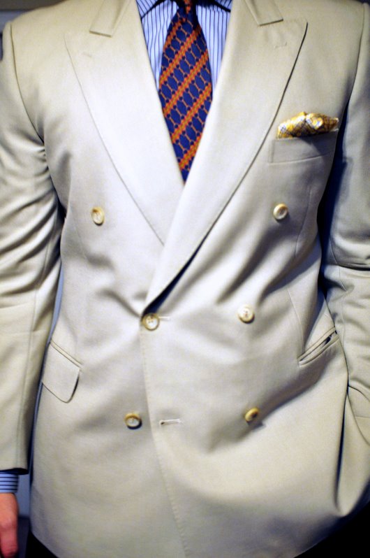
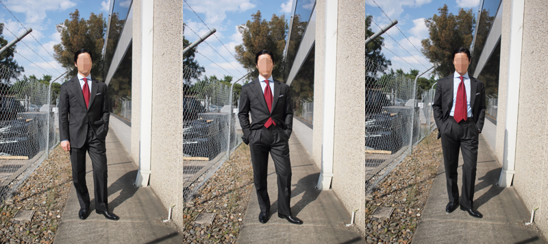
 Notice the fine house appliances in the background. iGents need good toast with bespoke grill patterns. An interesting example of a four button DB arranged the way our favourite lilliputian British royal liked it but on a taller, slimmer man. I really liked how the four button arrangement gives a very long lapel line but doesn't have the precariousness of a six button buttoning at the bottom.
 I get this but I don't like it. It says to me: "I am a fruity gangster." I don't care what the Koreans say. (yobusay-oooo)
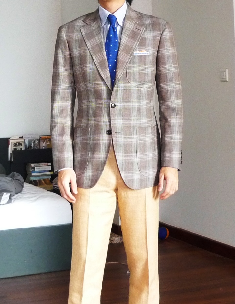
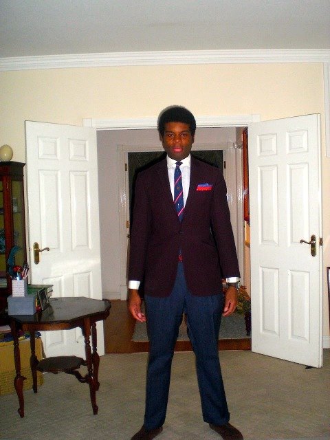
 The resolution killed the pattern a bit but I thought this clay red check was very impressive against the almost electric blue tie.
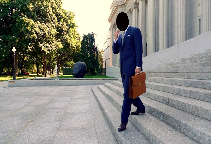
 Our glorious leader striding out of the office. Another fruitful day at the Colliseum!
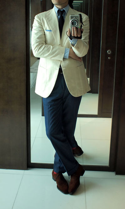
 I am very interested in the recent spate of darker trou, lighter sport coat outfits we've been seeing. The muted, cool colour palette is saved from obscurity by a touch of red in the shoes and square.
 Sharp, simple and rakish. The longer collar points are wonderfully British.
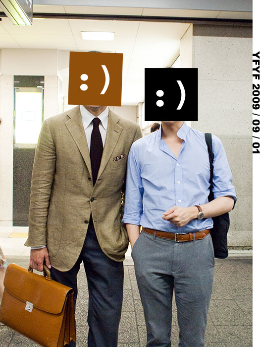
 The chap on the left looks great. Olive green sportcoat against brown knit tie. Very well put together. The guy on the right looks like he just went dumpster diving.
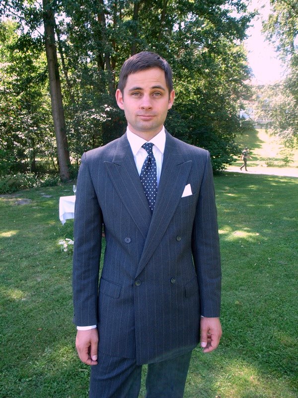
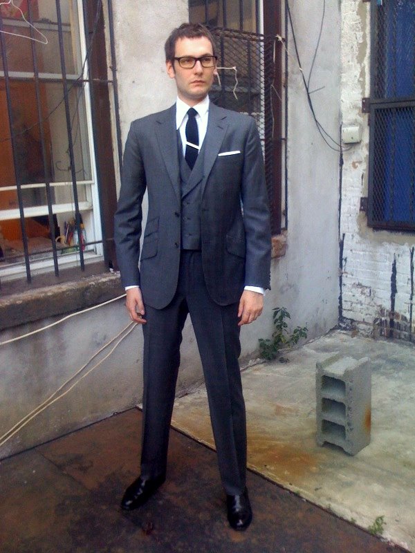
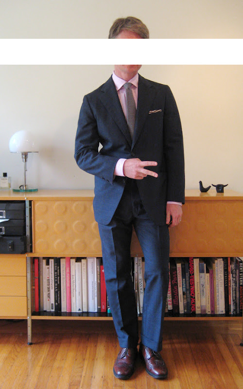
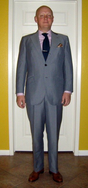
 A great example of (I believe) a one button notch lapel done with a very classic flavour. The pink and grey tie/charcoal suit is well chosen.
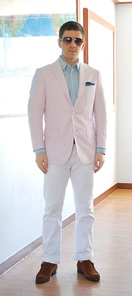
 He wears a lot of unusually pink things but you have to give credit to the man for flying.
 I am pretty sure the blazer is a Thom Browne, what's really interesting is how the narrow lapels can: 1. work with fuller trousers and 2. accentuate a fit physique, not just a slender waif. The colour combination is undoubtedly beautiful and will sets hearts a-flutter at this year's annual cinema usher convention.
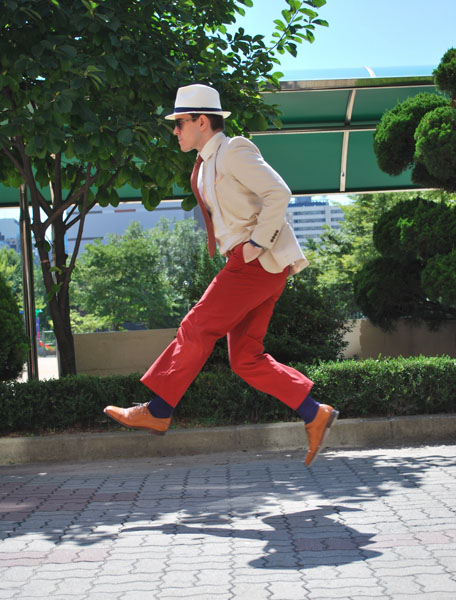
 The colours are very strong but very simple, just down to reds and blues with clean straight lines everywhere. However the gollum-esque stoop and the pelvic thrust stance makes the chap look preggers.
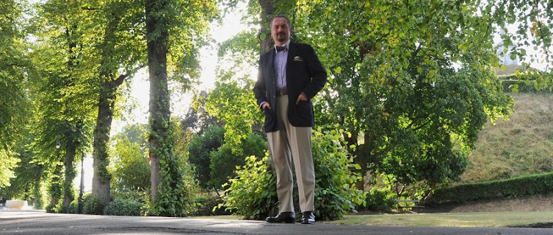
 The super sharp crease on the trousers was particularly impressive. If you want to know what old-school super-hard mohair looks like, well there it is.
 The outfit is simple but I'm liking the full, pleated trousers and contrast collar shirt. Scenery is nice too.
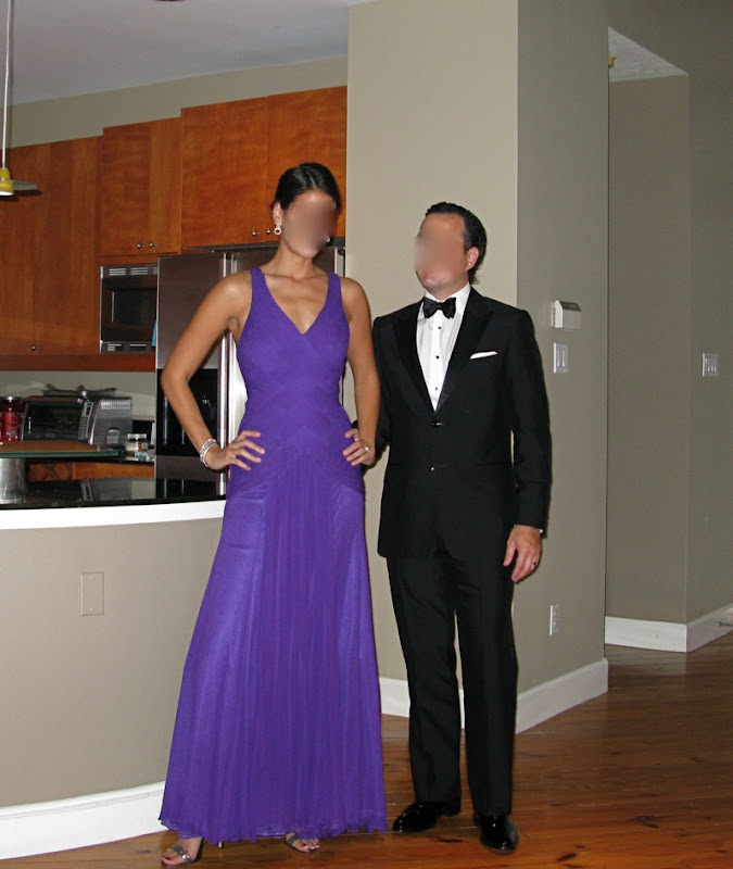
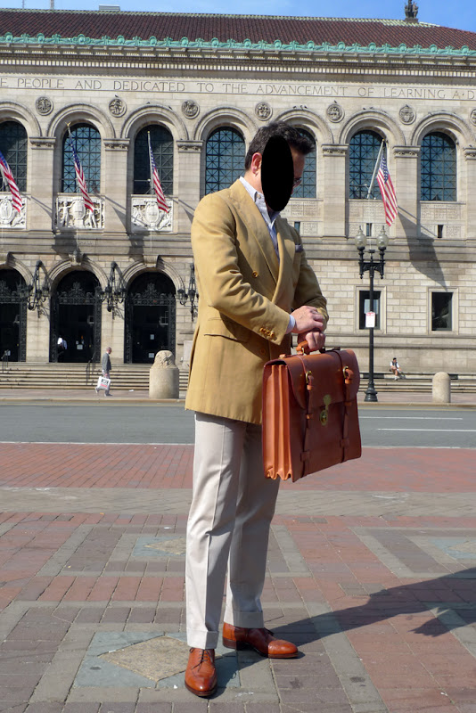
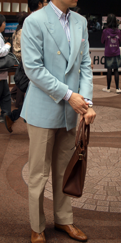
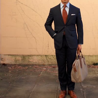
 Very elegant. Love the chestnutty/tan accessories even though the bag merely holds a banana and a thermos of cherry Kool-Aid. The shoes are worth a second mention, those (I believe) are the elusive St. Crispins in a very un-Corthay-ish last.
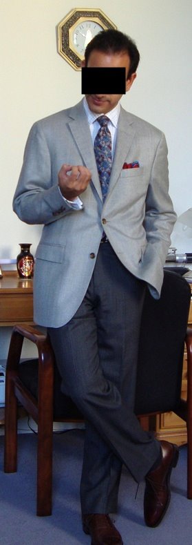
 I particularly like the 80s-ness of the tie and the palette is well chosen, mixing blues and yellows effectively.
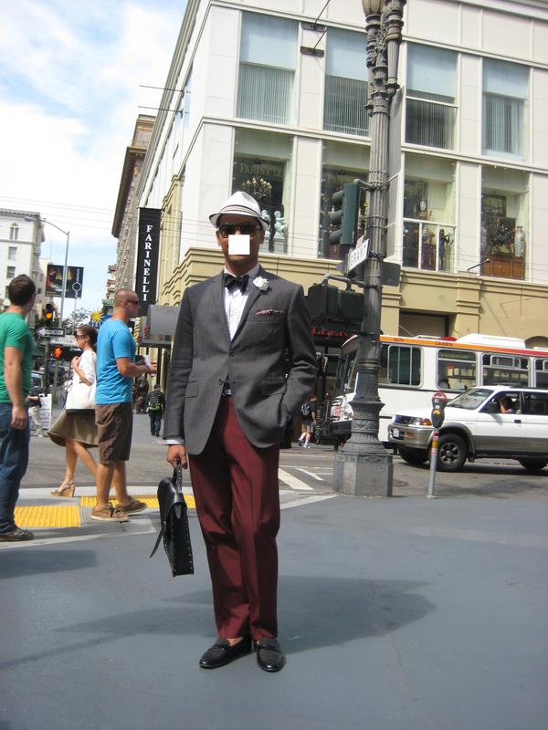
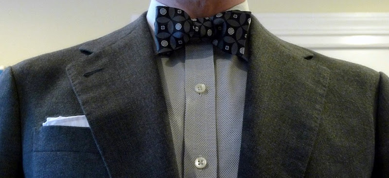
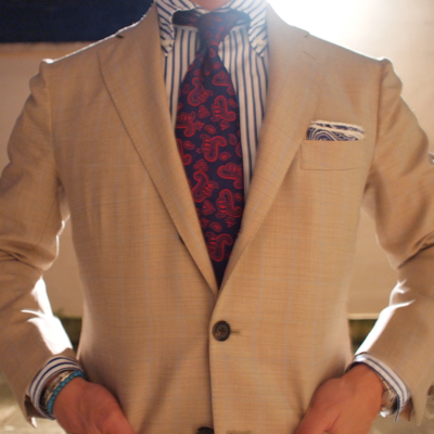
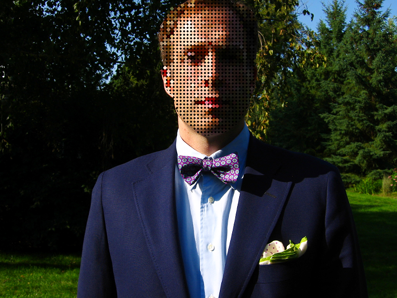
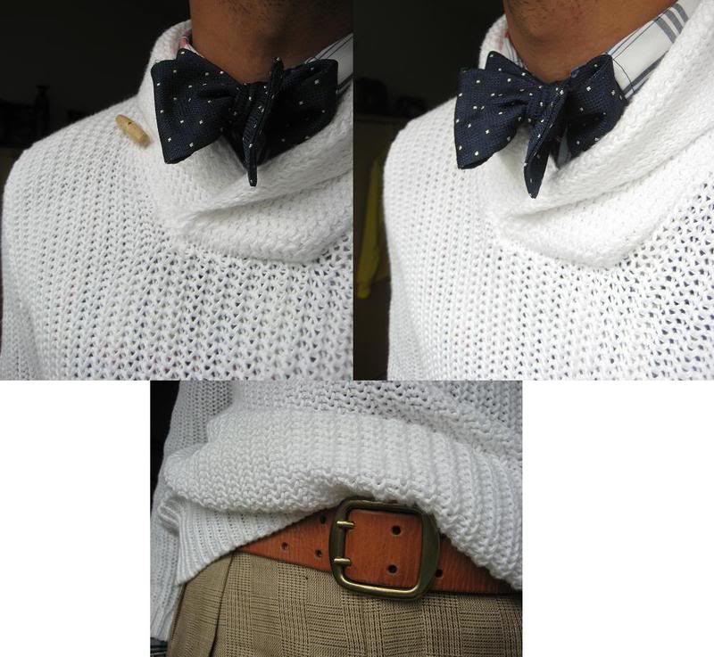
 While the suit and shirt say "bespoke", the bow tie says "Bed, Bath & Beyond Shower Curtain Special".
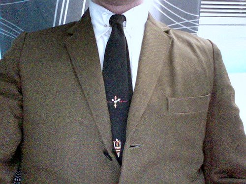
 I like this because it has a whole lot of random junk on the tie. I have found this to be the case with many ties of the 60s era. The one I own is grey based with a pink triangle, a unicorn and circles linking up to form half an Olympic logo. I think the embroiderers back then just took the piss.
 This shirt also comes with a little bag of checkers pieces.
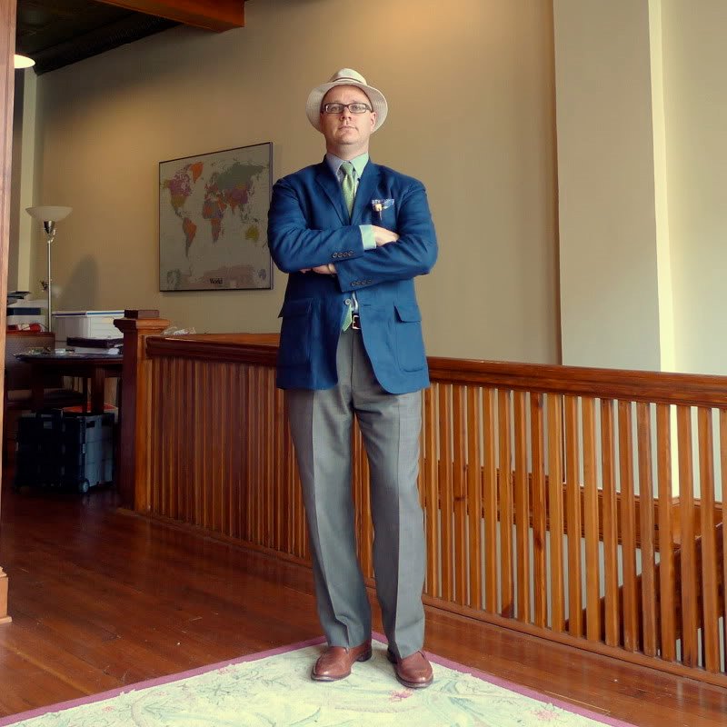
 While the hat says "fisherman" and the blue/grey should say "security guard", the lightness of the blue with the lime green tie save it. I approve.
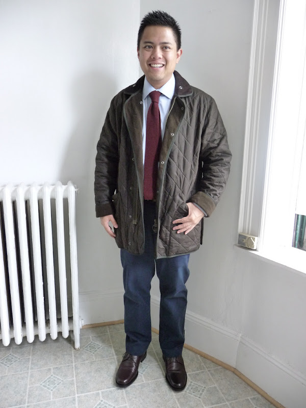
 The quilted jacket is the territory of London real estate agents but I like the red knit tie so we'll let it slide.
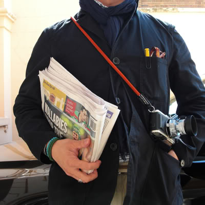
 I don't know who the hell the Wallabies are but I wholeheartedly approve the vivid accents in the canary yellow Lamy Safari pen in the pocket and the stylish orange camera strap.
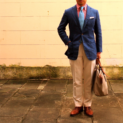
 This is ok, but the tie pushes it into caricature. The colour borders on obnoxious and it says "tie rack".
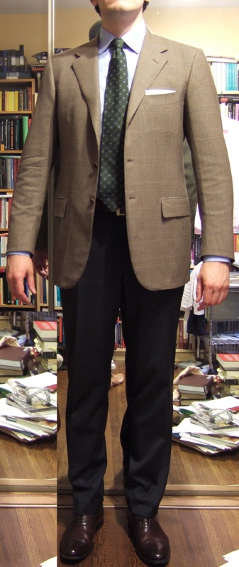
 I like this and it shows we're about to enter Autumn. The tie is a beautiful shade of green and one that is sadly absent in a lot of wardrobes.
 These are so sprezzatura I think I just sprezzed in my pants.
 There are lines and circles and curves and unicorns but I like the chaos.
 Very well executed though I find the way the pleats accentuate trouser bulging a bit disturbing.
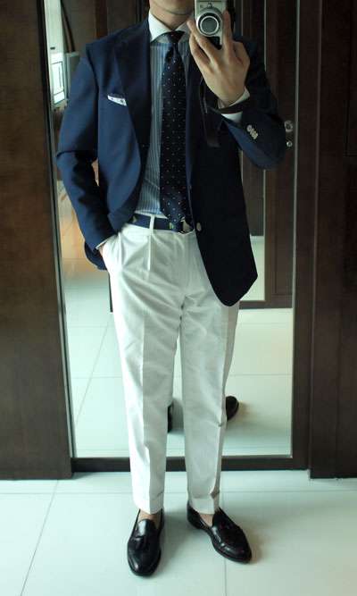
 Clean, simple and holding a ladies' handbag. Just the way I likes it.
 Well chosen, colours mix well and I particularly like the extra stitching at the edge of the lapels.
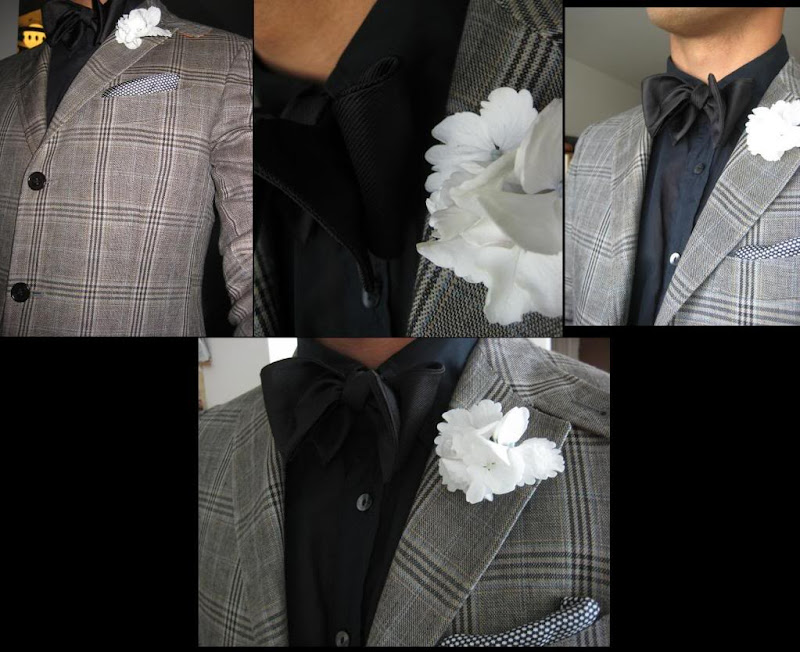
 Unusual, but nice. The dark and muted colour palette is the only way to do this properly and the louche, floppy bow-tie is a nice touch.
 Looks good, not much else to say.
 Another great look, a lot of good bowties this week. The simple navy/white dot bowtie is one of those simple, great things that never looks (too) affected.
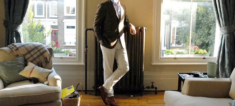
 The outfit is good, but I found the photo, with its comfortable decor and giant old-school radiator piping simmering blood from Tartarus, especially eye-catching.
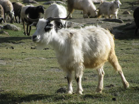
 And to wrap it up, a goat.
 Sorry for the delay but I'm not really sorry. I'm not sure if I'm allowed to do it again next week because I have to scrub Vox's multitude of Bugattis free of evidence.


