• Hi, I am the owner and main administrator of Styleforum. If you find the forum useful and fun, please help support it by buying through the posted links on the forum. Our main, very popular sales thread, where the latest and best sales are listed, are posted HERE

    Purchases made through some of our links earns a commission for the forum and allows us to do the work of maintaining and improving it. Finally, thanks for being a part of this community. We realize that there are many choices today on the internet, and we have all of you to thank for making Styleforum the foremost destination for discussions of menswear.
  • This site contains affiliate links for which Styleforum may be compensated.
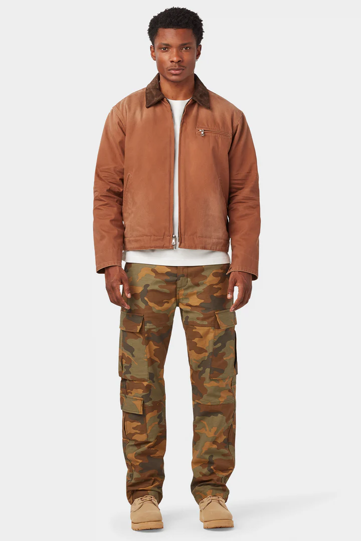
  • UNIFORM LA Japanese BDU Camo Cargo Pants Drop, going on right now.

    Uniform LA's Japanese BDU Camo Cargo Pants are now live. These cargos are based off vintage US Army BDU (Battle Dress Uniform) cargos. They're made of a premium 13.5-ounce Japanese twill that has been sulfur dyed for a vintage look. Every detail has been carried over from the inspiration and elevated. Available in two colorways, tundra and woodland. Please find them here

    Good luck!.

  • STYLE. COMMUNITY. GREAT CLOTHING.

    Bored of counting likes on social networks? At Styleforum, you’ll find rousing discussions that go beyond strings of emojis.

    Click Here to join Styleforum's thousands of style enthusiasts today!

    Styleforum is supported in part by commission earning affiliate links sitewide. Please support us by using them. You may learn more here.

Logo critique time!

sonick

Distinguished Member
Joined
Mar 11, 2003
Messages
5,686
Reaction score
406
Thanks for the input Brian & Vision.

I am not a trained designer by any means, nor have I taken any design courses. I am a marketing major minor design as an interest (mostly worked with layout design), so the whole 'conceptualizing' thing is new to me. And I totally agree with the fonts, typography on a design level isn't something I've worked with much in the past.

Thanks for the feedback and tips, perhaps I should start with a coming up with the general idea of the look and feel before delving into the actual design.
 

grundletaint

Distinguished Member
Joined
Dec 27, 2007
Messages
5,162
Reaction score
398
i like the blue one, but turn the "i" and the"t" into smokestacks at the top, maybe slant the "cruise" to accommodate this.

the black and white ones look cool, but the blue makes me want to go on vacation.
 

Brian SD

Moderator
Joined
Feb 5, 2004
Messages
9,492
Reaction score
128
Try these fonts: Eras:
eras_std.png
Lacuna Italic:
lacuna_italic.png
Tabula:
tabula_std.png
Fontin:
fontin_sans.png
BTW the ship drawing is looking MUCH better. Doesn't agree with your current type, but it looks quite nice, especially for an admitted non-designer! I would open up the space a little bit. The white areas need to breathe a little more. There also needs to be some logical reason why the back end is just cut off. I'd recommend either tapering the black shapes off, or make it come from some kind of aquatic shape. Play off the 3d-illusion. The top-right design is the one I'm talking about. It's the strongest one of the lot.
 

Brian SD

Moderator
Joined
Feb 5, 2004
Messages
9,492
Reaction score
128
A lot more still needs to be done, type-wise, but here's what it would look like, roughly:

logo3a.gif
 

Agnacious

Senior Member
Joined
Jul 20, 2008
Messages
677
Reaction score
4
Probably not particularly helpful, but in your initial post the first and third ships make me thing too much of Spy vs Spy for some reason.
 

designprofessor

Distinguished Member
Joined
Apr 14, 2006
Messages
2,412
Reaction score
8
If i had to choose:
Second one- why? seems the most cohesive between image /type
Something off about that drastic perspective.
Lukewarm on the font, but I'm at a loss for suggestion at this point.

Bottom ones not working imho. bit too corporate. type not helping, conflicting direction between type and logo. overall just not saying ship, cruise, etc

These designs you proposing or are these from their initial input?

keep on keepin' on sonik!
 

sonick

Distinguished Member
Joined
Mar 11, 2003
Messages
5,686
Reaction score
406
It was ones I was proposing (initial guidance was just that it required some kind of cruise ship imagery.)

I showed managers the two concepts and both preferred the bottom "corporate" one, and were quite indifferent to the black&white; not even a comment.

Wanted me to make the cruise ship imagery on that a bit more obvious; but I'm going to play with the font on those as well, not happy with it.
 

LabelKing

Stylish Dinosaur
Joined
May 24, 2002
Messages
25,421
Reaction score
268
I am no graphic designer, but I have noticed that most stuff nowadays seems very chubby looking. That is, the graphic images look rather chubby and slightly too complicated for such a small area of space.
 

Featured Sponsor

How important is full vs half canvas to you for heavier sport jackets?

  • Definitely full canvas only

    Votes: 107 36.8%
  • Half canvas is fine

    Votes: 108 37.1%
  • Really don't care

    Votes: 37 12.7%
  • Depends on fabric

    Votes: 47 16.2%
  • Depends on price

    Votes: 42 14.4%

Forum statistics

Threads
508,474
Messages
10,602,285
Members
224,644
Latest member
radhika077
Top