Manton
RINO
- Joined
- Apr 20, 2002
- Messages
- 41,314
- Reaction score
- 2,879
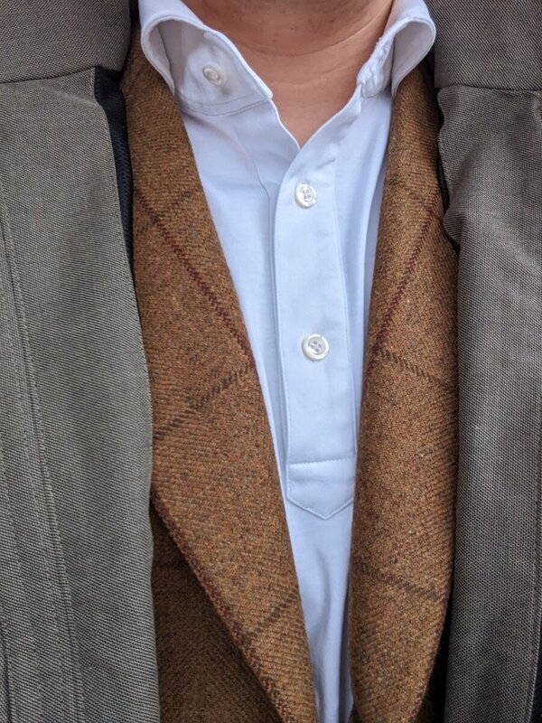
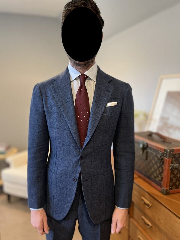
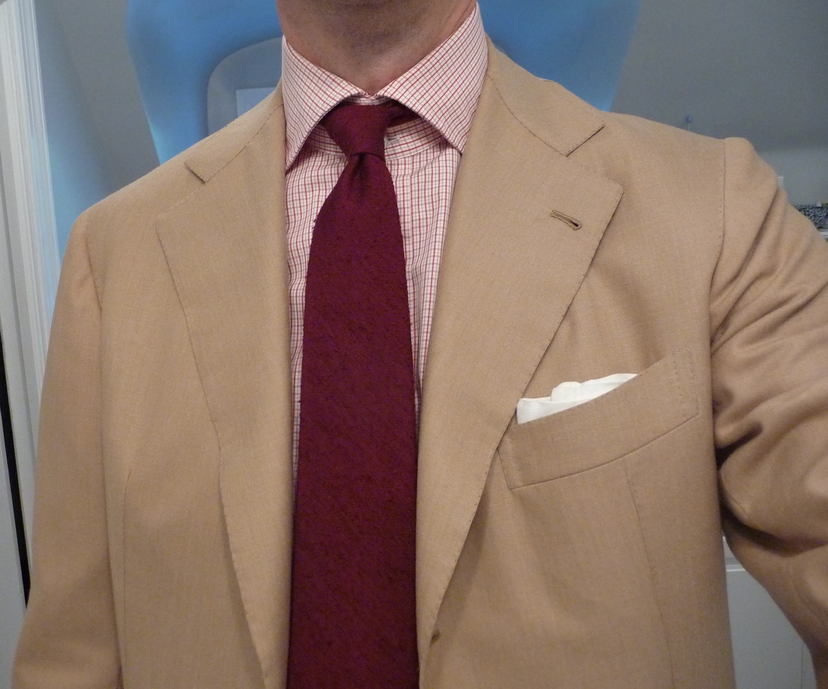
Complaints about the quality of my pics will be ignored. I urge chavs, fops, bottom feeders and n00bs to think carefully before you post in this thread. If you are wondering whether something is in good taste, it probably isn't. I encourage nay, foo, matt, dopey, gdl, vox (he is missed), concordia, t4, parker, will, baron, edmorel and some others whose names aren't occuring to me at the moment to comment with directness but without rancor. of course, there will be little need to say anything about my combos because they will always be impeccable.
Last edited: