-
Hi, I am the owner and main administrator of Styleforum. If you find the forum useful and fun, please help support it by buying through the posted links on the forum. Our main, very popular sales thread, where the latest and best sales are listed, are posted HERE
Purchases made through some of our links earns a commission for the forum and allows us to do the work of maintaining and improving it. Finally, thanks for being a part of this community. We realize that there are many choices today on the internet, and we have all of you to thank for making Styleforum the foremost destination for discussions of menswear. -
This site contains affiliate links for which Styleforum may be compensated.
-
STYLE. COMMUNITY. GREAT CLOTHING.
Bored of counting likes on social networks? At Styleforum, you’ll find rousing discussions that go beyond strings of emojis.
Click Here to join Styleforum's thousands of style enthusiasts today!
Styleforum is supported in part by commission earning affiliate links sitewide. Please support us by using them. You may learn more here.
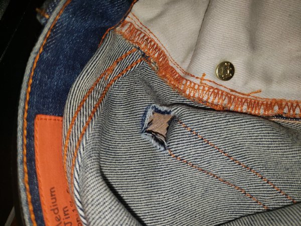
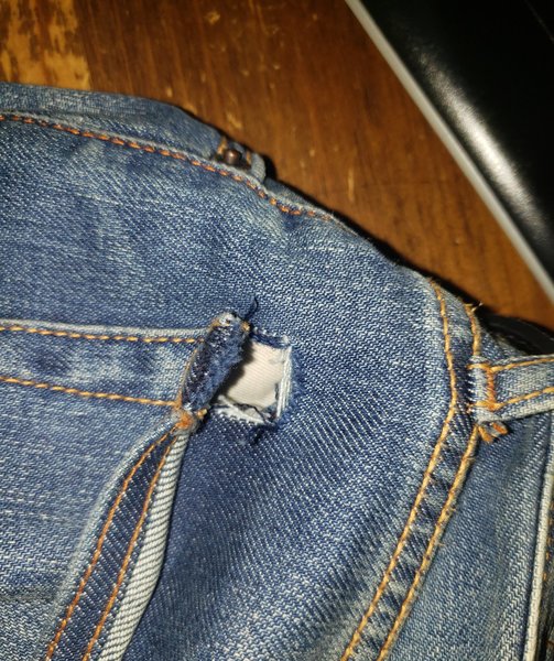
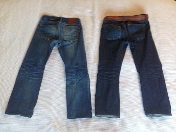
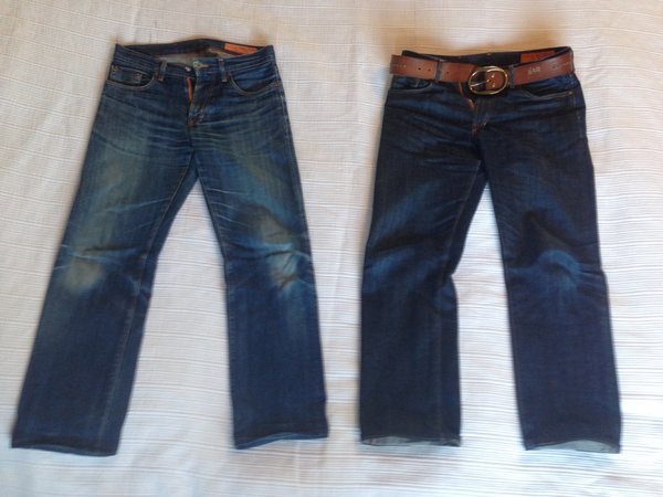
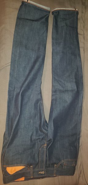
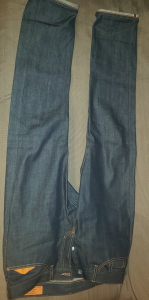
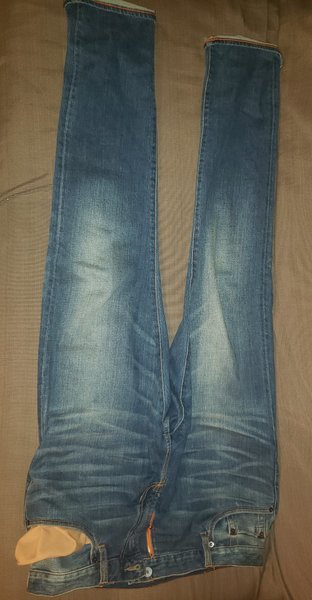
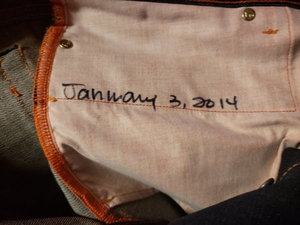
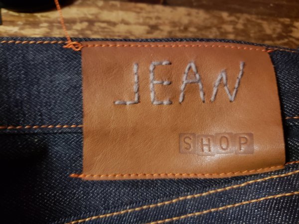
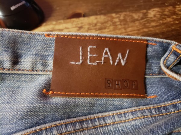
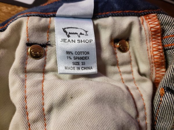
Jean Shop NYC
- Thread starter berlin report
- Start date
- Watchers 14

FEATURED PRODUCTS
-
 LuxeSwap Auction - Kiton Napoli 100% GUANACO Camel Flannel DB Top Coat
A virtual unicorn, this 100% pure Guanaco double breasted top coat by Kiton combines one of the worlds rarest fabrics with one of the worlds most exclusive brands. Retail on this item was deep in the double digits, and is being offered at auction with a $9.99 starting bid with no reserve.
LuxeSwap Auction - Kiton Napoli 100% GUANACO Camel Flannel DB Top Coat
A virtual unicorn, this 100% pure Guanaco double breasted top coat by Kiton combines one of the worlds rarest fabrics with one of the worlds most exclusive brands. Retail on this item was deep in the double digits, and is being offered at auction with a $9.99 starting bid with no reserve.
-
 Nicks Boots - Wickett & Craig English Bridle Veg Tan Leather - $759
These boots are made from 6.5 oz Wickett & Craig English Bridle Leather. This tannery has been making leather the old fashioned way since 1867. Each side can take about six weeks to produce, making it a significantly longer production time than most leather on the market.
Nicks Boots - Wickett & Craig English Bridle Veg Tan Leather - $759
These boots are made from 6.5 oz Wickett & Craig English Bridle Leather. This tannery has been making leather the old fashioned way since 1867. Each side can take about six weeks to produce, making it a significantly longer production time than most leather on the market.
-
Besnard - Made to Order Trousers - $351 Design your ideal pair of trousers by selecting a fabric, deciding between single or double pleats, choosing a zip or button fly, and opting for side adjusters or belt loops.
Similar threads
Featured Sponsor


Forum Sponsors
- American Trench
- AMIDÉ HADELIN
- Archibald London
- The Armoury
- Arterton
- Besnard
- Canoe Club
- Capra Leather
- Carmina
- Cavour
- Crush Store
- De Bonne Facture
- Drinkwater's Cambridge
- Drop93
- eHABERDASHER
- Enzo Custom
- Epaulet
- Exquisite Trimmings
- Fils Unique
- Gentlemen's Footwear
- Giin
- Grant Stone
- House of Huntington
- IsuiT
- John Elliott
- Jonathan Abel
- Kent Wang
- Kirby Allison
- Larimars Clothing
- Lazy Sun
- LuxeSwap
- Luxire Custom Clothing
- Nicks Boots
- No Man Walks Alone
- Once a Day
- Passus shoes
- Proper Cloth
- SARTORIALE
- SEH Kelly
- Self Edge
- Shop the Finest
- Skoaktiebolaget
- Spier and MacKay
- Standard and Strange
- Bespoke Shoemaker Szuba
- Taylor Stitch
- TLB Mallorca
- UNI/FORM LA
- Vanda Fine Clothing
- Von Amper
- Wrong Weather
- Yeossal
- Zam Barrett
Staff online
-
 JenAdministrator
Members online
- b-ill
- inmamy
- panchley
- VaderDave
- Jen
- Texasmade
- Numbernine
- jalh97
- Beav
- Valdor123!
- dan1996
- tim_horton
- scurvyfreedman
- oycg
- scrumtrulescent
- ScarsdaleVibe
- jesuisjesuis
- tomsocal
- RedLantern
- WBaker
- Hombre Secreto
- yungr1
- te0o
- Pawz
- DC10
- abantigen
- Robertbleda
- CityHunter
- Connemara
- KevM
- Strog
- blueberry7
- kevinftwman
- sushijerk
- Newcomer
- kurdo
- Wally_SF
- Ich_Dien
- Shoenut
- BlueSteel
- Omega Male
- grs
- Gil_Pender
- lagsun
- goonerble
- Jr Mouse
- NorCal
- SonnyTheElder
- howardeb
- idonotmatch