- Joined
- Jun 1, 2012
- Messages
- 4,653
- Reaction score
- 3,456
@Mr. Six
Just to chime in as challenges are fun.
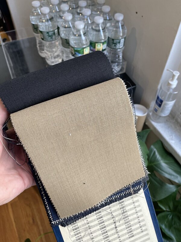
From a distance, I suppose the jacket looks like taupe, a muddy grey/brown. Don't get me wrong, I have a jacket that fits that description, but it's desaturated and sort of in this odd middle ground that Urban describes which makes trouser pairing harder. Dark trousers aren't going to cut it, I think, since it just adds to the muddiness, and similarly overly saturated trousers might be difficult. But lighter and similarly desaturated trousers might work, say some sort of lighter olive. I'm with Helden and others on cream or fawn/oatmeal.
On ties: I'm not sure very saturated colors in the blue tie are working for the jacket, IMO. It's a bit jarring. Stick with solids, or at least not small scale patterns. A slate blue would be better, but you have to adjust saturation to get it right while also keeping it on the darker end of the color wheel (altering two parameters, saturation and brightness accordingly). Again, a green, with similar properties would be good, towards desaturated but darker so as to stand against the jacket (rust, burgundy worth considering too).. Some of those coarse hopsack Cappelli's you've been considering might be nice. Sorry, I don't have the pics saved on the SF server
Slate blue:
https://www.instagram.com/p/BAzXynKAr7X/?taken-by=tweedyprof
Greens
https://www.instagram.com/p/-eFgRiArxr/?taken-by=tweedyprof
Just to chime in as challenges are fun.
From a distance, I suppose the jacket looks like taupe, a muddy grey/brown. Don't get me wrong, I have a jacket that fits that description, but it's desaturated and sort of in this odd middle ground that Urban describes which makes trouser pairing harder. Dark trousers aren't going to cut it, I think, since it just adds to the muddiness, and similarly overly saturated trousers might be difficult. But lighter and similarly desaturated trousers might work, say some sort of lighter olive. I'm with Helden and others on cream or fawn/oatmeal.
On ties: I'm not sure very saturated colors in the blue tie are working for the jacket, IMO. It's a bit jarring. Stick with solids, or at least not small scale patterns. A slate blue would be better, but you have to adjust saturation to get it right while also keeping it on the darker end of the color wheel (altering two parameters, saturation and brightness accordingly). Again, a green, with similar properties would be good, towards desaturated but darker so as to stand against the jacket (rust, burgundy worth considering too).. Some of those coarse hopsack Cappelli's you've been considering might be nice. Sorry, I don't have the pics saved on the SF server
Slate blue:
https://www.instagram.com/p/BAzXynKAr7X/?taken-by=tweedyprof
Greens
https://www.instagram.com/p/-eFgRiArxr/?taken-by=tweedyprof