• Hi, I am the owner and main administrator of Styleforum. If you find the forum useful and fun, please help support it by buying through the posted links on the forum. Our main, very popular sales thread, where the latest and best sales are listed, are posted HERE

    Purchases made through some of our links earns a commission for the forum and allows us to do the work of maintaining and improving it. Finally, thanks for being a part of this community. We realize that there are many choices today on the internet, and we have all of you to thank for making Styleforum the foremost destination for discussions of menswear.
  • This site contains affiliate links for which Styleforum may be compensated.
  • STYLE. COMMUNITY. GREAT CLOTHING.

    Bored of counting likes on social networks? At Styleforum, you’ll find rousing discussions that go beyond strings of emojis.

    Click Here to join Styleforum's thousands of style enthusiasts today!

    Styleforum is supported in part by commission earning affiliate links sitewide. Please support us by using them. You may learn more here.

chocomallo

Distinguished Member
Joined
Nov 3, 2009
Messages
1,266
Reaction score
1,875
I’m not familiar with that reference either, but must admit that I’m a sucker for scientific / sector dials. The fact that it actually says “scientific” is crazy to me.

Is it even close to a modern size? Possibly a re-dial?

I think original. Website says porcelain. 30mm. http://www.dazzling.co.jp/detail/watch/antique/86/5172/1

They also had a thorough selection of military watches. Like this cool IWC. I had never seen this one before. From their website (as was the Rolex pic):

1207692


The shop is definitely worth of visit if you find yourself in Tokyo. I cannot comment on prices since I don’t know the vintage market at all. But awesome selection. And they had a watchmaker on site. Not sure if they would ship overseas.
 

Dino944

Distinguished Member
Joined
Dec 24, 2011
Messages
7,730
Reaction score
8,740
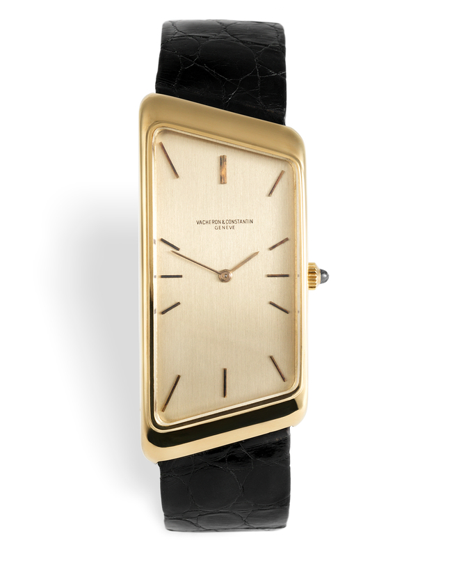
I prefer the Vacheron Constantin "Prestige de la France" version of asymmetric.
watch-club-vacheron-constantin-prestige-de-la-france-rare-vintage-model-ref-ii-103-year-1974-wb.jpg

Asymmetric watches are a love it or hate it thing. I really like them. Each of the "Big Three offered asymmetric watches at different times PP in the 1950s with the Gilbert Albert models and then more recently with the 5489, AP in the 60s, and then VC in the 70's. I like the "Prestige de la Franc" also known as the "1972," although it would look a bit cleaner without the raised bezel. I have the revised more modern version of that from 2006, which is not quite as rounded.
 

Keith T

TWAT Master.
Joined
Apr 17, 2004
Messages
1,847
Reaction score
1,465
^^Cool watch...I've never seen one in the metal but they always look appealing in photos. Definitely a good size for you.^^


Re: the BlancpaiN / Hodinkee collab, again for me it's a near-miss. I'd prefer it around 40-41 mm personally (more of my diver sweet spot). And although the ceramic is nice, I would have liked to see a lumed, sapphire bezel on it.

Of course they didn't ask me, and of course they will sell out within the hour (price at least seems "fair" if that's even the right word for this current market). But hey, obviously YMMV, and shout-out to anyone that snags this piece. Looking forward to real live wrist shots in the future regardless :colgate:
 

Dino944

Distinguished Member
Joined
Dec 24, 2011
Messages
7,730
Reaction score
8,740
Re: the BlancpaiN / Hodinkee collab, again for me it's a near-miss. I'd prefer it around 40-41 mm personally (more of my diver sweet spot). And although the ceramic is nice, I would have liked to see a lumed, sapphire bezel on it.

Of course they didn't ask me, and of course they will sell out within the hour (price at least seems "fair" if that's even the right word for this current market). But hey, obviously YMMV, and shout-out to anyone that snags this piece. Looking forward to real live wrist shots in the future regardless :colgate:

I like that it doesn't have a date window, and I like the hands on it. However, there are elements of other Fifty Fathoms models (dials & bezels) I like more. In addition, its just always one of the brands that when I've tried them in the past, I always feel like there is something else I would rather buy for that kind of money. Still congrats to those who fall in love with and pull the trigger on one!
 

dan'l

Senior Member
Joined
Apr 17, 2011
Messages
970
Reaction score
421
I would have preferred something along the lines of the FF Barakuda, but w/o the date and the garish branding on the side.

I also like the version with the moisture indicator on the dial.
 

pmeis

Senior Member
Joined
Nov 19, 2014
Messages
906
Reaction score
2,048
The 38mm Bathyscape has always had weird proportions. It could work if the bezel was thinner and the dial was wider but it feels a bit like a toy on the wrist with too small a dial. A 40mm version with the same bezel thickness would work as well, but that's out of the scope of this project.
 

cyc wid it

Stylish Dinosaur
Joined
Apr 2, 2011
Messages
12,492
Reaction score
20,901
It's already being flipped for almost double. :redface:
 

Belligero

Distinguished Member
Joined
Aug 30, 2010
Messages
2,423
Reaction score
2,595
The 38mm Bathyscape has always had weird proportions. It could work if the bezel was thinner and the dial was wider but it feels a bit like a toy on the wrist with too small a dial. A 40mm version with the same bezel thickness would work as well, but that's out of the scope of this project.
Speaking of that bezel, I'm amazed that a company of Blancpain's pretensions would continue to use bold Arial for the numbering; even the crappy microbrands seem to be figuring out how cheap and nasty the look is.

A design blunder that obvious just bleats out "DERP!" every time you look at it.
 

chocomallo

Distinguished Member
Joined
Nov 3, 2009
Messages
1,266
Reaction score
1,875
Speaking of that bezel, I'm amazed that a company of Blancpain's pretensions would continue to use bold Arial for the numbering; even the crappy microbrands seem to be figuring out how cheap and nasty the look is.

A design blunder that obvious just bleats out "DERP!" every time you look at it.

I feel ambivalent about Hodinkee at times. I equivocate between loving what they do as a website and thinking they are fleecing their readers. But when it comes to their collaborations, I think credit is due when the price of the limited edition is usually only marginally more than the standard edition. That means Hodinkee works within the available tooling of a brand and produces a version that purists will love. In this case the bezel looks to me like the standard bezel but in grey. Not sure if the material is different but I think it is using the Omega liquid metal material which is from Swatch so same family. I don’t own one of their collaborations and never will because I find the idea of a blog-branded piece off-putting but I appreciate what they do. As do many others obviously (especially speculators).
 

Belligero

Distinguished Member
Joined
Aug 30, 2010
Messages
2,423
Reaction score
2,595
I feel ambivalent about Hodinkee at times. I equivocate between loving what they do as a website and thinking they are fleecing their readers. But when it comes to their collaborations, I think credit is due when the price of the limited edition is usually only marginally more than the standard edition. That means Hodinkee works within the available tooling of a brand and produces a version that purists will love. In this case the bezel looks to me like the standard bezel but in grey. Not sure if the material is different but I think it is using the Omega liquid metal material which is from Swatch so same family. I don’t own one of their collaborations and never will because I find the idea of a blog-branded piece off-putting but I appreciate what they do. As do many others obviously (especially speculators).
For sure; I can appreciate that and largely agree.

The only snag is that Arial is a dead giveaway that the process involves computer-aided manufacturing, and the look is therefore not constrained by any physical tooling. That's why it's such a frustrating thing to see; instead of selecting one of the near-limitless options that would better suit this watch, they instead went with the default Windows setting.

It's a glaring sign of design laziness and/or incompetence even on a cheap product, let alone a fancy Swiss watch. What's especially galling here is that it costs literally nothing except for a well-chosen click of the mouse to use something better than dumpy Arial — a knockoff typeface with absolutely no redeeming qualities that only exists so that Microsoft can dodge Helvetica licensing fees.
 
Last edited:

bdavro23

Distinguished Member
Joined
Mar 11, 2014
Messages
3,699
Reaction score
4,475
My take on Hodinkee is one of Hate/ Envy. I actually really like what the site was set up to be, which was a watch fan site. At some point, money/ ad dollars started corrupting that goal, which I could live with until they started selling watches. With that said, they built a very popular and influential brand and there is no end to the envy I feel about them getting to design, or at least help design watches in their collaborations. That has to be one of the greatest joys that they have and I am sure it was completely unexpected when Hodinkee was started.
 

chocomallo

Distinguished Member
Joined
Nov 3, 2009
Messages
1,266
Reaction score
1,875
For sure; I can appreciate that and largely agree.

The only snag is that Arial is a dead giveaway that the process involves computer-aided manufacturing, and the look is therefore not constrained by any physical tooling. That's why it's such a frustrating thing to see; instead of selecting one of the near-limitless options that would better suit this watch, they instead went with the default Windows setting.

It's a glaring sign of design laziness and/or incompetence even on a cheap product, let alone a fancy Swiss watch. What's especially galling here is that it costs literally nothing except for a well-chosen click of the mouse to use something better than dumpy Arial — a knockoff typeface with absolutely no redeeming qualities that only exists so that Microsoft can dodge Helvetica licensing fees.

I have to admit I am not familiar with typeface ownership and licensing but I doubt that the licensing fee for a typeface is what causes brands to use Arial over something more pleasing to watch enthusiasts. The manufacturing piece I agree should be easy if it is computer controlled.
 

Featured Sponsor

How important is full vs half canvas to you for heavier sport jackets?

  • Definitely full canvas only

    Votes: 85 37.3%
  • Half canvas is fine

    Votes: 87 38.2%
  • Really don't care

    Votes: 24 10.5%
  • Depends on fabric

    Votes: 36 15.8%
  • Depends on price

    Votes: 36 15.8%

Forum statistics

Threads
506,522
Messages
10,590,073
Members
224,264
Latest member
bernas
Top