BLAUGRANA
Distinguished Member
- Joined
- Jun 14, 2012
- Messages
- 1,708
- Reaction score
- 554
The more I look at the OP41 (blue dial), the more I like it. Thoughts?
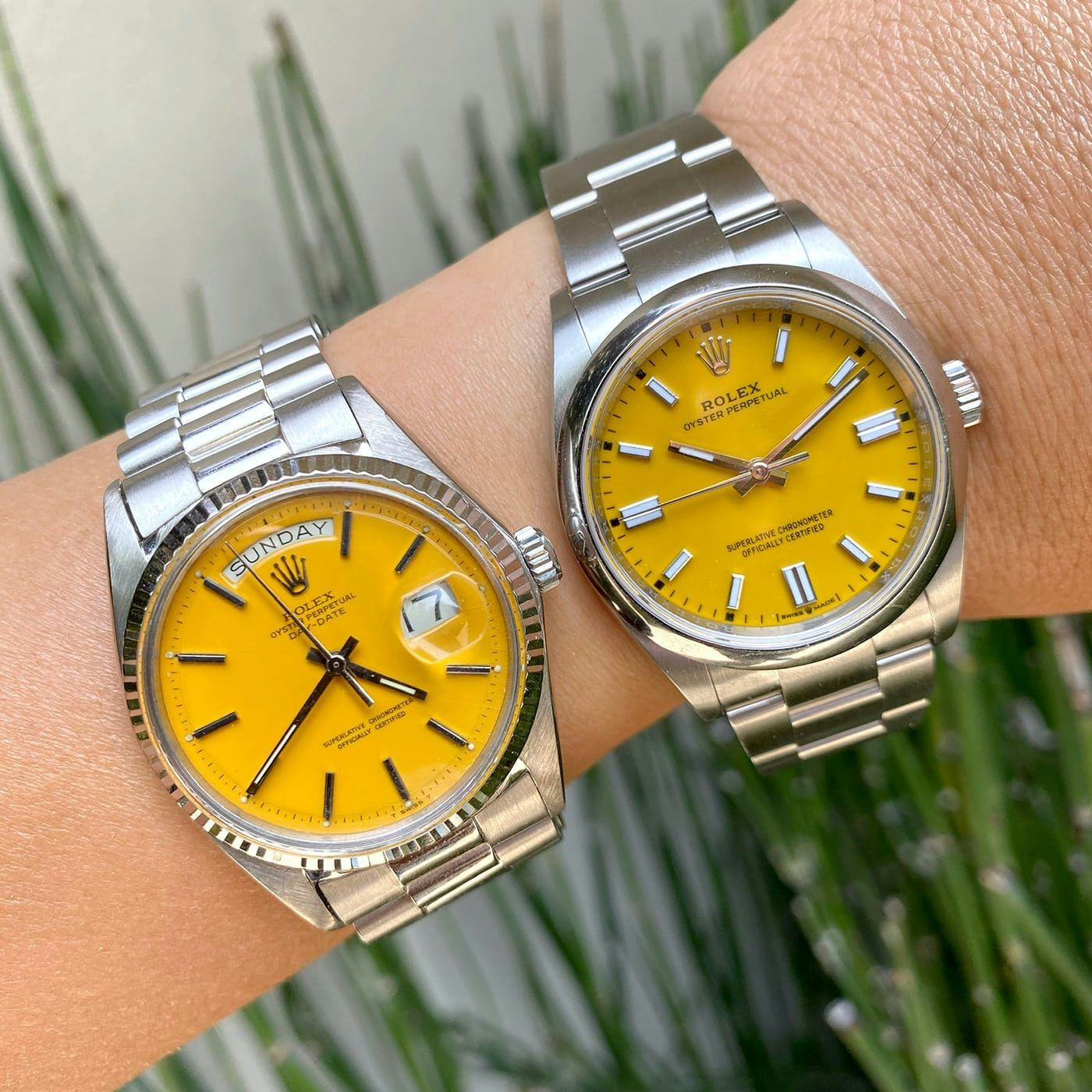
I assume you mean the "bright blue", or navy dial? I have to say the picture posted in this thread has me liking it more than I suspected. Not that I ever disliked it, but I think the... opportunity if you will is to get one of the more colorful dials with the current crop of OPs. I love the new OP dial colors. Turquoise blue, yellow or coral are the way to go I reckon. I do like that candy pink too. Even the green. Not a fan of the double indices at 3, 6 and 9 though, but I could live with them. I may move for one, but I'd only get a 36mm. We'll see though as the AD keeps coming through with my list. That said the list is actually starting to get exhausted. I probably owe them one with an OP purchase. Anyway, came across this again the other day and I think makes a good case for someone who wants the stella dial look. This is apparently from Eric Ku's instagram:
that actually wears much bigger than I thought it would, unless you have very skinny wrists.
Probably more the wrist shot itself. Wrist shots taken close up tend to make the watches look larger on the wrist than they actually are.
I’ve never understood the cyclops lens on the sub. The sub is the quintessential dive watch. It’s primary function is to inform the diver of the time he has spent at depth. Any feature on the watch that may interfere with that seems counterproductive.
I used to dive and I can tell you, sometimes visibility is not that great.
The ability to the tell date is non-essential.
The cyclops used to bother me, but now it doesn't at all. That said I never understood the need for a date on a dive watch. I can't imagine someone being on a dive and wandering what they date is because they have something to pick up at the cleaners.