TheShetlandSweater
Senior Member
- Joined
- Aug 20, 2020
- Messages
- 936
- Reaction score
- 1,108
I learned a lot from your post, but it kinda ran out of steam here, just when I was hoping to take something away from it.
Yeah. It's very complex. Color is part of it, but there are other things that matter too when pairing clothes. I'll summarize a few points I find worthwhile. Again, there are three variables to balance and that can make things pretty complicated.
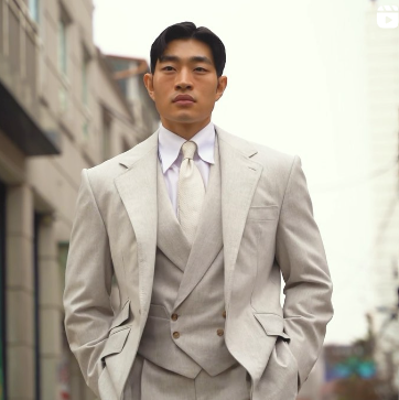
1) Colors have complements. The complement is the color opposite on the color wheel. For instance, red is roughly opposite green. Colors generally pair well with their complements, but those complements cannot both be in their dominant or most saturated form. It is best when there is some difference in saturation and value between the two complements. For example, the green and red of Christmas are both very strong and thus clash. A rose has a red flower and green stem but looks much better because the red has been knocked down a bit and because the green is a good deal darker and much less saturated. A pinkish flower on a dark green stem can look even nicer IMO because there is a nicer value contrast between light (the flower) and dark (the stem) and because the pink is a bit less saturated. If one of the complements is going to be really bright, it is best for there to be less of it (e.g. a pink or burgundy tie with a forest green jacket). In general, menswear is best when saturated colors are kept to a minimum. That is why the purple jacket several pages back was so problematic. There was just too much bright purple.
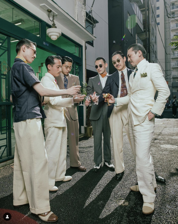
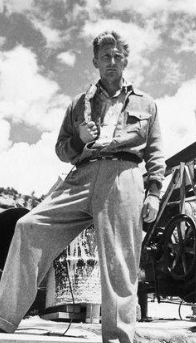
2) I think colors often go even better with one (or both) of the colors next to their complements. For instance, green can look really good with purple (again, both shouldn't be in their most dominant form and their should be some value contrast) and purple is adjacent to red. Navy is a warm blue. It is dark and not that saturated (colors can only be so saturated when they are very light or dark). It is roughly opposite orange on the color wheel. You can pair a navy jacket with an orange tie and that will look good, but it is even better to pair it with one of the adjacent colors on the color wheel, e.g. a yellow or red. I often wear navy jackets with a crimson university stripe ocbd (a very unsaturated pinkish-red overall) and a forest green tie (which goes well with the shirt for reasons discussed above). In terms of yellow and navy, this picture has always stood out to me in a good way.
Notice how the yellow is in a much more dominant form. It works well, though, because it is very much the minority color. This helps it pop. A bright complement like this that is in the minority is sometimes called a key. If you have a color in its dominant form, you don't want it to be that prevalent.
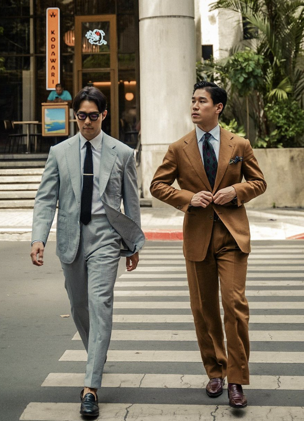
There are many examples of colors and compliments in menswear. Khakis with a blue shirt. A blue shirt with tannish or brownish tweeds or with most shades of linen. Dark brown shoes with a navy suit. A navy suit with a burgundy tie (adjacent to the complement).
3) Mid-grey is going to go with just about everything because it is so neutral and unsaturated. In general, more neutral colors (in terms of saturation, hue, and value) are easier to pair. This also goes for shoes. Shoes that are more saturated are generally harder to pair. This is why tan calf is hard to pair. Tan suede is less saturated and thus a bit easier to pair. Many like to talk about shoes being darker than trousers. I think this is silly. What matters is having the right amount of contrast. Yukio Akamine often wears white shoes with mid-grey trousers. The value difference is big, but the difference is otherwise small as both colors are very unsaturated and the hues are completely neutral.
There are many other factors to pay attention to. Understanding background and foreground colors is really important IMO, but I can't go into all of this now.
BTW, as I understand value, low value tones are darker, high value tones are brighter or “lighter”, more inclined to white.
That's not how those terms are used in the art world. It appears that designers and graphics people use these terms in the opposite way. Regardless, the terminology may differ, but the underlying concepts those terms refer to are the same.
Later Addition: Have you ever noticed how blue shirt and navy tailoring (not necessarily together) looks good on just about everyone? This is because flesh tone (basically regardless of race) is in the orange family and blues are its complement. Flesh is a less saturated orange and it will go well with less intense blues like navy or like blue shirts.
Last edited: