• Hi, I am the owner and main administrator of Styleforum. If you find the forum useful and fun, please help support it by buying through the posted links on the forum. Our main, very popular sales thread, where the latest and best sales are listed, are posted HERE

    Purchases made through some of our links earns a commission for the forum and allows us to do the work of maintaining and improving it. Finally, thanks for being a part of this community. We realize that there are many choices today on the internet, and we have all of you to thank for making Styleforum the foremost destination for discussions of menswear.
  • This site contains affiliate links for which Styleforum may be compensated.
  • STYLE. COMMUNITY. GREAT CLOTHING.

    Bored of counting likes on social networks? At Styleforum, you’ll find rousing discussions that go beyond strings of emojis.

    Click Here to join Styleforum's thousands of style enthusiasts today!

    Styleforum is supported in part by commission earning affiliate links sitewide. Please support us by using them. You may learn more here.

The Official Dieworkwear Appreciation Thread

Mr. Six

Distinguished Member
Joined
Sep 14, 2009
Messages
6,221
Reaction score
18,617
My assessment is that the cold light this is photographed in really helps sell the fabric. If it was photographed in the same way as Armoury jacket was , I think it would be be seen as another cabin blanket for Timberline Lodge.
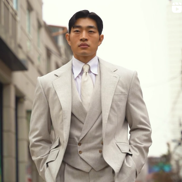
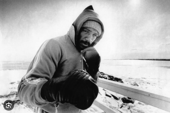
Maybe, but having looked at similar fabrics in several books, I actually suspect that Ethan's jacket and the LP fabric that McFox posted are likely neutral to cool. Even if they were warmer shades, I don't consider that disqualifying. It just means a different assessment of what I would wear with them when deciding whether to get the jacket made. I guess if the shades were so warm that the jacket would look like something costume-y, I wouldn't get it. But if I dressed differently or wanted something like that for occasional wear, I wouldn't see it as a problem then either.
 

mossrockss

Distinguished Member
Joined
Nov 25, 2008
Messages
3,771
Reaction score
8,235
Chiming in on the gun club conversation: mine has a smaller scale pattern, and the base is greige, so it's pretty cold which means it wears best with other cold colors (it looks weird with yellow-tinted chinos, etc.). Other colors are a green, blue, brown and orange over check. My favorite pairing is with olive pants. Even despite the orange overcheck I find it pretty easy to wear.

IMG_7758-2.jpg
IMG_7736.jpg
 

Mr. Six

Distinguished Member
Joined
Sep 14, 2009
Messages
6,221
Reaction score
18,617
Just as further horseblanket discussion, and stealing @jcmeyers photos.

Here’s a swatch for a fabric that’s kind of an inverted version of the LP: brown base with green checks.


Here’s how it made up.


It’s not everyone’s taste, of course. But it looks great in person and works with a variety of pants and ties.
 

TheShetlandSweater

Senior Member
Joined
Aug 20, 2020
Messages
936
Reaction score
1,108
To help people clarify, because I am about to go ballistic:

Warm colors=orange, red, yellow. Browns are oranges or reds and are thus warm too. Beige and tan are warm colors. Cream is more neutral, but still warm.

Cool colors=blue, purple, and green.

Neutral=grey, white, black. Neutrals can often lean cool or warm. They will rarely be perfectly neutral in practice.

Sometimes people will talk, e.g., of browns being cooler. This just means it is greyer or has less of a red/orange tone. It is cooler in virtue of being less warm, not in virtue of actually being cool. Similarly, people might talk of warmer greens (i.e. greens that lean more yellow than blue) or warmer purples (i.e. purples that lean more red) or even warmer blues (i.e. generally blues that lean more purple; greener blues are considered cooler blues).

Cool colors and warm colors can both be plenty versatile. There is nothing more versatile than a blue shirt (cool) or than brown shoes (warm). Likewise it is not the case that cool colors pair best with cool colors and warm colors pair best with warm colors. Indeed, there are many warm/cool pairings that work excellently together.

Warm is generally more rustic and country and informal and cool is generally more city and formal (it can also be tropical). Aside from those connotations, I don't think it is particularly helpful to think much about cool and warm colors in menswear.

It is much more helpful to think about value (how light or dark something is), saturation (how intense a color is--things that are less saturated are greyer), and hue (what "color" something is). For example, a blue ocbd is low value (it is quite light), lower saturation (the blue isn't very intense), and a warmish blue (a blue that leans a bit red).

Whether two things go together (at least color-wise) mainly has to do with these three factors. The "rules" here are much more complicated.
 

dieworkwear

Mahatma Jawndi
Dubiously Honored
Joined
Apr 10, 2011
Messages
27,320
Reaction score
69,987
orange check this, orange check that. orange someone supposed to be sending me a stimmy check?
 

bookbrother

Senior Member
Joined
Jun 8, 2015
Messages
144
Reaction score
128
To help people clarify, because I am about to go ballistic:

Warm colors=orange, red, yellow. Browns are oranges or reds and are thus warm too. Beige and tan are warm colors. Cream is more neutral, but still warm.

Cool colors=blue, purple, and green.

Neutral=grey, white, black. Neutrals can often lean cool or warm. They will rarely be perfectly neutral in practice.

Sometimes people will talk, e.g., of browns being cooler. This just means it is greyer or has less of a red/orange tone. It is cooler in virtue of being less warm, not in virtue of actually being cool. Similarly, people might talk of warmer greens (i.e. greens that lean more yellow than blue) or warmer purples (i.e. purples that lean more red) or even warmer blues (i.e. generally blues that lean more purple; greener blues are considered cooler blues).

Cool colors and warm colors can both be plenty versatile. There is nothing more versatile than a blue shirt (cool) or than brown shoes (warm). Likewise it is not the case that cool colors pair best with cool colors and warm colors pair best with warm colors. Indeed, there are many warm/cool pairings that work excellently together.

Warm is generally more rustic and country and informal and cool is generally more city and formal (it can also be tropical). Aside from those connotations, I don't think it is particularly helpful to think much about cool and warm colors in menswear.

It is much more helpful to think about value (how light or dark something is), saturation (how intense a color is--things that are less saturated are greyer), and hue (what "color" something is). For example, a blue ocbd is low value (it is quite light), lower saturation (the blue isn't very intense), and a warmish blue (a blue that leans a bit red).

Whether two things go together (at least color-wise) mainly has to do with these three factors. The "rules" here are much more complicated.

the jackets all have a mix or warm and cool and thus it’s worth talking about which way they lean and which ones look like actual horse blankets and which ones take on a more refined or wearable feel in more contexts. Don’t go ballistic please!
 

TheShetlandSweater

Senior Member
Joined
Aug 20, 2020
Messages
936
Reaction score
1,108
the jackets all have a mix or warm and cool and thus it’s worth talking about which way they lean and which ones look like actual horse blankets and which ones take on a more refined or wearable feel in more contexts. Don’t go ballistic please!

Again, I don't think the wearability has a ton to do with warm or cool (aside from formality and context of where you will be wearing the item), but with the other factors I mentioned. Scale of pattern also matters (horse blankets can be cool too). Blanket checks are usually hard to wear for this reason most of all.

I was going to go ballistic because people were misjudging colors as warm or cool and spewing other nonsense about warm and cool colors.

As far as jackets containing a mix of warm and cool, what matters most is the average color. Blur your vision and you will see what the average color of something is. Of course, checks can also just be a bad mix of colors, but that is a separate problem.
 

driving glove

Senior Member
Joined
May 11, 2008
Messages
286
Reaction score
261
Yes, please relax, this is a hobby. In my sense of appreciation for what I, individually, prefer, colour warmth, scale and contrast all matter. I can see that many would like Ethan Newton’s jacket. I find the large scale accentuates the contrast (in a way Derek’s smaller scale jacket doesn’t) and would personally like that blend of colours in a smaller pattern. I also thought the temperature of the ambient light in the photo tended to minimize the contrast in the pattern, but that is fairly trivial. When has that stopped a spirited discussion though, hahah! While I am familiar with the Munsell colour wheel (hue, value, chroma) my preferences are less scientifically based. Not saying that there is a right or wrong here, taste is individual, and not claiming my preferences are always consistent.
And certainly not trying to persuade anyone to like or dislike a fabric choice, even if I expressed caution about selecting a purple DB odd jacket.
 

acapaca

Distinguished Member
Joined
Oct 15, 2017
Messages
1,072
Reaction score
1,174
Whether two things go together (at least color-wise) mainly has to do with these three factors. The "rules" here are much more complicated.
I learned a lot from your post, but it kinda ran out of steam here, just when I was hoping to take something away from it.
 

TheShetlandSweater

Senior Member
Joined
Aug 20, 2020
Messages
936
Reaction score
1,108
Yes, please relax, this is a hobby. In my sense of appreciation for what I, individually, prefer, colour warmth, scale and contrast all matter. I can see that many would like Ethan Newton’s jacket. I find the large scale accentuates the contrast (in a way Derek’s smaller scale jacket doesn’t) and would personally like that blend of colours in a smaller pattern. I also thought the temperature of the ambient light in the photo tended to minimize the contrast in the pattern, but that is fairly trivial. When has that stopped a spirited discussion though, hahah! While I am familiar with the Munsell colour wheel (hue, value, chroma) my preferences are less scientifically based. Not saying that there is a right or wrong here, taste is individual, and not claiming my preferences are always consistent.
And certainly not trying to persuade anyone to like or dislike a fabric choice, even if I expressed caution about selecting a purple DB odd jacket.

This is just a pet peeve of mine. I am not actually angry in case you were concerned.

I also think most people's preferences can be explained in terms of value, saturation, and hue. The rules here are just a bit more complicated and most people haven't seen them explicitly expressed.
 

driving glove

Senior Member
Joined
May 11, 2008
Messages
286
Reaction score
261
BTW, as I understand value, low value tones are darker, high value tones are brighter or “lighter”, more inclined to white.
 

dieworkwear

Mahatma Jawndi
Dubiously Honored
Joined
Apr 10, 2011
Messages
27,320
Reaction score
69,987
Anyone know what happened to this article? I've been thinking of commissioning a couple "happy suits" to wear post-Covid and remembered this post had some great inspiration pics.

Some posts have been taken down, and that was one of them.
 

DavidLane

Distinguished Member
Joined
Feb 21, 2012
Messages
2,012
Reaction score
5,778
Not the same fabric but similar enough. I think that would make a pretty great jacket, but Greg’s observation makes me doubt myself.

IG link not working so here’s a screen capture.
View attachment 1561982

I was searching for this image. This is what popped into my head right away. I love it, but it may not be very useful.

-DL
 

mossrockss

Distinguished Member
Joined
Nov 25, 2008
Messages
3,771
Reaction score
8,235
Again, I don't think the wearability has a ton to do with warm or cool (aside from formality and context of where you will be wearing the item), but with the other factors I mentioned. Scale of pattern also matters (horse blankets can be cool too). Blanket checks are usually hard to wear for this reason most of all.

I was going to go ballistic because people were misjudging colors as warm or cool and spewing other nonsense about warm and cool colors.

As far as jackets containing a mix of warm and cool, what matters most is the average color. Blur your vision and you will see what the average color of something is. Of course, checks can also just be a bad mix of colors, but that is a separate problem.
I too think of color kind of like the HSB color model. Hue, saturation, brightness (Or lightness as you put it). Your point about gray being neutral is well taken. My jacket is beige but a very gray beige, as the base, which feels cool, at least in comparison to yellower shades of beige often used in clothes. It looks awful with those shades of beige. Its versatility is no different from any jacket, then—it looks good with certain things but not others. I’ve found it looks best with cooler shades of colors than others.
Don’t scream. It’s going to be ok.
 

Featured Sponsor

How important is full vs half canvas to you for heavier sport jackets?

  • Definitely full canvas only

    Votes: 85 37.6%
  • Half canvas is fine

    Votes: 86 38.1%
  • Really don't care

    Votes: 24 10.6%
  • Depends on fabric

    Votes: 35 15.5%
  • Depends on price

    Votes: 36 15.9%

Staff online

Forum statistics

Threads
506,437
Messages
10,589,381
Members
224,236
Latest member
uriel oodi 8
Top