• Hi, I am the owner and main administrator of Styleforum. If you find the forum useful and fun, please help support it by buying through the posted links on the forum. Our main, very popular sales thread, where the latest and best sales are listed, are posted HERE

    Purchases made through some of our links earns a commission for the forum and allows us to do the work of maintaining and improving it. Finally, thanks for being a part of this community. We realize that there are many choices today on the internet, and we have all of you to thank for making Styleforum the foremost destination for discussions of menswear.
  • This site contains affiliate links for which Styleforum may be compensated.
  • STYLE. COMMUNITY. GREAT CLOTHING.

    Bored of counting likes on social networks? At Styleforum, you’ll find rousing discussions that go beyond strings of emojis.

    Click Here to join Styleforum's thousands of style enthusiasts today!

    Styleforum is supported in part by commission earning affiliate links sitewide. Please support us by using them. You may learn more here.

Early 90s "Saved by the Bell" graphics

Kent Wang

Affiliate Vendor
Affiliate Vendor
Dubiously Honored
Joined
May 5, 2005
Messages
5,841
Reaction score
1,492
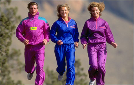
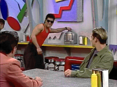
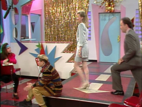
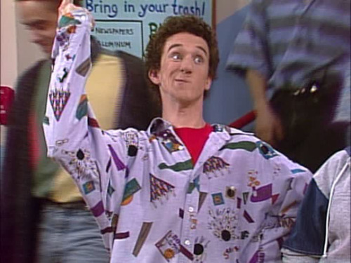
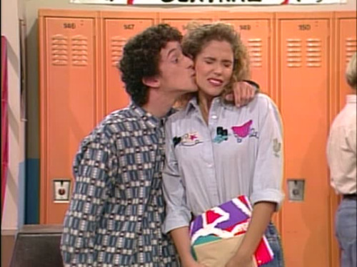
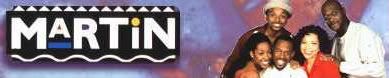
There was a style of graphics popular during the early 1990s, best exemplified in my mind by the opening sequence of the TV show Saved by the Bell (started in 1989). In Living Color (started 1990) is another example. 
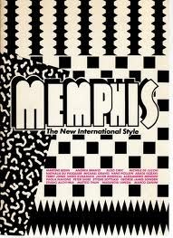
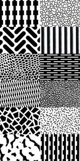
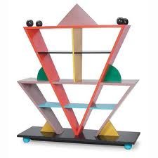
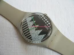
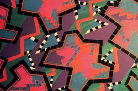
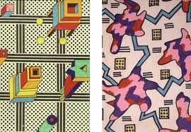
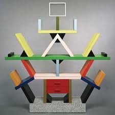
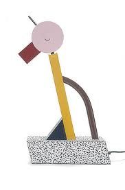
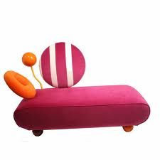
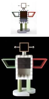
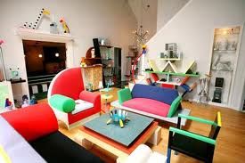
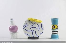
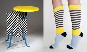
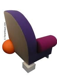
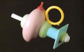
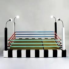
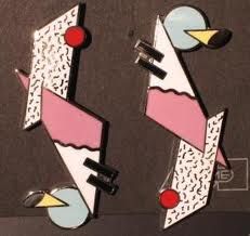
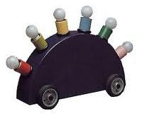
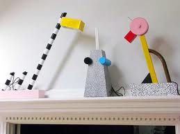
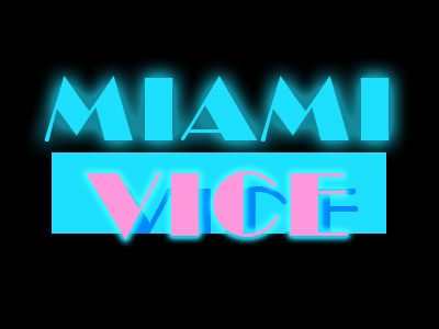
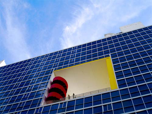
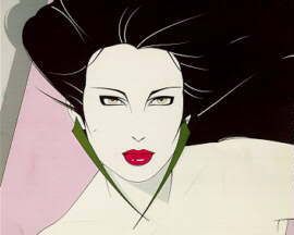
I wish to know more about this style of graphic design. Does it have a catchy name, like googie or supergraphics? For lack of a better term, I shall call it Saved by the Bell graphics (SBTB). The style was very colorful, but at times seem to favor certain colors now considered unfashionable, such as aqua and teal. It seemed to draw upon graffiti as a source, but I don't recall graffiti looking like this"”or perhaps modern graffiti style has changed?
 

Master-Classter

Distinguished Member
Spamminator Moderator
Joined
Jul 18, 2007
Messages
8,366
Reaction score
1,236
I know exactly what you mean. I think the colors tended to be sort of neon shades and the shapes were often squiggles or geometric related. Some more examples below. there were also a few big influences/movements. For example i remember African/Jamaican being 'in', ie bright colors, lots of patterns and layers, etc. then there was the sportswear stuff like skiing jumpsuits and new fabrics like nylon, rayon, etc. Then there was grunge, but we won't go there.
tracksuits.jpg
fresh-prince_324x218.jpg
90210.jpg
Rocko_group.jpg
mzi.pflmvqla.170x170-75.jpg
 

Kent Wang

Affiliate Vendor
Affiliate Vendor
Dubiously Honored
Joined
May 5, 2005
Messages
5,841
Reaction score
1,492
I think it would be fair to say that it started in the late 80s. Saved by the Bell started in 1989, but I'm not certain that they had same graphics back then—most likely though. Tangentially, I really think of the late 80s to early 90s as being one cohesive cultural period, with the teased hair, big shoulder pads on women (which you can see in your 90210 cast photo), and this graphical style. The montage in Wall Street (1987) where Bud gets his new apartment decorated shows a similar aesthetic.
 

Kent Wang

Affiliate Vendor
Affiliate Vendor
Dubiously Honored
Joined
May 5, 2005
Messages
5,841
Reaction score
1,492
Cool site. Even that cafe they hung out in is decorated like this:
tumblr_lmr4lv0Arq1qc46e7o1_400.gif
 

Kent Wang

Affiliate Vendor
Affiliate Vendor
Dubiously Honored
Joined
May 5, 2005
Messages
5,841
Reaction score
1,492
That site is a goldmine.
tumblr_ljtogdP2Gt1qc46e7o1_500.jpg
tumblr_lm4ufwfQGy1qc46e7o1_500.jpg
tumblr_ljyaebDMOz1qc46e7o1_500.jpg
Check out the binder (Trapper Keeper?)
 

grundletaint

Distinguished Member
Joined
Dec 27, 2007
Messages
5,162
Reaction score
398
i think a lot of it had to do with computers entering daily use and people getting all crazy with showing off new technologies in clothing and design. a lot of it, as mentioned above, was influenced by the nouveau-african movement happening around that time, taking those patterns and shapes and going from there.

DoTheRightThing.jpg
martinbn-2.jpg


the west coast style just took that stuff and made it neon.
california_dreams-show.jpg
 
Last edited by a moderator:

Bradford

Current Events Moderator
Joined
Mar 19, 2002
Messages
6,626
Reaction score
228
I remember reading articles back in the 80's about how the Memphis Group was highly influential in the look of Miami Vice, which also took a lot of its inspiration from the buildings and style of South Beach...

miami_vice_text_7.jpg


499.jpg
 

Parker

Distinguished Member
Dubiously Honored
Joined
Jan 9, 2005
Messages
8,895
Reaction score
15,881
I immediately thought of the Memphis Group (as Lucky Strike mentioned). But, I also think this style emerged from work of New Wave designers from the 70s/80s like April Greiman and Jayme Ogden in LA. Her WET magazine stuff used a lot of neon colors, non-grid layouts and squiggly/abstract shapes. She was a very early adopter of the computer as well.

Screenshot2011-06-19at105408AM.png


Wet.jpg


Screenshot2011-06-19at105448AM.png


Screenshot2011-06-19at105250AM.png


image.jpg
 

Nataku

Distinguished Member
Joined
Nov 10, 2006
Messages
9,833
Reaction score
27,416
I had a black Nike T-shirt in 1990-1991 that had pastel colored (green, orange, pink, yellow, etc) designs all over it (I can't for the life of me remember what they were) and the back had "Nike" written on it in the "Saved by the Bell" font.

Kinda funny as we were watching some old home videos last week and my wife saw me wearing that shirt and made a comment. Then we all got into a discussion of early 90's fashion/trends and Saved by the Bell is what always comes to mind besides those crazy t-shirts and shorts I used to have. Kinda funny that this stuff only lasted several years. I remember it was huge in '89-91 and faded out in 1992-93. By 1994-'95 it was just a memory.
 

imatlas

Saucy White Boy
Joined
May 27, 2008
Messages
24,775
Reaction score
28,574
Originally Posted by Nataku
... I remember it was huge in '89-91 and faded out in 1992-93. Thankfully, by 1994-'95 it was just a memory.

FTFY.

PatrickNagel.jpg
 

Kent Wang

Affiliate Vendor
Affiliate Vendor
Dubiously Honored
Joined
May 5, 2005
Messages
5,841
Reaction score
1,492
Haha. I read that the London logo is supposed to be inspired by graffiti.
 

Featured Sponsor

How important is full vs half canvas to you for heavier sport jackets?

  • Definitely full canvas only

    Votes: 85 37.3%
  • Half canvas is fine

    Votes: 87 38.2%
  • Really don't care

    Votes: 24 10.5%
  • Depends on fabric

    Votes: 36 15.8%
  • Depends on price

    Votes: 36 15.8%

Forum statistics

Threads
506,522
Messages
10,590,065
Members
224,264
Latest member
bernas
Top