venessian
Distinguished Member
- Joined
- Jan 23, 2011
- Messages
- 3,204
- Reaction score
- 1,923
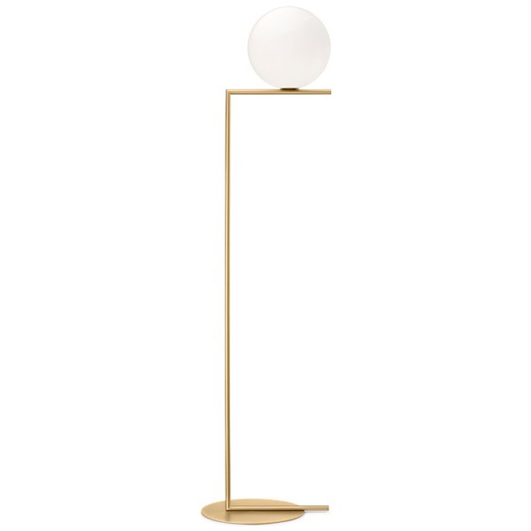
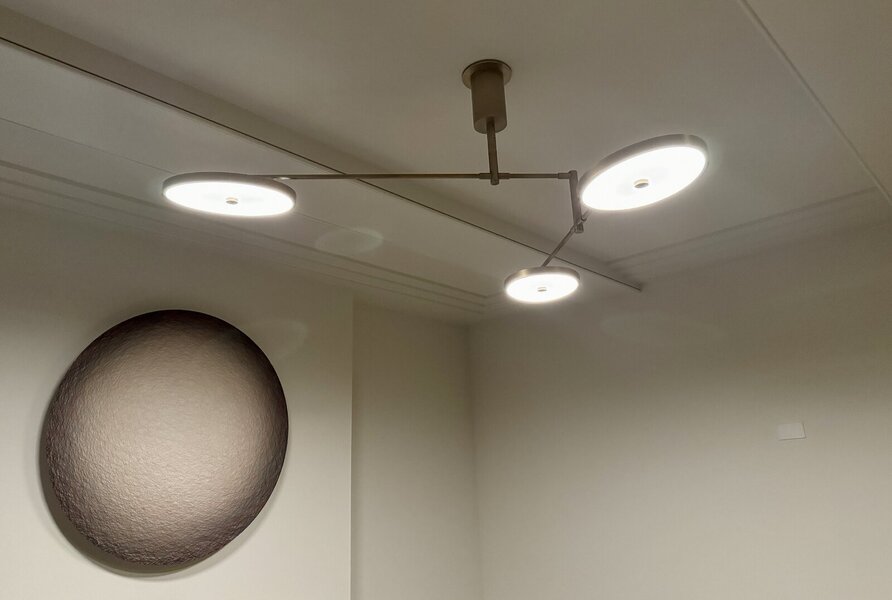
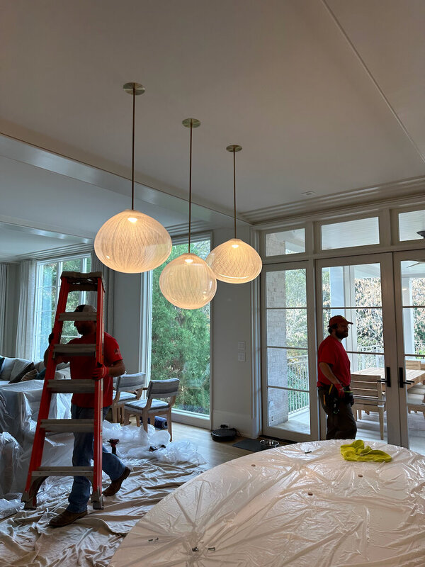
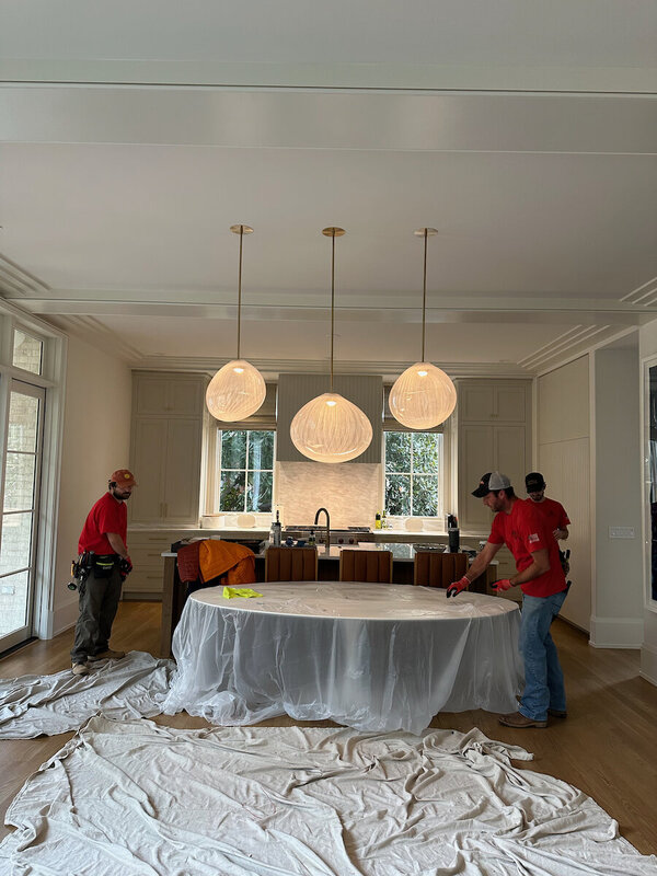
On the subject of Iittala, thoughts on the Putki lamp by Matti Klenell?
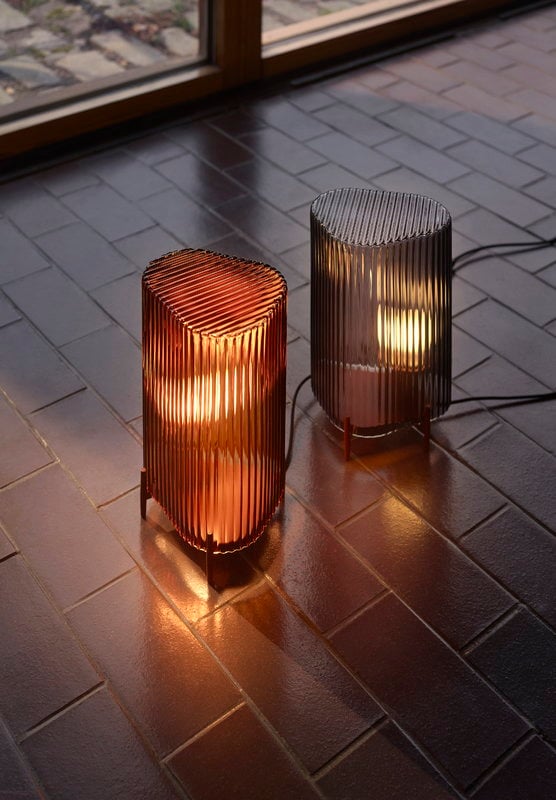
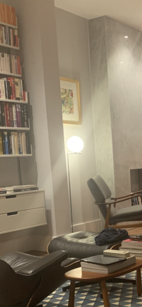
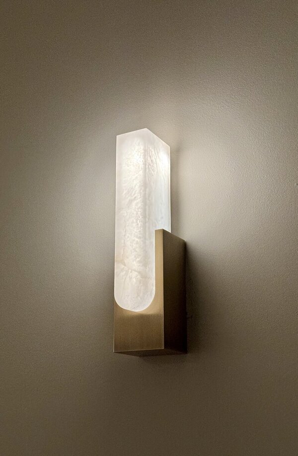
Solely mood/aesthetic - not expecting to use it for reading
I am not feeling these. They look far too oddly "night-light-ish", very "safe" design", not that interesting, an odd mixture of elements.Thanks for this - it aligns with what I was thinking, though I'd have to make do with 1 or 2 at most.
The opinion that they might "work better" in multiples underscores that. Great lighting shouldn't need to be papa bear, mama bear, baby bear, and baby bear's friend too...unless the lighting is candles, preferably in a venerated church or on birthday cakes.
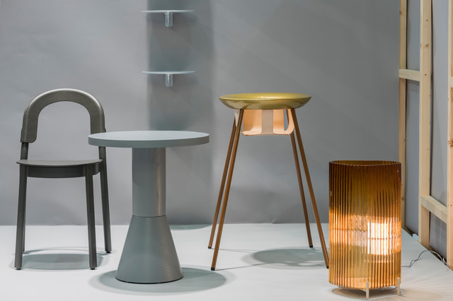
For real object lighting, serving only as base illumination or "decoration" or "mood", if must be maybe look at more interesting examples like Artemide "Boalum" or Santa y Cole "Cesta", etc., many other variants. To me those Iitala "Putki" look very Pottery Barn generic.
Last edited: