- Joined
- Jun 1, 2012
- Messages
- 4,653
- Reaction score
- 3,456
@Sam Hober
David, can you explain the napping aspect a bit? Do you nap it when you cut a tie, and what determines why you might do this. Thank you, this is all very fascinating, feeds my obsession about details but I'm sure others find it informative too.
@Mr. Six
Those Bigi knots are fine. I've no problem with a grenadine I got from them, though in retrospect, the tie is a bit too formal (fina weave with thin stripes), so I only wear it with a navy blazer, and even then not so often. I think it's the wool that could be a wild card, depending on the weight. When I get serious about that tie, I'll ask Greg.
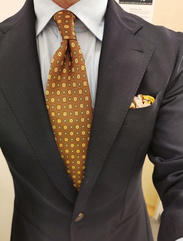
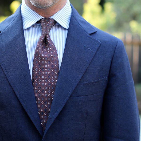
Of the block stripes, I think the multi-stripe works better for thin block stripes. It's high in energy admittedly, but in your configuration the brown and blue are in the same lightness (darkness) range so it creates, for me, an illusion of two irregular stripes. But the two equally spaced stripes feels, to my tastes, less desirably. I know, YMMV. We're not here to change anyone's tastes/preferences unless they want them changed!
For stripes, my preference is on irregular ones with thin stripes against a background (and as noted above, completely the opposite about shirts). Hmmm...see post soon in Lounge.
David, can you explain the napping aspect a bit? Do you nap it when you cut a tie, and what determines why you might do this. Thank you, this is all very fascinating, feeds my obsession about details but I'm sure others find it informative too.
@Mr. Six
Those Bigi knots are fine. I've no problem with a grenadine I got from them, though in retrospect, the tie is a bit too formal (fina weave with thin stripes), so I only wear it with a navy blazer, and even then not so often. I think it's the wool that could be a wild card, depending on the weight. When I get serious about that tie, I'll ask Greg.
Of the block stripes, I think the multi-stripe works better for thin block stripes. It's high in energy admittedly, but in your configuration the brown and blue are in the same lightness (darkness) range so it creates, for me, an illusion of two irregular stripes. But the two equally spaced stripes feels, to my tastes, less desirably. I know, YMMV. We're not here to change anyone's tastes/preferences unless they want them changed!
For stripes, my preference is on irregular ones with thin stripes against a background (and as noted above, completely the opposite about shirts). Hmmm...see post soon in Lounge.