- Joined
- Jan 7, 2005
- Messages
- 9,403
- Reaction score
- 301
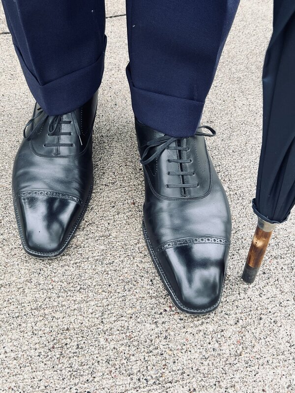
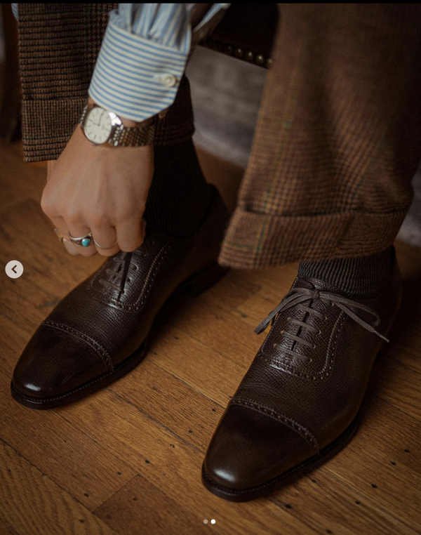
Love it.
Love it.
STYLE. COMMUNITY. GREAT CLOTHING.
Bored of counting likes on social networks? At Styleforum, you’ll find rousing discussions that go beyond strings of emojis.
Click Here to join Styleforum's thousands of style enthusiasts today!
Styleforum is supported in part by commission earning affiliate links sitewide. Please support us by using them. You may learn more here.
 Nicks Boots - Wickett & Craig English Bridle Veg Tan Leather - $759
These boots are made from 6.5 oz Wickett & Craig English Bridle Leather. This tannery has been making leather the old fashioned way since 1867. Each side can take about six weeks to produce, making it a significantly longer production time than most leather on the market.
Nicks Boots - Wickett & Craig English Bridle Veg Tan Leather - $759
These boots are made from 6.5 oz Wickett & Craig English Bridle Leather. This tannery has been making leather the old fashioned way since 1867. Each side can take about six weeks to produce, making it a significantly longer production time than most leather on the market.
")