- Joined
- Dec 26, 2006
- Messages
- 5,097
- Reaction score
- 1,593
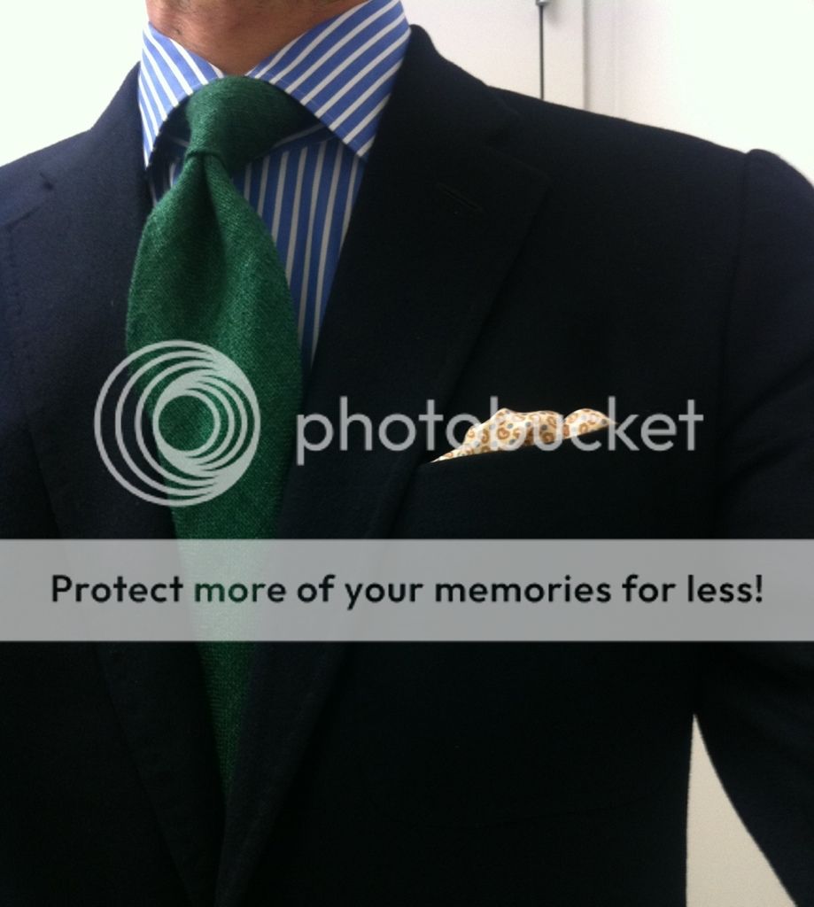
Without the pocket square, the top half of your outfit looks fairly sober. Dark jacket. Dark tie. There's nothing wrong with that. However, the pocket square really stands out. The bright orange dominates, and the eye is immediately drawn to it. That's not harmonious. The pattern of your shirt is very similar to the pattern of your square. That's not harmonious. The fold of the square is very business-like, while the color and pattern of the square are very fun. That's not harmonious.
I'm not going to argue that I made the best choice of PS with my latest fit, but I'm afraid I'm going to need a better explanation of what went wrong if I'm to avoid such mistakes in the future.
In my case, I paired an orange, white, and blue PS with an outfit that was predominately blue and white. Two of the PS colors harmonized with the rest of my ensemble, and the third (orange) is the complement of blue. Maybe it didn't work in practice -- I'll leave that to the eye of the beholders -- but it seems to me that, in theory (color theory, that is), the PS should have had just the right amount of pop while still harmonizing with the whole.
Without the pocket square, the top half of your outfit looks fairly sober. Dark jacket. Dark tie. There's nothing wrong with that. However, the pocket square really stands out. The bright orange dominates, and the eye is immediately drawn to it. That's not harmonious. The pattern of your shirt is very similar to the pattern of your square. That's not harmonious. The fold of the square is very business-like, while the color and pattern of the square are very fun. That's not harmonious.