• Hi, I am the owner and main administrator of Styleforum. If you find the forum useful and fun, please help support it by buying through the posted links on the forum. Our main, very popular sales thread, where the latest and best sales are listed, are posted HERE

    Purchases made through some of our links earns a commission for the forum and allows us to do the work of maintaining and improving it. Finally, thanks for being a part of this community. We realize that there are many choices today on the internet, and we have all of you to thank for making Styleforum the foremost destination for discussions of menswear.
  • This site contains affiliate links for which Styleforum may be compensated.
  • STYLE. COMMUNITY. GREAT CLOTHING.

    Bored of counting likes on social networks? At Styleforum, you’ll find rousing discussions that go beyond strings of emojis.

    Click Here to join Styleforum's thousands of style enthusiasts today!

    Styleforum is supported in part by commission earning affiliate links sitewide. Please support us by using them. You may learn more here.

best/worst corporate logos

Thracozaag

Distinguished Member
Joined
Aug 24, 2002
Messages
3,093
Reaction score
9
Originally Posted by rdawson808
What does that mean? They offer a product that people like? They offer it a lower price (well, I guess it probably isn't that)? How are they "torching their competitor's shops" metaphorically?

As BrianSD says, don't go there.


Believe me, I don't. I'm sick of Starbucks bullying these charming mom and pop places out of business in my old hometown.

koji
 

Nantucket Red

"Mr. Fashionista"
Joined
Mar 10, 2006
Messages
5,380
Reaction score
23
Originally Posted by faustian bargain
probably so. although it seems to be a pretty common image to use in crests, and i guess in japan crests are used both for families and for companies...?

here's a similar one for 'yoshino japanes antiques' in pasadena:
Yoshino-mon.jpg


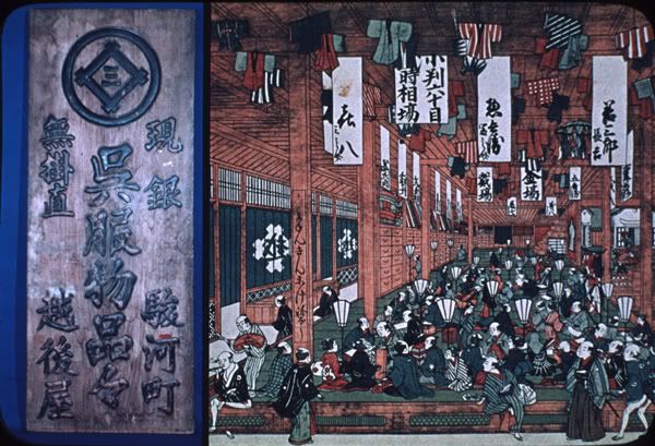
Because Japanese companies were often named after the person or family who established them, the logo is often the family crest. These frequently incorporate stylized characters for the name. This picture shows an excellent example: The Mitsui crest, which incorporates the characters for Mitsu (三), or "three," and i (井), or "well." The illustration shows an Edo-period department store. Many of today's major Japanese companies had their beginnings back in the 17th or 18th centuries.

Saikaku024.jpg
 

faustian bargain

Distinguished Member
Joined
Jun 25, 2004
Messages
2,444
Reaction score
2
*nod* i figured it was a simple explanation like that.

btw for clarification (not yours of course, red, but the non-nipponologues) - 'sakura' is 'cherry blossom' (AFAIK), hence the flower motif.

is there a compelling reason for the circular form of the crests, or is it a tradition whose origins are lost to the mists of time?
 

Nantucket Red

"Mr. Fashionista"
Joined
Mar 10, 2006
Messages
5,380
Reaction score
23
Originally Posted by faustian bargain
*nod* i figured it was a simple explanation like that.

btw for clarification (not yours of course, red, but the non-nipponologues) - 'sakura' is 'cherry blossom' (AFAIK), hence the flower motif.

is there a compelling reason for the circular form of the crests, or is it a tradition whose origins are lost to the mists of time?


Since it's a slack day, I asked a coworker why most of the crests are round. He explained that, while round crests are popular, they come in many different shapes. They are called kamon, meaning "house mark" literally and "family crest" in properly idiomatic translation. They would be displayed on houses to identify the family, and may have decorated the round ends of roof tiles, which would explain the popularity of the shape. They also decorated the sleeves and back of kimonos. He proceded to search the web and came up with this site that lists a huge variety (in Japanese):

http://www1.ocn.ne.jp/~argus/

I've also found this site in English:

http://www.asgy.co.jp/anglais/index.html
 

briancl

Distinguished Member
Joined
Feb 17, 2005
Messages
1,210
Reaction score
1
Originally Posted by Nantucket Red
Many of today's major Japanese companies had their beginnings back in the 17th or 18th centuries.

Subaru came about in the 50's..

"Subaru" is the Japanese word for the star cluster Pleiades that is depicted in the company logo. The Pleiades (also known as the Seven Sisters) has seven stars visible to the naked eye. The Subaru logo's six stars represent the five companies that came together after World War II to form one large company. While an automotive minnow compared to many of its competitors, Subaru has been a highly profitable company for many years. It is noted for the production of conventional-bodied cars with full-time AWD (in fact, in many markets its entire product range has this feature) and its use of the horizontally-opposed engine.

subaru_logo.jpg
 

rdawson808

Distinguished Member
Joined
Feb 22, 2005
Messages
4,122
Reaction score
4
Originally Posted by faustian bargain
it's retro because it's a silhouette of Jerry West, recruited by the Minn. Lakers in 1960: http://ask.yahoo.com/20030912.html


Yeah, I realize that. But still the whole things seems very 70s to me (even though it is even older than that). To me, it says 970s, in a headband, short-shorts, and wristbands sort of way. Of course that's probably because of my age and the fact that the emblem has not changed.

bob
 

chrysalid

Senior Member
Joined
Apr 17, 2006
Messages
528
Reaction score
0
smart_badge.jpg
- dislike the typeface - hate the logo/badge - totally forgettable.
 

Dakota rube

Stylish Dinosaur
Joined
Jan 14, 2005
Messages
13,306
Reaction score
237
Originally Posted by rdawson808
...the fact that the emblem has not changed.
bob

In a perfect world a logo would never have to be changed. The logotype should be instantly recognizable, a timeless and boundary-less symbol for the firm. I think if one were to review these many pages of submissions, we'd find several of the favorites are virtually unchanged since their introduction.
 

faustian bargain

Distinguished Member
Joined
Jun 25, 2004
Messages
2,444
Reaction score
2
coupla good avatars, right there.
 

Bags

Active Member
Joined
Feb 9, 2005
Messages
38
Reaction score
0
How about some good ones from the world of sports.

I've always thought this old Milwaukee Brewers logo was great...
history_logo2.gif


Much better than the awful one they replaced it with...
history_logo3.gif


I'm glad to hear they're actually bringing back the old logo for their alternate uniform this year.
 

Tokyo Slim

In Time Out
Timed Out
Joined
Apr 28, 2004
Messages
18,360
Reaction score
16

bryce330

Senior Member
Joined
Feb 18, 2003
Messages
803
Reaction score
3
Originally Posted by Bags
How about some good ones from the world of sports.

I've always thought this old Milwaukee Brewers logo was great...
history_logo2.gif


I love that old Brewers logo as well - a lot of people just see a glove and ball and not the letters "m" and "b." It's kind of like the FedEx logo with the "hidden" arrow.
 

Featured Sponsor

How important is full vs half canvas to you for heavier sport jackets?

  • Definitely full canvas only

    Votes: 91 37.4%
  • Half canvas is fine

    Votes: 90 37.0%
  • Really don't care

    Votes: 26 10.7%
  • Depends on fabric

    Votes: 40 16.5%
  • Depends on price

    Votes: 38 15.6%

Forum statistics

Threads
506,854
Messages
10,592,560
Members
224,333
Latest member
menophix-reviews
Top